HOME | DD
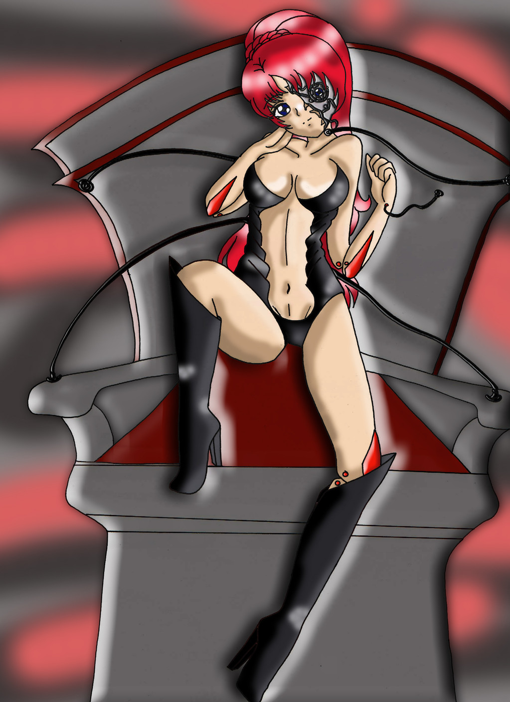
 return-null — Succubus

#devilgirl #lineart #lineweight #lingerie #posepractice #succubus #basecolors #cellshading #celshading #shading
Published: 2017-01-02 07:01:49 +0000 UTC; Views: 755; Favourites: 17; Downloads: 0
Redirect to original
Description
Sorry for flooding with all these Succubus WIPs the last couple days. Hopefully someone found them more interesting than annoying. I'm sure there is more I could do with this picture (highlighting instead of just shading) but I am calling it with this one.Since the original sketch got so much attention, I decided I would take some time and try to fix this picture up digitally. This is the final phase in my process. My process is not perfect and needs to be improved, especially where speed is concerned. I also need to start defining the shadowed areas at time of sketch probably.
In this step I shaded the character. Definitely interested in feedback. I hope it maintains the qualities that were appealing in the original picture.
When I was messing with the layers at the end, I found looking at it without any of the base colors really interesting/striking, so I went ahead and included that on the left.
(UPDATE: Fixed an issue with some shading gone bad. Still visible on the left haha. Also changed the dulled the color of the shawl.)
Background credit:
Timelapse of this step:
www.youtube.com/watch?v=SugmfS…
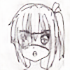
Original:
Lineart:
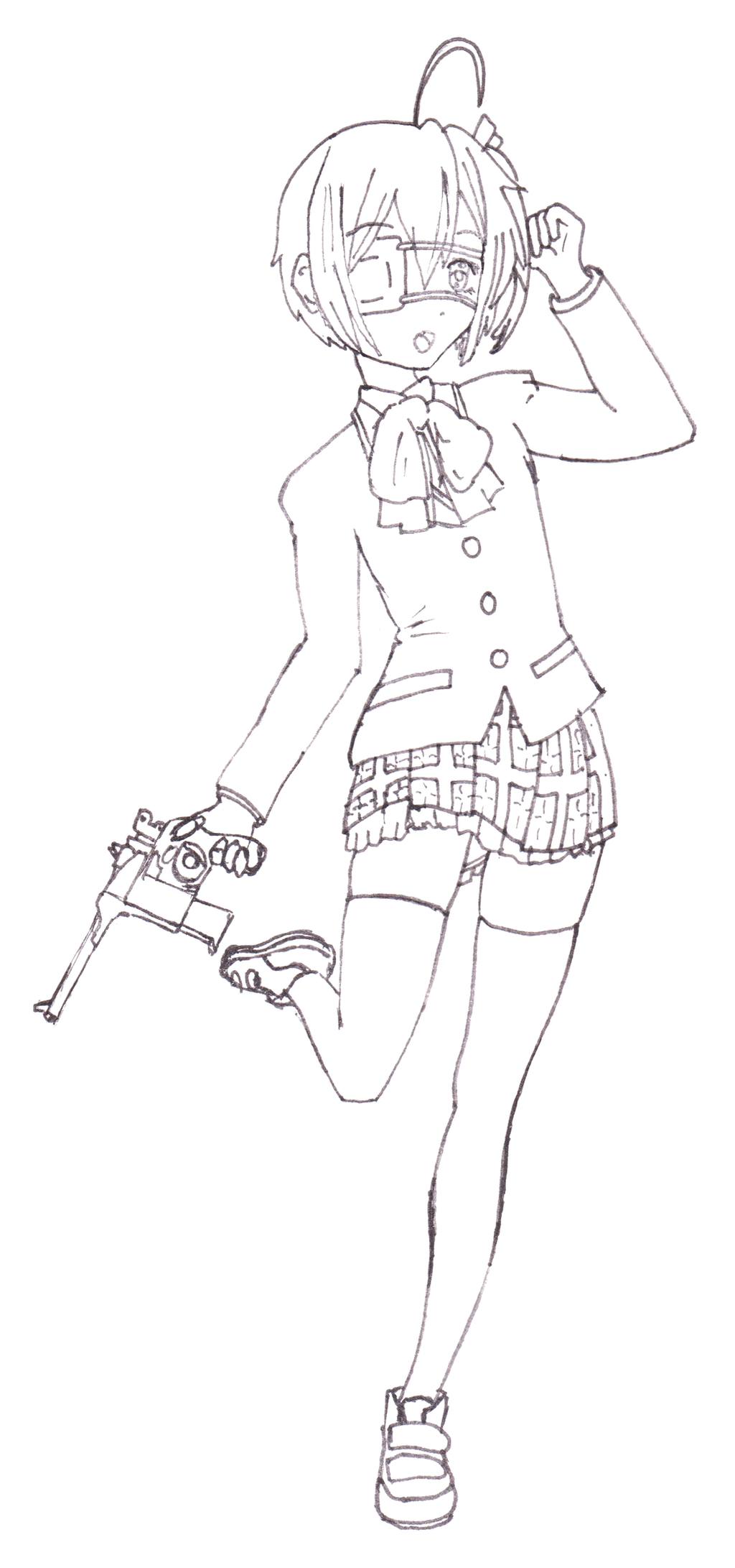
Base Color:
Lined with Weight:
Related content


Comments: 23


Originality

Impact
Ooh! The background suggests a seductive yet mysterious mood. Good job! I like how you show your progress on drawing the succubus! ^_^
Here is a list of things that you need to improve on:
- You know that clear sash around the succubus. I think you should add some shading to it make the whole drawing feel more 3D. You just need to lower the opacity when shading the sash.
- It's weird how you shade around the belly button. It makes it looks like she's forcing her stomach in.
- Just me being nitpicky here, I think the hair color doesn't fit with the seductive succubus well. I think a dark purple would have been a more seductive color.
Overall, I like how you color and cel shade the art. Hope this helps! ^_^
👍: 0 ⏩: 1

The shading (or lack thereof) on the sash and stomach have come up the most as criticisms on this picture, so I will definitely keep that in mind. I also debated trying some other color scheme, but played it safe with the black/red instead.
I'm glad you enjoyed all the Work In Progress steps that I did! Did you take a look at the timelapse videos? I want to continue doing some kind of work in progress in the future, but I don't know if multiple deviations or timelapse videos (maybe posted as journals) would be better. I'm open for feedback!
I hope you will continue to watch me grow as an artist in the future!
👍: 0 ⏩: 1
OoO There's a timelapse of this? Where is it?
You're welcome!
 (Smile)")
👍: 0 ⏩: 1
Doesn't have the original sketch, but I practically redrew it when I went digital anyway
Succubus Timelapse VideosI tried something completely new to me with my most recent WIP deviations on the Succubus. I used Chronolapse to create some timelapse videos showing the work/process that I used. Zero editing or anything, though I'm sure I could figure out how to do voiceover, titles etc. But I'd rather do something more focused with that (tutorial or something?).
Presently, I'm just wanting to include the videos here on dA, but it sucks that you can't embed them in a deviation description. I've been adding links but I'm not sure how visible that is. I'm guessing that journals are probably the best way to go about it, but hopefully it won't be too annoying to get 2 notifications for a single drawing.
Anyways, if you've read this far, check out the videos, and if you feel inclined, give some feedback about what you like to see in drawing videos on youtube or if you even like those at all.
👍: 0 ⏩: 1
The way you did the succubus drawing reminds me of how I had used MS paint with a mouse before I was given a tablet and moved on to Medibang.
👍: 0 ⏩: 1
Haha, I think everyone used the Paint/Mouse combo at some point...though that was a looong time ago for me. I've just never gotten great at cleaning up my pencil to lineart. Clip Studio Paint helps with that at least. Even though I have a tablet, I only used it in this picture for adjusting the line weights.
👍: 0 ⏩: 0

Overall
Originality
Impact
Hello, I'm here from a.deviantart.net/avatars/p/r/p… " alt=" " title="ProjectComment" />
To start off, I must say I'm really impressed by the anatomy. You didn't make any common mistakes like the head being to large for the body or the arms being to short.
The main problem seems to be with the light and shadows. I find that when you make shadows, it looks much more natural if you do not simply darken the base color, but change the hue a little bit as well. For example, instead of just darkening the shadows, you could have made it slightly more purple or orange than the base color. Another thing, although the veil she is wearing is transparent, transparent objects still have shadows and you didn't really add any on it. However, most of the shadows are put in the right places which is very impressive, you knew how to add shadows on the legs to make it appear more round, and the shadows outlining the muscles on her torso are also in the correct places. I think the shadows on the hair could be a bit more detailed though, maybe some shadows on the top left of her head.
Overall, its a very good piece of art. It could use a few tweaks for the colours, and a few shadows could be added or rearranged, but it is still great. Keep drawing!
👍: 0 ⏩: 1
With all the feedback I got on this picture, I feel like I came so close but stopped short. I think I'm going to try and go that last 10% and try fixing some of the things that have been brought up by others and some of the things I know myself I could do better. I think you are right that tinting the shadows could really aid the picture and I will try that.
The shading on the veil was a little complicated as I was worried how I would do it without messing up the transparent effect. I will need to just shade it on a separate layer and experiment with various transparencies.
This was some of the most ambitious/detailed shading work that I have done, and while I'm pretty happy with it, I know there is room for improvement. Your comment is equally encouraging and motivating to improve. Thank you for taking the time to give feedback.
I hope you will consider watching me grow as an artist in the future!
👍: 0 ⏩: 1
You have a lot of potential and the art was great! Keep drawing
👍: 0 ⏩: 0

Overall
Vision
Originality
Technique
Impact
Wonderful execution, but suffers significantly with the background and color choices. Oddly, the original posting, when zoomed, is much darker than the Critique version which shows your mid-tones much better. The socks and horns get lost in the background. Onward.
My problem is a lack of highlights. You have the base and shadows well laid out and following good anatomy, but the base on the socks is lost in the background. This is a bit clearer in the zoomed Critique copy, but the issue stands. You have a clear lighting plan, so follow through with highlights to add shine to the boots. The horns disappear as well, so this needs attention. You use an edge highlight (base tone, actually) to define the characters left side from ankle to neck -- carry on with the light source side as highlight.
Anatomy - Applause, applause! If I had to pick a nit, considering your lighting, their might either be a shadow interior of the toon's left deltoid, the slight hollow under the end of the collarbone above the breast, or somewhat less of a shadow on the lit side of the stomach (toon's left side). Rib cage shadow, yes, and maybe a bit more, but as is, it seems a bit over done. The shadow setup makes it look like her stomach is straight on, but shoulders are rotated toward the light.
The veil/wrap is well done and a nice feature.
Basically, if you're going to shade down, shade up as well. Great stuff otherwise!
👍: 0 ⏩: 1
Definitely helpful feedback. This makes it 0 for 2 as far as the background choice, which while I think it gives off the atmosphere I wanted, is problematic for the visibility of the image. I could probably alleviate the issue somewhat by having a thicker outline around her as a whole. I think the fact that I wanted to make sure I submitted the B&Wish version as well is a subconscious admission that I could have done a better job on the background. I think there is a way I could have pulled off my original vision, I'll just have to improve going forward.
As far as the lack of highlights, I made conscious decision to just wrap this image up last night and move on to something new. I was proud of how the shadows turned out, and I could say the shading only is a stylistic choice, but I agree it would definitely look better with some highlights. Maybe I'll revisit and add them in sometime. Even though it means I may be leaning more on my digital tools, I think this whole process has shown me that I should worry less about a super clean initial sketch and more about planning things like light and shadow.
I'm glad you like the anatomy and the veil/shawl. Thanks for the feedback and suggestions about the shading of the torso. I definitely struggled there, and I could have found more references and tried to copy more directly, but part of me wanted to have this picture be a bit of a bookmark of where I stand currently skill-level-wise, so I just studied my few references for a bit and tried to reinterpret blind. The result is something that I feel is believable at a glance, but less convincing and pleasing the longer you look at it.
Thanks for the pointers, tips, and kind words. If nothing else, it's a reminder that I can never get complacent! Thanks for taking the time to comment, and I hope you will watch me grow as an artist in the future!
👍: 0 ⏩: 1
Thank you for the watch and Llama! I have a soft spot for anatomy, and a soft head to go with it. I certainly understand the choices and edges of model sheet design, so I have no problem with stylized construction. But when I see good anatomy done only half way, it would be good to see it finished properly.
Looking forward to seeing more!
👍: 0 ⏩: 1
Haha, I will try to live up to your expectations in the future!
👍: 0 ⏩: 0

Thank you! I'm pretty proud with how it turned out, glad someone else feels the same!
👍: 0 ⏩: 1

you're welcome! yeah it looks beyond awesome! ^^
👍: 0 ⏩: 1
Thanks! I hope you will consider watching me in the future! If you think my art is looking beyond awesome, I'll have to set my sights lightyears past awesome!
👍: 0 ⏩: 1
you're welcome! ^^you're art is good to where if you learned to animate you could probably make you're own anime! ^^and become famous and everything!
👍: 0 ⏩: 1
I haven't done much in the way of animation, but anyone who can do that earns a lot of respect from me... I want to give it a shot sometime, but I'll have to get MUCH faster at drawing first...
Thanks for the positive vibes!
👍: 0 ⏩: 1
well it's okay to take you're time in drawing, i mean a quick drawing isn't always a skill full and good looking one. It's better to take you're time to make it look good. You're welcome!!! ^^
👍: 0 ⏩: 0