HOME | DD
 RoninDude — Cel Shading Tutorial - Fairchild of Gen13
Published: 2013-12-06 00:30:07 +0000 UTC; Views: 18803; Favourites: 328; Downloads: 680
Redirect to original
Description
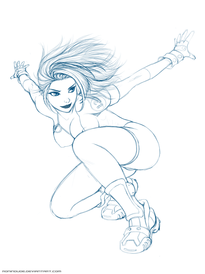
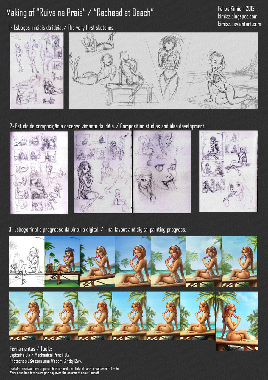
Here's a little animated gif to go along with my tutorial below. Hope it helps!I do a majority of my work in Paint Tool Sai. I know photoshop is a more complete program, but for cartoon/anime work, I feel Sai has a faster smoother flow, at least for me.
Ok, here we go:
1. SKETCH
This is done loosely in light blue, just because I feel it's easier on the eyes. I picked it up from an old friend, and it's stuck with me. I start off with basic shapes, and build up from there, sometimes using several layers as I experiment with the pose and lines.
2. INKS
Once I have a sketch I like, I turn the opacity for the sketch layer down to 30%, and create another layer on top of it for the Inks. The reason I turn the opacity down on the sketch layer is because it helps me distinguish between the layers as I lay my lines down on the ink layer. I use black here, and various line thicknesses, depending on my desire. After I am finished inking, I lock the opacity on the ink layer, so that I don't mess it up accidentally. Also, you can color the lines if the opacity is locked, just by choosing a color and painting over the lines. It will only color where there is already a line, so it works well!
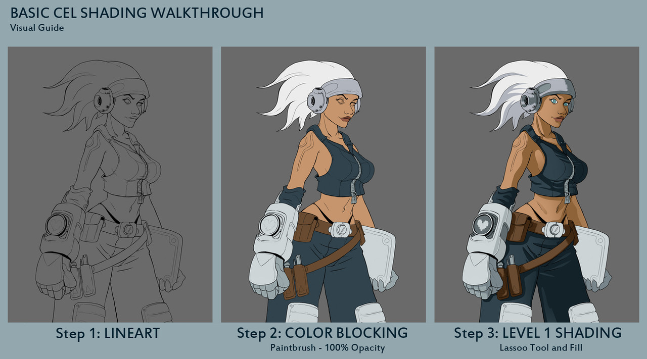
3. FLAT COLORS
Now I create a new layer for EVERY separate piece of the image that has a different base color, such as skin, hair, eyes, shirt, etc. A new layer for each, set UNDER the ink layer. Once I have them created and titled, I go ahead and color them appropriately, with one solid, mid-tone color for each. For example, if I was going to color the hair red, I would pic a flat, mid-saturated red, not a shade that is too dark or two bright. If the shirt was going to be purple, I would choose a mid-tone purple. Once done laying the base colors, I lock each layer, so I can shade each without worrying about going outside the lines. If I want to go quickly, instead of filling in each color by hand with the pen tool, I go to the ink layer, and select the white area's between the lines with the wand tool. Then, in SAI, I go to the selection window and select “Increment”. This will expand the selection by one pixel, which does a good job of making sure the selection goes under the lines nicely, so I don't have to deal with a ton of white jaggies floating around the lines. Then, I just fill the selection in on the appropriate layer. BE SURE YOU DO NOT ACCIDENTALLY FILL IN THE INK LAYER! That would be sad, I am sure you can guess why. Again, that's why I lock the ink layer. Again, I lock each color layer also, so I can shade without the worry of going outside the lines. It makes things so much faster!
4. SHADING - HAIR AND EYES
Now I'm ready to start shading. I like to start with the hair and eyes, because I feel that when those are done, the picture “feels” closer to finished. But that's just me. I start by selecting the base color on whatever layer I am coloring, and adjusting the value slider to a slightly darker tint, and start laying in the shadows. Once the shadows are in, I select the base color again,and go a bit brighter. Then I go ahead and add some faint highlights. After I have this done, I add several layers of shadows and highlights, until it feels done. Usually I have about 3-6 shades of the base color for each color layer.
A note on eyes... I tend to use a soft brush for brightening the eye, just under the pupil, because I like the effect.
5. SHADING – BODY
I continue doing what I did for the hair and eyes, only all over, considering the textures of each part of the character.
6. BLUSH
Now that all the colors are shaded, I create a new multiply layer above the skin layer, and call it “blush”. I choose a nice shade of blush, grab the airbrush tool, and just dab a bit of color over the cheeks, nose, knees, shoulders, elbows, and a few other places, if it would look good. Doing this is going to cause some of the blush to overlap into the areas outside the skin, so what I do then is go to the skin layer, grab the wand selection tool, and select OUTSIDE the skin. I then go back to the blush layer and delete what is in the selection. This should clean up any blush that may have overlapped into the background or clothing.
7. HIGHLIGHTS
Now, I go ahead and create a new layer called “Highlights” over all the rest, and start putting in tight white marks, here and there, where appropriate. Sometimes, that's just the eyes, if the character is not shiny.
A note on eyes... I put one white dot on the edge of each pupil, just barely overlapping the iris. This adds a bit of depth. A also add another faint highlight, if you look closely at some of my recent pics. It's an almost transparent bit of gloss just to the side of the white dot highlight. I do this by creating yet another layer above this one, and setting the opacity to 30-40%. I make a large white dot and erase some thin lines through it. I move it around the eye until it looks good. If you want the eyes to be exact, you can create the highlight layers for one eye, then duplicate the layer and move it over to the other eye. This give the eyes a clean symmetrical look, that works even if the character is facing slightly to the side.
8. BACKGROUND
This is always different. Sometimes I do this in photoshop, sometimes I stay in Sai. The idea is to complete the composition, using some sort of combination of shading, shapes, and color.
And that's it! I hope this helps to show my process, since people have been asking a lot. If you have any questions, feel free to ask!
Later!
~Ronin
Related content


Comments: 27

👍: 0 ⏩: 1

👍: 1 ⏩: 1
👍: 0 ⏩: 0

👍: 0 ⏩: 0


Even though this is a few years old its still very helpful for this newbie to digital art. Thank you!
👍: 0 ⏩: 1
I don't really do anything the same way anymore, but there are many ways to go about making art. I am glad it's helpful!
👍: 0 ⏩: 1
I'm sure as I move forward I'll find my own groove, but this really is helpful in having a place to start. Narrowing down the dizzying array of choices makes it all seem much less intimidating.
👍: 0 ⏩: 1
That actually makes a lot of sense! Didn't think of it that way.
I tend to enjoy exploring things, so I don't often get overwhelmed. But I can totally see what you mean.
👍: 0 ⏩: 0

On step 7.
Is there any certain type of layer you use or pen to make the highlight effect?
I have everything else nailed down but it seems with the highlight I can't ever like nail it no matter what pen, marker, airbrush, etc setting I use.
👍: 0 ⏩: 1
This tutorial is about 6 years old and I don't do anything the same as I did, back then, so I can't really elaborate, too much. My style and all my techniques are different. I've simply moved on.
However, looking at the example image I provided at the time, the highlights are simply tiny white marks, on a normal layer, made with a simple, standard round brush. Just shape it appropriately, either with multiple strokes or by erasing away to get the sharp edges. Most of how you get it to look good is by understanding how lighting actually works. Look at real life photo references of shiny surfaces: oiled/wet skin, latex, metal, whatever. Study the patterns you see in that part of the highlights that are absolutely white in color. That's the specular highlight. Not many things in natural lighting use absolute white, so be sparing.
A word of advice: If you can't seem to get a detail right, then turn to reference. Real life reference. You don't need to reinvent the wheel, here. Just look at what exists, imitate it through study, and eventually, you'll understand how to replicate it for your own purposes, and eventually, stylize it however you want.
👍: 0 ⏩: 1
Thank you so so much for the advice.
I'll look at more real life reflections and try to learn my own style.
It truly does help me even if this tutorial is super old. c'x
👍: 0 ⏩: 1

I like this, a great way to show the steps. Wish I could pause it though.
👍: 0 ⏩: 1
I'm glad you like it! I suppose it would have been better to upload them as a strip, with the next panel being the progression.
👍: 0 ⏩: 0


Very cool. I added it to favourites because I get a lot of people asking me for a good tutorial and I'm way too lazy to make one of my own.
")
👍: 0 ⏩: 1
I'll have them let me know.  (Smile)")
👍: 0 ⏩: 0

These are essentially the same steps I take.
Great job, though, I have a feeling I'll be coming back to this.
👍: 0 ⏩: 1
Thanks! I think it's a common method, but a large number of people have asked me lately, so I figured it'd be easier in the future to just link back to this, instead of typing it up every day.
👍: 0 ⏩: 0

")
You could do this with photoshop too, I just got used to sai first. lol. I still go to photoshop for cool effects though.
👍: 0 ⏩: 0