HOME | DD
 rthaut — Blog Template 02

Published: 2009-09-26 19:50:45 +0000 UTC; Views: 9840; Favourites: 26; Downloads: 0
Redirect to original
Description
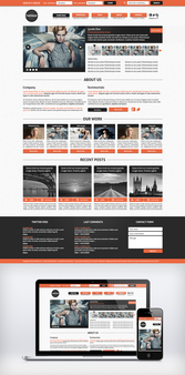
I came up with the design for this last night. I basically wanted to combine various elements of some of my recent designs into a Blog template. While there are some reused parts, most of the design still had to be completely remade so that everything would fit together well.I kept the footer from one of my other designs, mostly because I still don't know what content should go there. I was not happy with the footer in my previous Blog template, but I might replace the one shown now in the future if I ever have a good idea of what to put there instead.
I like the color scheme in this one a lot. I love light designs, as well as blue, so this worked out pretty well. I also like the contrast of the sidebar, which is probably what I spent the most time on.
This design is for sale; contact me for more information.
EDIT: I have created a dark version of this design called Blog Template 02 Dark
Related content
Comments: 13

You really did a good job. Where's the live preview?
👍: 0 ⏩: 1

Thanks - this is just a design (PSD), so there is no live preview.
👍: 0 ⏩: 0

No. I wish I could illustrate like that...
It was a free (no usage restrictions) Twitter icon I found in an article on Creative Nerds a few months ago.
👍: 0 ⏩: 1

heh, yeah I ended up finding it last night, I need icons for my website
👍: 0 ⏩: 0

Nice! This template really struck a cord with me! It's as slick as your other designs... but that Black/Blue side-bar makes it even more awesome. Black/Blue is my favorite color scheme!
I may consider buying this from you!
Sadly, with dwindling funds in bank and a general disregard for blogging at the moment, I wouldn't put it to good use, really. I can't even update my current blog WEEKLY. [link]
And a suggestion - I feel like if you switched out all the white with black/grey it could make it look even better. Just a thought, though.
👍: 0 ⏩: 1

Thanks! I really appreciate that! I am not much a fan of black & blue, as they seem to be overused anymore. However, it does look pretty slick, and I love the blue in this one; it is probably my favorite color, honestly...
I like your suggestion. Actually, my original idea (which I sketched on a napkin last night) was with the main section being a dark gray background, instead of the white it currently is. However, that caused the header, navigation, and footer to feel really out of place. It seemed like if I was going to make the main section dark gray, I basically had to make everything dark gray too, which I did not want to do for this design.
I plan on doing a dark blog theme soon; it will probably be similar to this in structure, but will be almost completely dark gray background colors. It would basically be my Band Store Template 01 in blog form, but likely without the splatters and pink/purple/blue gradients.
I really just need to get my footers designed now; I think I have a good structure created for blog themes, but my footers are not quite up to par yet. Once I get those down I have a few ideas to make the main section and the sidebar a little more unique.
👍: 0 ⏩: 0


