HOME | DD
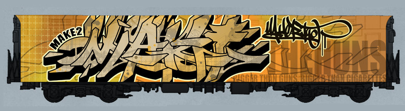
 rustymarc — MAKE - Huns Train, Old
Published: 2005-07-18 07:05:30 +0000 UTC; Views: 1005; Favourites: 7; Downloads: 318
Redirect to original
Description
Yeah. I was saving this and saving this and saving this and waiting and waiting but this project never ended up getting finished so fuck it, i'll just post up my entry on the HUNS train.Enjoy. It's really old.
C/C Appreciated.
Related content


Comments: 18


this is probly a dumb ass question, but where did you get that train, the graff is fresh, but i want my own train....
👍: 0 ⏩: 1

yeah i wouldnt mind it either
sick work though, to bad the collab didnt work out
👍: 0 ⏩: 0

i wish i had ur skill with grafitti.. and the backgound in the grafitti it self is killer. it's almost like a plaid.. or sumthing.. it weird i cant explain. bt i like it man.. keep up the killer taggin'..
👍: 0 ⏩: 0

Yeh its nice homie the photoshop kicks my ass all over the place, But your much more deadly than that.
👍: 0 ⏩: 0


Yeah, no kidding. I bugged 'em all, too. Maybe I'll just paste the ones I have together and it'll be a mini collab instead.
👍: 0 ⏩: 0

nice ish. i like the coloring! the 'Two' is really hard to read but you did an awesome job with the 'M' in my opinion.
the rest is fine, as always.

👍: 0 ⏩: 0

ur asking for advanced critique... so here it is... first off its bangin. i like it a lot. if i were to change one thing. i would extend the right leg on the "A" a lil longer then the right leg from the "M" where it extends under. if you want i could show you what im talking about. but other then that its dope
👍: 0 ⏩: 0


personally i feel this style alot more then what uve been doign recently...the letters are defined and still readable
just a thing of personal taste i guesse
👍: 0 ⏩: 0

dope dude. It has a little bit of a chinese look. The way u made the letters flow
👍: 0 ⏩: 0


That. Is. Fresh. Fully mad design, you exceed yourself, i'll link to my mates work when he gets some up. Be sure to check out my Gallery!
👍: 0 ⏩: 0