HOME | DD
 Sarinilli — SariF Hylian Ancient Alphabet Font
Published: 2012-09-04 05:59:58 +0000 UTC; Views: 18843; Favourites: 144; Downloads: 2446
Redirect to original
Description
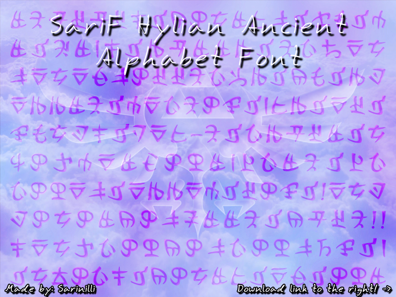
♥ This alphabet is an adaption for my Hylian Language Project! ♥April 08 2017: Few updates with this font finally... it isn't a mandatory update, but I HIGHLY recommend getting the newest version!
• Polished it up so it should work better in all browsers.
• Updated the pdf help file so it's easier to use.
• Updted the font name to conform to a new standard.
Thank you and enjoy the font! ♥
July 08 2014: Here we go again with fixes and updates... sorry guys, I keep doing this to you! I went and fixed some issues in ALL my fonts. Also got pdf updates for all of them as well! Enjoy!
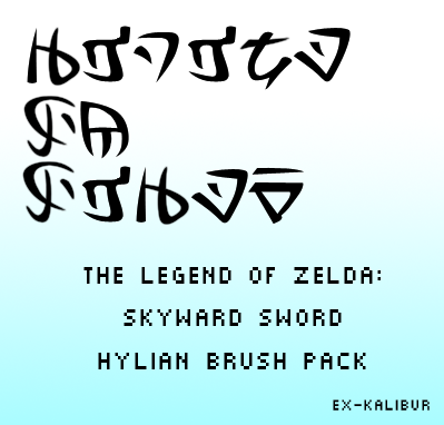
Based on and adapted from the Hylian alphabet seen in The Legend of Zelda: Skyward Sword. I took the original/official game version made by Nintendo and added to and adapted it to suit my Hylian Language. This font works the same as my "modern" Hylian alphabet font.
Remember to keep the PDF that's in the zip, it tells you how to properly use the Font!
I cannot stress this enough! The alphabet consists of 52 different characters. Not lower and upper case. If you use the font wrong then whatever you write will NOT say what you want it too. So keep the PDF.
That said, I present to you the "full" Ancient Hylian alphabet in font form!
Note:
This font is free for personal use. If you plan to use this alphabet in fanart, fan-fiction, tell your friends about it, use it in print work, you get the point... I expect credit.
If you're unsure whether or not I would allow for any specific reason, please contact me beforehand.
Please do not host this font on any site without my direct permission!
Related content


Comments: 50

👍: 0 ⏩: 0

👍: 0 ⏩: 0

Woah, this looks so complicated and detailed! I am prepared... LET'S DO DIS
")
👍: 0 ⏩: 1

Definitely refer to the Hylian Language Project lessons on this version! You can easily use it for English if you feel like it, but you have to be careful with letters like the different I's since one's short (it, into, with) and one is long (like, life) and so on. The lessons give a good bit on how to use and understand the alphabet functionality so you can use it correctly. Though the general rule of thumb is though, as long as you aren't trying to write something with capitals like they are in languages that use the Roman alphabet, you should be fine. :3
👍: 0 ⏩: 0

Would it be alright for me to use this font for a 4'x6' mini print that's not sold, but given away if people buy a set of my Zelda prints? It would be an incredibly limited run, as I doubt many people will buy the entire 3 piece set.
👍: 0 ⏩: 1
Under one condition..well, two, actually.
One, let me proof read the text. You wouldn't believe how often I see it and my language variation Modern Hylian used as if they have capitals, even with the lessons I provide. Just want to make sure the text represents the language project and intended use properly. :3
And two; send a little card or note with the prints; some way for them to find the font and language project. :3
👍: 0 ⏩: 1
If I decide to follow through, I'll be sure to share via a note. Thanks for the reply!
👍: 0 ⏩: 0

Wonderful font! Just what I was looking for. Thank you so much! You are very kind.
Blessed Be,
Albion
👍: 0 ⏩: 1
Aww, thank you so much! Makes me extra happy that you like my Language Project version. Hope you enjoy it, and if you have any questions about how to use it that my lessons don't properly explain, you're more than free to send me a note. ^_^
👍: 0 ⏩: 0

I tried it out on Win8 and both triforces looked a little weird (they were slanted) but yeah. They are ok I guess.
👍: 0 ⏩: 1
That's...actually rather strange. How are they slanted? Like a forced italic, or the other way? I don't have Win8 or I would check it out... if they're slanted the wrong direction I would suggest putting the Triforces in italic to see if it fixes it; if not..I'm not sure what to say. I have no idea why Win8 would mess something like that up in a font. o_O
👍: 0 ⏩: 1
I took a screenshot so you can see. prntscr.com/3o9nwu I'm not sure if it was supposed to be that way and the & and % symbols aren't working. Did you even put a symbol for that in?
👍: 0 ⏩: 1
That's very strange; no, it's not supposed to be like that. That definitely looks like a forced italic. I'll see if I know anyone with Win8 to test it for me since I can't.
And no, the & and % never got anything assigned to them; the pdf that came with the font file explains how to use it and lists the mappings. I pretty much included the two Triforce variations and Hylia/Goddess crest for the fun of it. I can keep those in mind for any future updates if I decide to add to it though.
Again, sorry it's looking so weird for you. Hopefully it's not a version compatibility issue; I do plan on getting the newest version of the font maker I use but it's a bit pricey, so if it needs to be run through an up to date program for compatibility, I'm sorry to say it's something that is going to have to wait a while. 
👍: 0 ⏩: 0

This looks really cool! I just wanted to make sure that it was OK if I use this in a LoZ Fanfiction I'm writing. I may post it online so that is the only reason I'm asking. Thanks for doing this!
👍: 0 ⏩: 1
Sure! Just make sure you read the notes on how the alphabet works so you get the right characters when writing with it. And credit, of course. A link back will be fine. If you have any questions feel free to ask! :3
👍: 0 ⏩: 1
OK thanks! I will definitely use the notes!
👍: 0 ⏩: 1
This helps a lot too if you're not sure about what to do with say, the different i letters. :3 [link]
👍: 0 ⏩: 0


Do you know how I can fix this?
👍: 0 ⏩: 1
I have no idea. I haven't ever had it happen myself.. what program(s) are you using it in?
👍: 0 ⏩: 1
Microsoft Word. Tomorrow I'll try it on the PC instead of the laptop and see if it works then.
👍: 0 ⏩: 1
Hmm... I'm not sure. I actually use the Libre Office equivalent of Word. It works just fine there. Though I'v heard of some weird problems from some people and others it works fine. If it helps you work out what's going on, from the best of my knowledge it works perfectly fine on Windows XP and 7, not sure about 8 because I've never been able to test it. It works fine in wordpad too, though if I turn superscript off it freaks out and cuts the whole top half of the characters off. So that's the only thing I can think of that might be an issue. My suggestion? If it's doing it on normal mode, try turning subscript on and see if it's still cutting off. Might have nothing to do with it but it's at least something to try.
👍: 0 ⏩: 1
If that helps or you figure it out, could you let me know? If I find a fix or some settings that make the font not work right I'd love to be able to put the information in the description for others. :3
👍: 0 ⏩: 1
It shows up just fine on my PC 
👍: 0 ⏩: 1
That's possible. If there's a version update then it's really an issue with older versions of word. Would you mind checking for me? If that's been the problem all along it would be great to know. ^_^
👍: 0 ⏩: 3

I actually have that problem too. I have been using this font on my android phone and the browser usually cuts off the top of the font. Idk if this makes sense but maybe the top of the font is in an area reserved for superscript or diacritics. That aside thank you very much for taking the time to translate, modify and post this font for all of us.
👍: 0 ⏩: 1
See, that's the funny part, is the font creator I use has a very defined place for where the glyphs should go for a standard sized font. They're all well within that range. I keep thinking there has to be something in the settings that I've missed, or that it may be the fact that I have an older version of the program, but I haven't found anything to date to suggest that. The fact that issues with the top being cut off seem to happen to some people and not others, even with the same programs and OS just baffles me. Though if I ever do find out there's some strange obscure setting that's slipped past my multiple checks, I'll definitely test it out and fix it if I can.
What's more confusing is that it seems to happen to some of the fonts I've made but others seem to be just fine. So it's rather confusing. Sorry for the trouble with it. Might just need to invest in the newest version of the font maker one day.
👍: 0 ⏩: 0
I actually have that problem too. I have been using it on my android phone and tablet and the browser cuts off the tops of the letters a lot. Idk if it makes sense but maybe the tops of the letters are in an area reserved for superscripts or something like that. With that being said it works for just about everything else. Thank you for coming up with this translation and font.
👍: 0 ⏩: 0
My PC is Windows 7, and I'm pretty sure Word is 2005(?). The laptop Word is 2010 (pretty sure).
👍: 0 ⏩: 1
That's really strange. Thanks for the info though, and I'm glad it works better for you on your desktop computer! :3
👍: 0 ⏩: 1
No prob 
👍: 0 ⏩: 0

when i tried to compare the letters to the images on zeldawiki (zeldawiki.org/Hylian_Language_Translations#Skyward_Sword) the z's on your alphabeth turned out to be o's on zeldawiki, what is the reason behind this?
👍: 0 ⏩: 2
Because in the alphabet from the game, z and o share the same letter. This is an enhanced version of the alphabet I created with alterations and more letters, for the Hylian Language Project. Check the second and third links in the description for this font- those pertain to the game correct version. :3
👍: 0 ⏩: 0
sorry, i was comparing zeldawiki to your FULL font
👍: 0 ⏩: 0


Thank YOU too! Glad you like it! ^_^
👍: 0 ⏩: 0

")
👍: 0 ⏩: 1
With the download button to the right, and to your computer. o.o
👍: 0 ⏩: 1
👍: 0 ⏩: 1
Well considering I don't know what OS you have, what your experience is with zips, font files, or the like... I'm not sure how I'm supposed to help.
👍: 0 ⏩: 0


 (Smile)")

No problem ^^ you're awesome for providing this, I don't have the time to do anything like this and you doing it helps alot so thank you very much ^^
👍: 0 ⏩: 1
Hehe well...I have reasons for thinking I have to share. Now to get the language stuff worked on and back up! Got a couple small ideas before I really binge on working on it, but this and the upcoming goodies should help buffer till I can do that ^_^
👍: 0 ⏩: 1