HOME | DD
 SheWolff — WIP - Help please
Published: 2008-09-15 01:11:57 +0000 UTC; Views: 1066; Favourites: 38; Downloads: 21
Redirect to original
Description
Thanks a lot for your comments, I appreciate them greatly.
 This is going into scraps now, as I think I have enough feedback to make a decision. ^^
---------------------------------------------------------
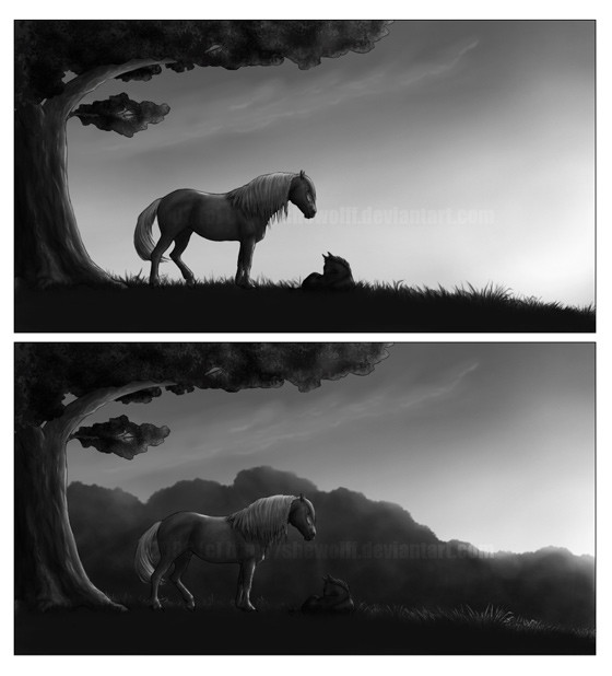
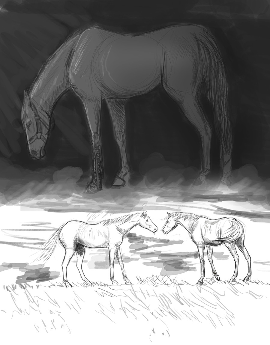
Hiya guys, I need your help for a sec. *begs*
Here's two versions of a panel in the first page of my comic. But, I can't decide which version to use! The one with trees in the background is the original one, but I was curious to see how the panel would look without the trees, and I quite like the dark silouhettes against the sky...
One word: HELP?
") Which version do you like?
Which version do you like?Btw, there's much more to be done to this; coloring, adding further detail etc. The original is in a much larger resolution as well, but you'll have to wait 'til the entire page is done if you wanna see more details.
")
Related content


Comments: 72

I like the first one... they look so very alone...
👍: 0 ⏩: 0

I like the first one. It's very dramatic and puts a lot more emphasis on the horses. I also get a stronger feeling of sunrise/sunset going on.

👍: 0 ⏩: 0

Hm... I like that I can see the foal better in the first one. But I can't see the definition on the foal as well as in the second.
So maybe... lighter, less opaque trees?
👍: 0 ⏩: 0

I like the top one better, with no trees. The trees are nice, but it makes it a little easier to see without them, and horses look like they fit in better in a large field rather than a forest.  (Smile)")
👍: 0 ⏩: 0

The first one, for sure. I love the contrast and the atmosphere, and the foal is much more noticeable. I find it overall to be much more dramatic and pleasing to the eye.
👍: 0 ⏩: 0


I like the one without the trees, it gives more mmmm..... emphasys (is that how you spell it? 
👍: 0 ⏩: 0

hmm, that's tough! But I think I really like the top one, with the dark silhouettes against the lighter sky
👍: 0 ⏩: 0

I like the contrasts of the horses and the sky in the first one better.
👍: 0 ⏩: 0

if you want a more cozy, homey feeling, you should go with the second. if the mare and foal are supposed to be alone then maybe the first?
👍: 0 ⏩: 0

i love the first one! 
👍: 0 ⏩: 0

I like the first one better. It's easier to see the foal and it just makes the horses stand out more.
👍: 0 ⏩: 0

In all honesty, though it is a tad harder to see, I really like the second panel more.
It just seems a wee more, busy, I don't know, balanced.
👍: 0 ⏩: 0

In the first one, it's easier to see the foal, plus, I like how it gives off that feeling of a wide open space...like freedom and such.
👍: 0 ⏩: 0

I much like the first one, more because you can actually see the foal. In the second one I can't even see the foal.
I love this though
👍: 0 ⏩: 0

I like the first one definately. I didn't even notice the foal in the second one, and the second seems more "flat," without those striking silhouettes and that gorgeous sunlight in the back.
👍: 0 ⏩: 0


hmmm hard choice they are both soo amazing!
The first one: Would look good if both the horse silhouettes were darker, black almost.
The second one: My personal fav! The foal needs to be lighter,but Still looks great as it is!
👍: 0 ⏩: 0

They are both amazing... but I really like the silouhettes against the sky in the first one! So if I had to choose, I would say the first one.
👍: 0 ⏩: 0

I think it's a wee bit easier to see what's going on in the first. :] I wouldn't have really seen the foal in the second one, especially since my monitor's a little dark. >.<
Looks awesome, though! I'll definitely read.
👍: 0 ⏩: 1

Thanks a lot for your feedback.
👍: 0 ⏩: 0