HOME | DD
 shftfrm — Project Ziro
by
shftfrm — Project Ziro
by

Published: 2007-09-04 17:42:57 +0000 UTC; Views: 9893; Favourites: 43; Downloads: 0
Redirect to original
Description
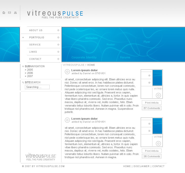
Project ZiroMy last deviation was in june for the dC contest and I design since this time on a lot of things but I can't finish them, because I need time and I hadn't this time. But after a lot of people ask me for new stuff, I must finish one piece now!
It's a little website with some new things and old things of me. I tested a lot of styles in the last time but I think this piece looks good enough to show it here. It's in my lovely colours and the effects not to much, in my opinion.
Used logos by ~Kwaku , ¢elusive , $liquisoft and `-kol .
Let me know what you think about it and don't spare with comments and
 s.
s.--------------------------
www.vitreouspulse.com
© 2007, vitreousPULSE
---
greetings,
synthes
Related content


Comments: 83

Wow! Super  (Smile)")
👍: 0 ⏩: 1


Mh, gefällt mir gut ... schöne Farben, konsistentes Grid (ja, ich achte auf sowas. *_*) und interessanter Aufbau.
Optisch find ich auch nicht, dass du mit den Effekten übertrieben hast ... aber fürs Layout brauchst du ja IRRE viele Bilder.
- Damit hat sich die Kritik auch schon wieder. Ich bin still.
👍: 0 ⏩: 1

Naja soviele Bilder sinds nun auch nicht, wozu gibts CSS? Damit kann man relativ viel anstellen inzwischen. Aber danke für deinen Comment, freut mich das es dir gefällt.
👍: 0 ⏩: 1
Ja, aber das kann man auch mit CSS nicht herzaubern. Verläufe, Glanzlichter, gerundete Ecken, zweifarbige double-dash Borders ... ganz zu schweigen von den "ausgefallenen" Schriften, die nicht jeder auf dem Computer installiert hat.
Es sei denn, du weisst etwas das ich nicht weiss? (was ja auch nicht ausgeschlossen ist. Asche auf mein Haupt. ")
👍: 0 ⏩: 1
Hatte eigentlich vor das ganze in Flash umzusetzen, und so ausgefallen sind die ganzen Schriften auch nicht, nur die Überschriften sind was besonderes.
👍: 0 ⏩: 0


damn how I love to have something like this as folio, stunning!
👍: 0 ⏩: 1
write me a note with your offer
👍: 0 ⏩: 1
I dont have money right now, so maybe later; )
or otherwise I will kick some of ma flash buddys to fix me something clean like that
👍: 0 ⏩: 0


Danke  (Wink)")
👍: 0 ⏩: 0


glad that you like it
👍: 0 ⏩: 0

Sehr schön gemacht, bin aber dafür, dass du die Farbwahl des "Happy Welcome" Textes nochmal überdenkst.
Schwarz auf Schwarz?
")
👍: 0 ⏩: 1
Hab auch helles grau ausprobiert, sah aber irgendwie komisch aus. Ist mir auch klar das dunkel auf dunkel absolut nicht geht.
👍: 0 ⏩: 1
Naja vorerst geht es ja in Ordnung, wollte es nur loswerden.
Habe aber selbst gemerkt, dass das eine dieser Situationen ist in der man einfach keine andere Farbe findet

👍: 0 ⏩: 1
ja, leider. naja das nächste mal mach ichs wieder besser
")
👍: 0 ⏩: 0

your design are very clean and elegant, professionally done!!! 
👍: 0 ⏩: 1


looks really nice but one thing that bugs me is the alignment of the boxes, the very top banner section is slightly smaller than the rest and so doesn't align properly.
It's just a small thing but it really gets under my skin lol
👍: 0 ⏩: 1
thanks for your great comment. yes the header is a little bit smaller but I think it disturbs.
👍: 0 ⏩: 0

sehr schön, gefällt mir gut (und außerdem ist's nett mal wieder deutsch zu schreiben) *gg*
👍: 0 ⏩: 1
Freut mich das es dir gefällt. Naja die Seite ist halt international von daher finde ich englisch schon angebrachter
👍: 0 ⏩: 0


| Next =>