HOME | DD
 Shinybinary — never

Published: 2005-11-16 18:32:01 +0000 UTC; Views: 11178; Favourites: 231; Downloads: 1557
Redirect to original
Description
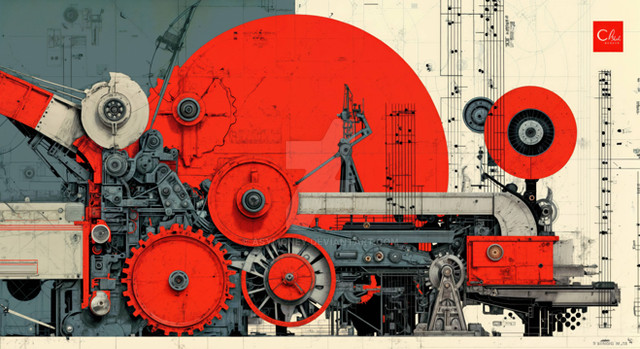
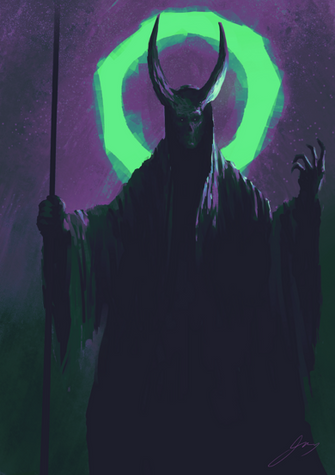
The spiritual sucessor to 'only' : [link] , I know that some people will like it because of its experimental nature and some will hate it because it doesn't really fall into the 'eye candy category'. I enjoyed making it though, and enjoyed playing around with a new style... old and musty is how I see it :}You wouldn't believe quite how much Photoshop twiddling went into making some of those shapes, at one point it looked like a giant cartoon sydney opera house and later it was some sort of medieval bird carving. The original photo was part of a knife I think, but those bendy things that look like blades were actually made out of part of the handle. Weird.
Great textures from:
=resurgere
Related content
Comments: 71

oh I love it. I wonder how you do those shapes -_-
tell me^^
👍: 0 ⏩: 0

i was having a bad today.....and for some reason it made me feel better
👍: 0 ⏩: 0

Fantastic! Very nice looking and very impressive! Its something i see on my psychedelic trips
👍: 0 ⏩: 0

I am looking for a heart that looks like the one you got here with the # and letter.
Can you help me out.
I tryed looking every where.
👍: 0 ⏩: 1

I have it already. Do you know where I can find others??
👍: 0 ⏩: 1

Nope, that was the one I used...
👍: 0 ⏩: 0

Even though you integrate it successfully, I think I would like this sans the "NEVER"
Or, if it was less directly comprehensible as a word.
The meaning assigned to that particular series of letters...one that forms out of the shapes is distracting.
This is such a strong work, I wish the word was something I did not understand so I would be able to speculate and enjoy the mystery of the letterform.
All in all not a horrible result, as I said you do integrate the text nicely, just that I think the work is so much stronger than that text element.
In a way it is reduced to an object that resembles a poster rather than a fine art work, which intended or not, I think it is.
All in all, good stuff!
👍: 0 ⏩: 0

this is amazing beyond understating..i totally admire your style ! Unreal man...unf***kreal.
👍: 0 ⏩: 0

That is in other words..... sex·y
adj.
Slang. Highly appealing or interesting; attractive: “The recruiting brochures are getting sexier” (Jack R. Wentworth).
👍: 0 ⏩: 0

lol... madness... incredible how you have managed to keep the fine lines running along each of the feather like shapes so crisp. I love the typo too man, its almost like a whisper escaping the entity with a fine trail of smoke... hard to describe, nice visualisation though. good stuff man-
Fa11.
👍: 0 ⏩: 0

whoa thats crazy, you have some skillz man, love your works.
👍: 0 ⏩: 0

when i saw the thumb, i thought it looked like muscles. love the anatomy bits poking out, little arteries and such!
👍: 0 ⏩: 0

amazing way to manipulate stocks, by the way are you rarely on msn cause i added you and havent seen you on once
👍: 0 ⏩: 1

Net connection is dodgy at home, should have our wireless router by next week which will sort things out...
👍: 0 ⏩: 1

this pieche is pretty amazing and i think it deff is eye candy indeed the one named only isnt but this one is just great
👍: 0 ⏩: 0

A nice touch on your old style but with a couple new techniques added in there?
It looks like i would go to touch it, and loose a finger as it squelched away.
Nice palette
Good job.
👍: 0 ⏩: 0

do you basicly use the pen tool to create shapes and then put textures on them? ( NOT ONLY , of course.. )
just wanna know the BASIC move you make in ps. It seems in your works that you often use the same technique.
👍: 0 ⏩: 1

Nope no pen tool work, lots of different tools, but same overall technique yes.
👍: 0 ⏩: 0

That's mindblowing. You are always full of new ideas. I like how you have abandoned the usual vividity of your ther work for this and settled for what you described as an 'old and musty' approach. Very innovative Nik. I likey
👍: 0 ⏩: 1

For some reason I think of a piano when I see it. I think it's just great, I really like the colors.
👍: 0 ⏩: 0

*drools* I think it's eyecandy worthy. Wonderful job as always. My god I love those colours together.
👍: 0 ⏩: 0
| Next =>


