HOME | DD
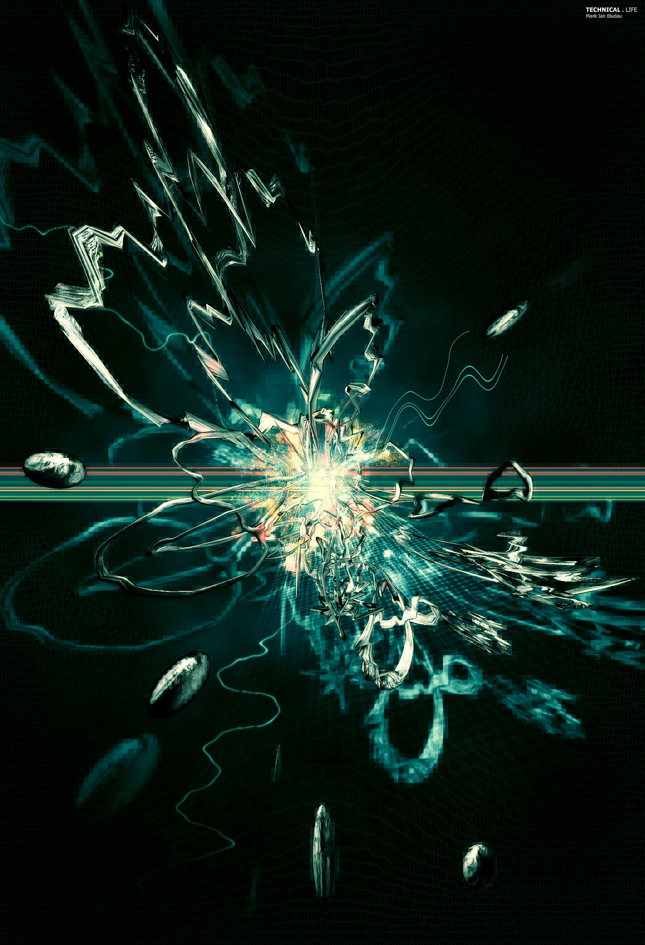
 Shinybinary —
only this and nothing more
Shinybinary —
only this and nothing more

Published: 2005-12-01 13:22:05 +0000 UTC; Views: 25530; Favourites: 856; Downloads: 6124
Redirect to original
Description
After the rather muted tones of 'never' I felt like going a bit overboard in the other direction and produce something really bright and cheerful. It's the first time in a while that I've produced something purely in Photoshop without some photo or render as a starting point (a few of the extra details around the edge were done in Illustrator though).I also wanted to make something like this for DC's Deluxe packs as the whole feel of deluxe was colourful and vibrant in my mind. It would have been a shame not to have at least one eye candy piece there :}
Related content


Comments: 197

perfect design man!! colour is just perfect!!
👍: 0 ⏩: 0


Great work, veyr nice belned truny spin shoot wave stuff
👍: 0 ⏩: 0


The colors are beautifullll! The whole image is too! 
👍: 0 ⏩: 0


crazy PS work again man, really amazing stuff
👍: 0 ⏩: 0

Further testament too your genius.
We have to collab for XXIII!!
👍: 0 ⏩: 0

")

Great as usual man, looks very trendy
👍: 0 ⏩: 0

awesome use of colours, flow and repetitions, dude
👍: 0 ⏩: 0


Im going to go out on a limb and say its not a peacock.......
i can't be the only person to get a little meaning from the title. im pretty sure its inspired by, "The raven - Edgar Allen Poe"
Quoth the raven "Nevermore" only this and nothing more
👍: 0 ⏩: 1

i mean the shape could be any bird, and i see where you're going, but when i see the colors i most certainly don't think of a black lurking raven as much as i do a bright peacock.
👍: 0 ⏩: 0

awesome, so much detail and love the coloring, look at bit like a bird
great job dood
👍: 0 ⏩: 0


you are going to an interesting place with these new images. this reminds me of ribbon candy. beautiful image!
👍: 0 ⏩: 0


Awsome. I love the refference to Poe's Raven. I was looking at it blankly and then I'm like "ohhhhh. I get it." Maybe not.
👍: 0 ⏩: 0

I love the grey colored plant work. makes the rest contrast well in color. I'm really diggin this style
👍: 0 ⏩: 0

man you could like make covers of cds for like the strokes and people. just a thought
~Spatz
👍: 0 ⏩: 0

how on earth did you make the body? It's just too good, there is no program 'alive' which can do that!!! I love the tough of photo coning of the back, and what really hits me is the sheer detail. Really amazing.
👍: 0 ⏩: 0


Nik 

 (Wink)")
Did I ever Show you 'Plunge' framed up on my wall? The frame is cheapass so I'll wait til I get a better one to show you
")
👍: 0 ⏩: 0

saw this in DC deluxeII and was simply like 'best piece in the whole pack'. definately one of my faves from you
👍: 0 ⏩: 0

it looks like a bird, i love how you used so much color, i can never use a lot of color. the black background works great. *fave
👍: 0 ⏩: 0

ok now THIS is brilliant.
The glossiness is just so sexy. The amount of detail you put into your work is amazing, I truely respect that.
However, The choice of Font in this piece is imo the wrong one. I personally would favour a Helvetica Neue, or an other straight, sans serif typo.
Leaving the backround black here, is the best you could have done. That way, it gets a very worthy and elegant look.
overall, you once again impress me, less because of the techniques ( because you are obviously using the same kind of technique all the time more or less  (Smile)")
👍: 0 ⏩: 1

I actually see Helvetica and Helvetica-a-like fonts so often I really get bored of them. They do look pretty good but are such a lazy choice.
👍: 0 ⏩: 1
yeah.. but I mean, you never find sex boring do ya? eventhough thats basically the same everytime
i guess you get my point.
👍: 0 ⏩: 1
yeah, you have boring sex!
👍: 0 ⏩: 1
shinybinary: 1 : 0 Donnie Dubson
👍: 0 ⏩: 1


I like it as is.
Looks abit like a bird to me
Nice colours and shineyeyecandyness
👍: 0 ⏩: 0

fucking amazing!
all this in PS thats just mind blowing!
great job!
👍: 0 ⏩: 0

So amazingly funky. I love stuff like this, I could look at them all day.
👍: 0 ⏩: 0

Very interesting... but maybe need bg.
Very cool anyway

👍: 0 ⏩: 0

awesome job, color is the most important thing for me and you nailed it
the black bg is perfect, it makes your colors pop like crazy
👍: 0 ⏩: 0
<= Prev |