HOME | DD
 SilverGinja —
Invocation
SilverGinja —
Invocation

Published: 2005-07-26 10:39:34 +0000 UTC; Views: 13643; Favourites: 369; Downloads: 4703
Redirect to original
Description
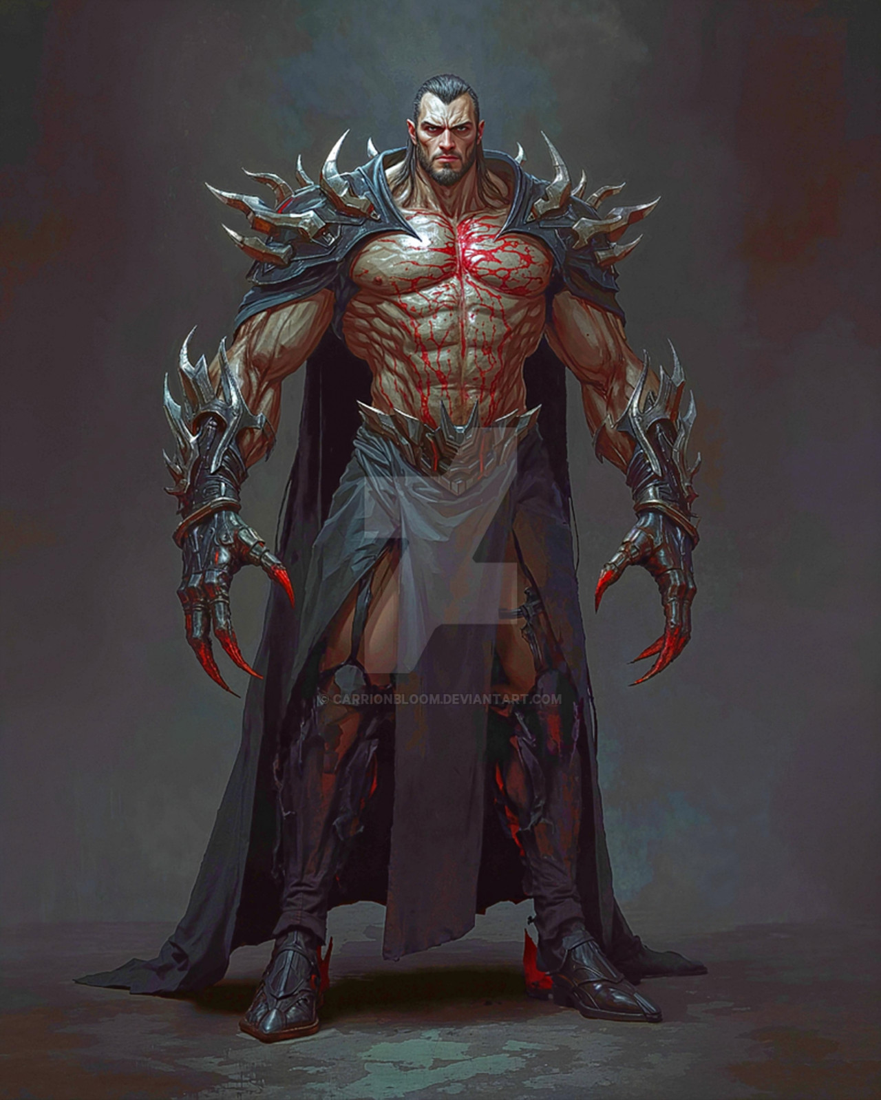
Hi all, not only is this my first deviation; this is actually my first foray into digital illustration. The piece came about just through an interest in mythological / occult imagery and while this image is laden with cliches it was a simple enough concept to experiment various techniques with.Any advise / critisism / questions would be awesome!
Related content


Comments: 113

This is a very nice piece. I really like it. Keep up the good work.
👍: 0 ⏩: 0


I like it very much...
but is that deamon summoned out of the anarchy sign?
Dunno, but punkers(Anarchy in the UK) don't deal too much with satanists...
Maybe a punkdaemon?
Anyhow, very cool!!!
👍: 0 ⏩: 1

He he , punkdaemon..... sweet
The pentagram got cut off, it was actually intentional but a few people have mentioned that now.
👍: 0 ⏩: 2
present... lol
[link]
👍: 0 ⏩: 0
still a cool pic... maybe something for next time...
")
👍: 0 ⏩: 0

so are you human oir is it just a rouge
👍: 0 ⏩: 0


")
 (Smile)")


With most of the light coming from his hand, I feel like the shadows on his other arm, his head (mainly the big, curved horn) and his abdomen should be more extreme. As they are now, he looks a bit 2d in those areas, so the shadows need to be darker.
The light trail looks a little too cloudy to me, but maybe it was meant to be cloudy. The area of his arm, right under the glowing fist looks wrong, like you used some strange effect. It doesn't look at all like it's being lit up, unless his arm is supposed to change color and become 2d when light is on it...(The same thing happened with the floor "above" the pentagram, but it doesn't seem like as much of a problem there.)
His teeth don't look like they're in a mouth. They seem to be part of his upper lip. Maybe that's intentional, but I feel like they at least need a little bit more shadow on the upper parts of them to make it seem like they're protruding from something, rather than just sitting on top.
The pillars in the background don't seem to have any light from his fist on them. I guess that's just the "camera" angle that makes the bright spots not line up with the light, but it does look a little off to me. The pillars seem to need more shadow in the cracks. I think that those different vertical sections need to be lit more differently. By that, I mean that each of those sections of the pillar would have a different amount of light on it. Right now, the ones with light on them look like they're lit almost exactly the same amount. This has the effect of making the pillars not look totally round.
Ok, now for the positive stuff. The pose looks quite good. The background is very well done. I really like the pillars, even with the problems I pointed out earlier.
I know I pointed out a lot of problems I see in this, but I do think that this is a really good start. Just learn from all the input people gave you, and I think you'll do really well. Anyway, nice work.
👍: 0 ⏩: 1
Thanks for the critique amigo, this is exactly why I joined this site; to get constructive critism on my work and in turn hopefully progress as an artist. Greatly apprieciated!
👍: 0 ⏩: 0

This is awesome work! I love the textures you used.
I love experimenting with different effects, trial and error is great fun. And it's great when a piece comes together so well, especially a first piece, like this. Well done! 
")
👍: 0 ⏩: 0

you are a very talented deviant to be able to do that on your first attmpt. good jab

👍: 0 ⏩: 0


wow. your first deviation and first attempt at digital art gets a Daily Deviation....
i love the picture too ^^ this kinda thing has always fascinated me, though I dont look into it as much as I should
you get a +fav and a +devWATCH ^^
👍: 0 ⏩: 0

Simply amazing, especially if this is your first attempt at Digital Art. *tries to make digital art and computer blows up* Ughhhhh. *adds to favorites*
👍: 0 ⏩: 0

nice 1 m8 dat pic iz gr8 and ur 1st !!!
carry on ur a top artist
👍: 0 ⏩: 0

The only criticism I can think of is the detailing around your pentagram. If that's light spilling out, chances are it won't be muted in any way by the mist. If anything, it will infuse the mist with light. You've got it falling off to a sort of dull grey on the extreme edges, but it should really be full brightness throughout. A good trick for getting a sort of filmic quality to your light rays is to create your light on a layer that's totally black, set to screen or hard light mode. Once you're happy with the position of your light streaks, apply a hue/sat adjustment, and check the "colorize" box. Push the saturation up to 100%, and move the hue slider until you get an "under colour" that you like. In this case, you'd probably want to move it around to about 170-180º (in the blue range, to match your overall hue). If you need to see it, I can set up a tutorial for you.
👍: 0 ⏩: 1
Thank you for the help man, I think I grasp the method; however if you were to set up a tutorial I'm sure it would benifit the community (well, the new artists anyhow) rather than just me!
👍: 0 ⏩: 1
Done. You can find it here . Let me know what you think.
👍: 0 ⏩: 0


this is sooooooo awsome exspecially for your first peice defanatly worth a
👍: 0 ⏩: 0
this is sooooooo awsome exspecially for your first peice defanatly worth a :+fave:
👍: 0 ⏩: 0

I really do envy your talent, skill and creativity... especially within this picture...
its a shame you got rid of the high-res picture, it would of been good to see it like that
 (Wink)")
👍: 0 ⏩: 0

That's very powerful in a spiritual sense, and even more so powerful towards imagining fantasy - very well done on your first DD to your first deviation, even more so it being your first picture!
A must have to my

👍: 0 ⏩: 0


Wow, if this your first deviation, you've got some talent. I like how the colors blend in, how the mist/smoke is just lingering, and the demo seems to be rising from a pentagram. Very, very cool.
👍: 0 ⏩: 0


This is very impressive, not only is the design, anatomy and pose of the character really good, but the digital work is awesome too! my first digital attempts looked like CRAP! they still do a bit i think... lol.
cool work, welcome to DA!
+watch
👍: 0 ⏩: 0

awesome job on a first digital art, and congratz on getting a DD on your first submission. Great!
👍: 0 ⏩: 0


Good job!
I love the way he kinda floats, and the way the light shines.
👍: 0 ⏩: 0

Thats SOOO KKOOOOOLLLL!!!!!!!!!!
I luv ur work...definately if that woz ur first!
+fav
--
Vegeta: ''I don't c wots the problem...when they appear, I'll jus' destroy them…''
Vegeta and Goku r the BEST!!!!
XD XD
(oh yeah...an' so is Vegeto and Gogeta!! Dont 4get them!!)
👍: 0 ⏩: 0


👍: 0 ⏩: 0

dude.. bein tht u made tht from scratch i take my hat off to you... this is an awesome piece of work...wish i had your talent and imagination.. im mostly into abstract.. but i made try to convert after seein this piece!!!
excellent by far one of the best... and guess what.. its gonna be a fav for me!!
excellent keep makin more!!
👍: 0 ⏩: 0


That's really well done. I put this piece up with all the brillant pieces. The demon I like, I don't think I've really seen anything like that before. Everything in the piece is very creative. Nice work.

👍: 0 ⏩: 0

Wow.. your first Deviation and its a DD rightaway?.. *respect*
👍: 0 ⏩: 0


awesome. Cant believe this is your first go at digital art
👍: 0 ⏩: 0

dang that is totally amazing!
👍: 0 ⏩: 0

your first attempt is way better than my art pieces after a year of experience. very well done, i like the spackle-looking markings on the chest and the detailed ripples on the horns. the glowing lights look really great - i've always had trouble with those.
👍: 0 ⏩: 0

| Next =>