HOME | DD
 SimonSoys — Pick a Mighty, Any Mighty

Published: 2012-07-13 22:15:51 +0000 UTC; Views: 9873; Favourites: 330; Downloads: 166
Redirect to original
Description
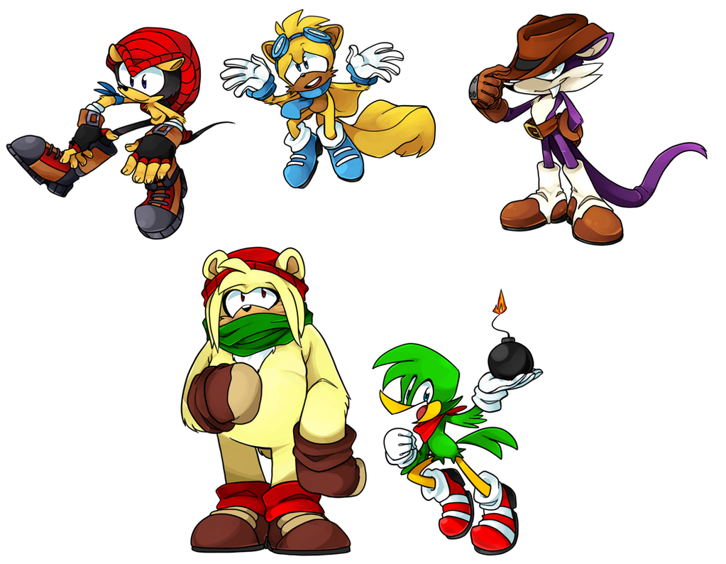
Playing around with Mighty designs, like how I did with Ray:Obviously, I'm not redesigning Mighty nearly as much as Ray, but I still wanted to change up some of the details. I was really starting to hate the version I did for Bunch of Armadillos 2 and just wanted to try something else.
1 - Original Chaotix artwork colors. Looks fugly as hell when I try to do it. I'm pretty sure the Archie comics always show him with the yellow skin and bright red shell, too, come to think of it.
2 - Previous design from Bunch of Armadillos 2. I'm really not sure what I was thinking with some of the gear I threw at him. I mean, it looks okay, but it's so totally unnecessary and wouldn't really fit a game design. And as partial as I am to that vest, it really doesn't make sense of how he gets it on. (No, I choose not to accept that his shell is removable, even if it's canon. IRL armadillos can't do that and it's creepy.)
3 - This was actually the first one I worked on, so in comparison the colors look really pale and grim. I do like the super light-blue eyes, tho'.
4 - Took a step back and tried to simplify everything, get rid of everything that wasn't necessary, and brighten up the colors. I liked this one better, but he didn't have enough "weight" to him. Definitely looks more speed than power. And the eyes are too dark.
5 - Took all of my favorite pieces from the other designs and threw them together. I think I like this one the best. Idk, my opinion towards it is not as strong as my opinion was towards the Ray design I liked the best, so maybe that's an indication that it still needs more work.
And then a bunch of eye colors that I wanted to try. I'm pretty happy with the blue, but you never know if you'll find something you like better if you don't try other options. I'll be sticking to blue, but I admit I like the bottom three and the lavender one at the top.
One day I'll stop just designing things and draw actual pictures... but not today!

Mighty the Armadillo (c) SEGA
Download for a picture you can actually see.

Related content


Comments: 59


ALL OF THEM!
But I'd pick the first one! (I like the vibrant colors)
👍: 0 ⏩: 0


 (Smile)")

Number 2 is how I see Mighty in my reboot series, love it.
👍: 0 ⏩: 0


")


Mighty is definitely one of my favorites based on his character design, ^^
👍: 0 ⏩: 0

I'm completely with you on the shell thing. Removable is creepy, no.
I also like 5 best, though 4's shoes are pretty cool too!
👍: 0 ⏩: 1

It's like when cartoon characters unzip their fur and walk around in their skin, it's just weird and unnatural and they look naked.
Thanks for the feedback! (And sorry for the late reply, been all over the place lately.) I like 4's shoes, but I'd like to see if I could make them a bit bulkier and sneaker-like.
👍: 0 ⏩: 1
THAT is the creepiest thing ever. I'm sorry, but when I was a kid and saw that in cartoons I was so uncomfortable. Like... no, it's not wacky or funny, it's just disturbing
No problem!

👍: 0 ⏩: 0

Wow, just wow. Mighty is by far my favorite SEGA character (Which is now sadly only used by Archie Sonic Comics every once in a while) I really like all the design ideas you have for Mighty, each one is fitting and does the character justice (as far as a design change goes) plus you draw him just so well!
👍: 0 ⏩: 1
Ahh thanks so much for the comment! I'm really glad you like the designs! (Though secretly I'm not that good at drawing him... his shell always gives me trouble and this here took so many tries! XD)
Lucky for us, Mighty's coming back to the comics soon! Like, November/December-ish~
👍: 0 ⏩: 1
Your welcome! (XD Don't worry I'm not that great at drawing his shell either and sometimes his ears).
Yeah? I don't keep up on the news (Upcomign anyway) of the Comics, I have subscriptions to all of them (Universe, the orignal, blah blah whatever can be subscribed to now lol) but I sure am excited now! I love Mighty!
👍: 0 ⏩: 1
Yeah, the Chaotix is getting their own SU arc where they go off to find Mighty. I'm pretty stoked! X3 (While certainly it would be nice if Mighty got his own arc to himself, I'll happily go for this, too, as long as he comes back.)
👍: 0 ⏩: 1
Thats totally awesome! I'm super excited now! (And yes Mighty getting his own Arc would be totally awesome! Hopefully they split up this arc the evenly show what the Chaotix are doing to find Mighty and between what Mighty is actually doing, I think that'd be a fair idea)
👍: 0 ⏩: 0

I think that you should draw the original Archie-SEGA mighty with your colour scheme (preferably the second one).
But yeah, looking over these, I'd say the second one is my favorite.
👍: 0 ⏩: 1
I dunno, I was never wild about the shoes being so plain (but then again I always really liked Sonic's clown SOAP shoes, so idk XD). I should give it a shot with the newer colors though.
Haha, everyone seems to like the second one so much.
👍: 0 ⏩: 0


Hmm, I should try that!
👍: 0 ⏩: 0

Honestly two seems my favorite. The jacket looks awesome also the shoes match well with his color, that dark tone gives him a nice look. :>
👍: 0 ⏩: 1
Everyone seems to like 2, I can't get over it! XD
👍: 0 ⏩: 0


I actually like number two. I started drawing Mighty with a vest after the Chaotix got their redesigns, so it speaks to me.
👍: 0 ⏩: 1
There's something about the vest that really looks good on him. XD
Hmm, maybe I'll keep the vest after all.
👍: 0 ⏩: 1


I'd pick number 5 because it's stylish, has the SEGAsonic arcade feel and looks badass. It also has a nice colour scheme and is simple.
👍: 0 ⏩: 1
Yeah, I think that's the one I'm gonna go with.
👍: 0 ⏩: 0

Mighty will now forever be Jet from Avatar because of the fourth Mighty. And it cannot be undone.
👍: 0 ⏩: 1
Hopefully without an ambiguous death scene to go along. XD
👍: 0 ⏩: 1
Ha ha. Lol at Jet death.
Even Sokka was confused about it.
👍: 0 ⏩: 0


Honestly, I like four. Though the shoes do say speed rather than strength.
👍: 0 ⏩: 1
Hm. I liked 4 too, but there was something about the shoes that didn't jive with me.
👍: 0 ⏩: 1
Give him the shoes from 5 maybe?
👍: 0 ⏩: 1
That's what I did for 5. 4 and 5 are exactly the same except for the shoes and eye color.
👍: 0 ⏩: 1
I think he still needs the piece of grass in his mouth. It fits him, for some reason.
👍: 0 ⏩: 0
| Next =>