HOME | DD
 sinthux —
Wordpress Two
sinthux —
Wordpress Two

Published: 2008-09-19 13:06:19 +0000 UTC; Views: 98465; Favourites: 693; Downloads: 3248
Redirect to original
Description
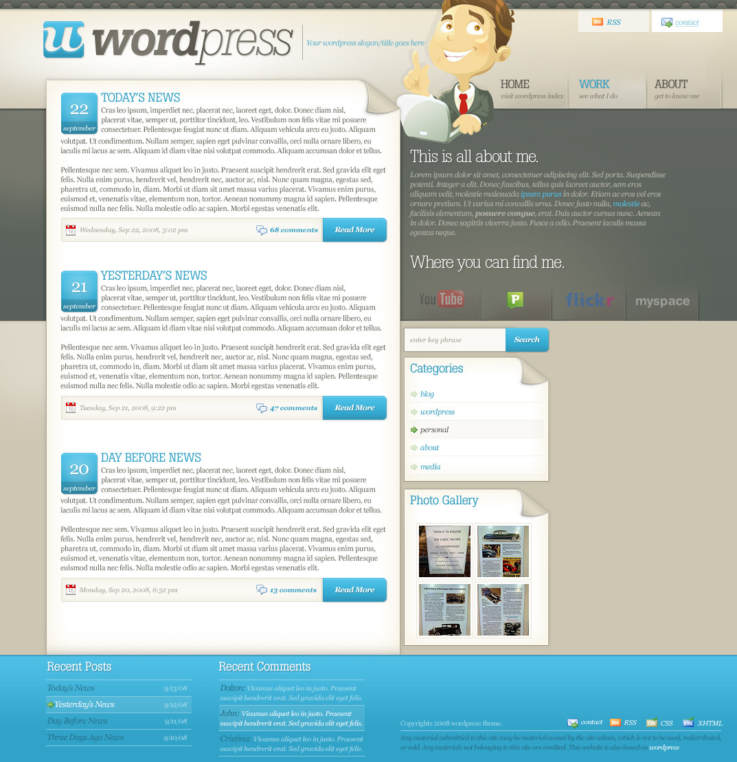
This is what I'd like to think as the sister theme of the original Wordpress theme. And to think I almost didn't upload this?
WPmonk Themes - As low as $30
*credits* stock vector not designed by me. It's from the ultimate stock vector designer (chihhang) from istockphoto. Icons from UtomBox , Bartelme , and Function .
Related content


Comments: 187

Gorgeous design. I love how the colours go together. <3
Did you design the little girlie there too? She's really cute.
👍: 0 ⏩: 1

nah, i just did a little color modification and adding really minor lineart changes
the stock is from chihhang via istockphoto
👍: 0 ⏩: 0

This is just brilliant! Amazing work and it even looks like this in real. Really, some fresh and special layout.
👍: 0 ⏩: 0

Some minor things about the live version ... if the viewer clicks on 'Enter search text here' the viewer would expect that the text disappears, now the viewer must first select it and remove it before he/she can type something.
Also the CSS doesn't render as it supposed to be (I'm using Firefox 3.0.2): [link]
The dates don't show (they are there, but it's white text on white background), and notice the 'View more' on the right side of 'Latest twitters'.
The attention of the user viewing it is drawn to the right things: About Me, the title, and the blog entries ... the choice to put the bar/menu on the right side really helps, else the viewers attention would on that (relatively unimportant) part ... same goes for the colors, they draw the attention to the right things.
The mouseover effects are awesome, it's not exaggerated and feels natural.
The tabs are also very neat and they safe a lot of room. It's clear for the user what is shown (other wordpress themes I've seen just put everything under each other making it one big list, which isn't very clarifying for the viewer).
Everything looks really nice and clean ... it makes me want to use WordPress
")
👍: 0 ⏩: 1
the text select was fixed on the final version [link]
as for the flash text, it seems like a problem on Firefox's support for sIFR.. which should be fixed. i'm using FF3 atm and don't have any problems with the sIFR (flash text) as explained, so i would imagine they'll make it viewable with another update as it is with FF3.
thanks for all the really helpful and complimenting comments! it's always nice to get a detailed comment of everything the user thinks i did right
👍: 0 ⏩: 1
Nice!
Well, I'm running Firefox 3 under Ubuntu 8.04 (linux distro), and sometimes the flash objects just don't show (restarting Firefox helps) ... so it's probably something only I experience.
Ok, this is weird .... when I clicked your link (opening in a new tab) everything rendered the way it should, then I went back to dA, and then back to the newly opened tab again but then it showed the page like in the image. I think I'm going to reinstall the Flash plugin, this is not the way it should work
I like to get those kind of comments myself, so I try to give them too. [link] helped me a bit
👍: 0 ⏩: 0

What can I say? this is seriously an amazing theme. I really like what you did with it!
Can anyone use this theme? : )
👍: 0 ⏩: 1
it's for sale $2,000 (not free use)
👍: 0 ⏩: 1
 (Smile)")

 (Wink)")


beautiful, you totally deserve a DD
I like the fresh blue color

👍: 0 ⏩: 1


nice work ")
👍: 0 ⏩: 0

Really awesome, and seeing it actually working gives you a big extra.
👍: 0 ⏩: 0

I can't help but agree. That's what happened last time. Well it was fun so it was alright. Plus the line moved pretty quickly.
👍: 0 ⏩: 1


this is AWESOME!!! OMG!!! o.o
👍: 0 ⏩: 0

eh, you should release this as a free theme, people would LOVE you
M
👍: 0 ⏩: 0


WoW!!!
Its really nice!
I liked
bye bye dude.

👍: 0 ⏩: 0


nice work love the coded version
👍: 0 ⏩: 0

Totally Awesome, i love the colors !!, the desing & the rollovers.
Awesome Awesome !!!
👍: 0 ⏩: 0


Holy cracker. That's an awesome lame. Mine's kind of shit the only original thing I did was to change the header: [link]
👍: 0 ⏩: 1


Wow, I've never +favved a design here before, but this is so beautiful and inspiring I couldn't not do so. I'm interested in this "profession", too, I hope one day I can reach your level!
👍: 0 ⏩: 1
for sure 
👍: 0 ⏩: 0

This is awesome man, I can't say much since it's nearly perfect... But I do think, if you had the pages section toward the bottom like 50px less wide then the other content container... it would be mighty fine.
👍: 0 ⏩: 0


<= Prev | | Next =>