HOME | DD
 sparkpenguin — RV: Fen
Published: 2007-07-25 08:44:51 +0000 UTC; Views: 3786; Favourites: 85; Downloads: 54
Redirect to original
Description
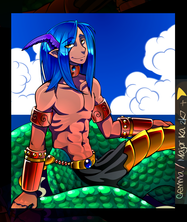
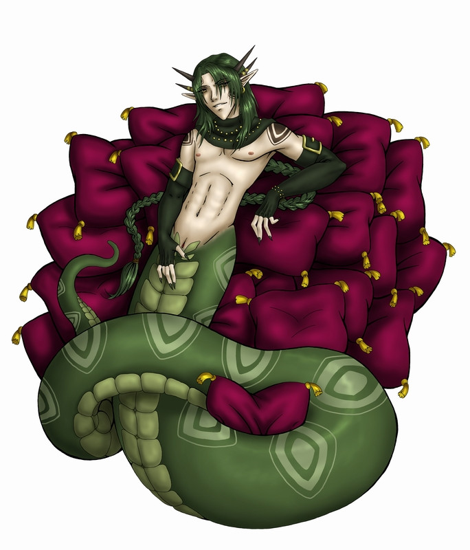
PEOPLE OF EARTH: SHHHH.i'd asked the abundantly well-known !snapesnogger in a note if i could color this then-new drawing of one of her lesser seen (trust me- i looked) characters from her project, Red Venom. so i pretty much guessed on everything except his hair/scales/horns which i was lucky enough to find a ref. his backstory is there. kinda.
i did take several liberties i'm sure i could've asked her about, but what the hell since she's a busy lady and all: - you can't go wrong with yellow eyes.
- polished bronze is more beautiful than gold and silver put together, also a more practical material as far as armor goes. (and it is fuckin FUN to SHADE). the old ref i used had hide armguards but the ones in this drawing were metal, and, screw gold.
- i don't specifically remember seeing a beach, but no one likes a pasty naga. also i liked the pinup-worthyness of the lineart.
- what was a jewel and what was just a stud? no clue, made due.
TECH:
when i fanart some famous whacko from japan i've never met or gotten permission from i tend to y'know... SWEAR AGAINST TRACING THEIR FUCKING MANGA SCANS AND CALLING IT 'VECTOR ANIME ART" LIKE SO MANY FOLKS I KNOW DO not naming any names... but in Fen's case, since i had only asked to "color" a specific image in question, i decided not to deviate from Gem's lineart at all. down to how i shaded it. and yes, it was tempting to re-do his entire face (not for it not being good already, but just, into my style.) but this isn't fanart. this is someone else's art colored and i didn't really ask if i could hack it up apart from that. i didn't even license it myself since it technically isn't my art, i just made it look colorful.
LINEART:
COLORTRACE:
shut up.
PS hopefully my internet will be working tomorrow and i respond to the comments/shrieks/rocks.
Related content


Comments: 93


thank you very much. :>
👍: 0 ⏩: 0

oo wow...thats SO fekin good! he seems like a nice a guy Great colouring RULERZ-OF-ARTZ!
👍: 0 ⏩: 1
lol thanks, and thank snog for lettin me color it
👍: 0 ⏩: 0

Ohhh do I remember this image from FA! Once again beautiful and his story makes me sad ;.;. I love the hair, his abs, his scales...everything! Your vector works always....thrills me
👍: 0 ⏩: 0

Splendidly colored. You're really good with this stuff.
👍: 0 ⏩: 1
thanks meng
i don't fanart without a kickback but my coloring jobs are always gratis.
👍: 0 ⏩: 0


thanks! i didn't redraw it though, just inked it with vector and colored ")
👍: 0 ⏩: 0

God, that is just so beautiful. Fen is my favorite character in her series. I wish he wasn't killed off. ;_;
👍: 0 ⏩: 1
eh, i'm glad he is. it's a bold move, on the writer's part
he's not my fave though.. i'd've preferred to do kave but i couldn't find any awesome uncolored art of him. so i might have to completely draw him MYSELF, and that's just way more work than coloring something of hers for fun
glad ya dug it!
👍: 0 ⏩: 1
I see. Well, Kave's pretty awesome too, just a little scary sometimes. >.>;; But when he's calm he's pretty good-looking. Like Fen. ")
👍: 0 ⏩: 1
i like the scary! happy bishies are all good and well, but i likes me the mean manly badasses.
rofl this conversation is pretty much persuading me to actually DO a fanart of him
👍: 0 ⏩: 1
XD Then you should, because people like us would like it xD
👍: 0 ⏩: 1
that'd be too much work to spend on a fanart though
👍: 0 ⏩: 1
True, true. I'm a FanArtist though, so I do a lot of it. 
👍: 0 ⏩: 1
i only use one, and i swear by it: Paint Shop Pro. and it's available for free.
... Photoshop is the devil.
👍: 0 ⏩: 1
I use photoshop right now. o_o I have PSP 9, however. I bow to your superiority.
👍: 0 ⏩: 1
dude get good with PSP... trust me.
it's the mack-daddier program of the two. it's just less popular because well, i guess that's how it worked out
👍: 0 ⏩: 1
Yeah, I'm gonna practice. 
👍: 0 ⏩: 1
hey anything you need to know just ask.
👍: 0 ⏩: 1
Thanks. I recently got PSP9 on my laptop, so I'm all set, really.
👍: 0 ⏩: 0

BaJesus! This just rules man, great job. I love the coloring so much, as I've told you so many times how much I love and envy your coloring skills, just like you love mine, haha. Grass is always greener and all that shit.
I LOVE THE RED UNDERTONES ON HIS SKIN! *hugs* And Snapesnogger kicks butt so I was wondering how you're styles would go together but it's perfect. The scales are awesome too, my only issue is that they don't show a lot of gradation, as much as a scale can hold i suppose. Not meaning to give critisim. >.< I can't remember if it's you or Jahi-chan that hates critics. *tapping chin*
SPAAARTAAA!! And you're right. BRONZE RULES SCREW GOLD AND SILVER
👍: 0 ⏩: 1
i don't mind crit, it just usually comes in a way that i can't use or appreciate it; like when people critique on style issues or personal discretions i take on an image (like the "i would've made it blue instead" or "you use really heavy line weights, you should tone that down cuz it overpowers the picture" kinda shit). in this instance, i honestly gotta say, those scales can eat me out. they took way too long. they're all right if you don't stare at em directly-- they're just kind of adding a little depth to the texture department.
thanks for liking it
i TOTALLY WOULD'VE GONE WITH BISMUTH INSTEAD OF BRONZE but that would've taken way too long. ")
👍: 0 ⏩: 1
I dunno. People who make arm guards out of that shit?
I hate people like that! People who think that they're critics when they're just speaking from personal tastes. >.< It's evil. Like, I use a lot of blue undertones on my skin tones, I think it makes it prettier, and one time someone actually said to me that they would have used red. RED. I mean, c'mon, for someone who is ORANGE red would have made it look funny, purple or blue is perfect. Oops, rambling, haha.
👍: 0 ⏩: 1
when you think about how shadows on human skin in the sunlight are BLUE, makes a little more sense huh? red on orange would've made her look like she was made of velvet. the light principles are all wrong! you SHADE WITH THE OPPOSITE COLOR. some imbeciles.
👍: 0 ⏩: 1
I know, haha. Then again it helped that I know what I'm doing when it comes to shading in Demon now, since I've been obsessing over her. Good luck coloring her. wait till you see Techie, you'll have an orgasm. She's the 'cute' one of the Outcasts... She has a mechanical arm!
👍: 0 ⏩: 0

Ouh bronze lurvelyness OwO *drinks it with her EYES* i love the contrast of the deep blue jewels ^w^ *looks at the scales and gets a eyetwitch, then sees metallicness and has a cieser* i wish i had your patience & talent


👍: 0 ⏩: 1
so do i. wish i had pateince and talent that is. i don't. only sometimes. i rent it, see. hourly. so... usually i'm without it (unless i got paid that week).
dude i wanted so bad to do my favorite metal ever (bismuth) but on top of it being not-that-strong it probably would've driven me nuts shading it. THE RAINBOWS! THE RAAAAINBOOOOOWS
the bronze was definitely a payoff though, i love it and i'm SO happy everyone else thinks it looks good!
👍: 0 ⏩: 0

Most of what I can say here is simply "what."
Spanky colors though.
👍: 0 ⏩: 1
i asked myself 'what' and 'why' and other question words all through the production of this. and really,
it only got me a lot of commentless favs. but it looks nice on my page anyway.
👍: 0 ⏩: 0

your colours here are unusual for you...very bright and cheery. I like it lots...for some reason it reminds me of video game days gone by...when people weren't afraid to come out of the dungeon.
👍: 0 ⏩: 1
i know. everything's got a blue/grey overlay nowadays. i'm also guilty. but i've trying to work much warmer lately.
i'm glad you liked it!
👍: 0 ⏩: 1
lol....maybe as you age your art will become even more warmer.
👍: 0 ⏩: 0

Your coloring always amazes me! I love how shiny everything always looks, especially in his hair and on the metal bits. I've always wondered how folks pull off that effect on metal. *takes notes* The skin has a very nice blend of colors as well, and I like how you did the scales. The ocean and fluffy clouds in the background fit perfectly. Very nice!
👍: 0 ⏩: 0

thanks, i kept hoping as i added more they'd look less inconsistent than they did at first.
👍: 0 ⏩: 1

lol, no , its really nice effect -even if you did stumble upon it by accident lol!
👍: 0 ⏩: 0

i know i know! i needed my stunna shadez the whole time i was coloring it!
👍: 0 ⏩: 0

honestly it reminded me of the odyssey with all the different gods and creatures and this guy might be someone mischievous (cuz of the look i guess) plus the sea and clouds in the background fit the greek landscape as well....well done
👍: 0 ⏩: 1
it totally wasn't her kinda atmosphere but that is still SO TOTALLY what i was going for.
thanks!
👍: 0 ⏩: 0

Daaaamn. Nice coloring. I love that polished bronze look. And the scales.
👍: 0 ⏩: 1
thanks, the scales were a bitch. i'm still 100% satisfied with them.
👍: 0 ⏩: 0

sweeeet i love snapsnoggers shit its good as and ur colouring is awsome i like the mix very cool looking the colours are sooo vibrant. i like it how his body has that red light on it,
👍: 0 ⏩: 1
yeah, the overlay kinda did that. i was polite enough to let there "be" a mix, and not just completely redraw the picture in my style/proportions. i like the duality of it.
👍: 0 ⏩: 0

 (Smile)")
yeah they weren't part of her sketch but i thought it looked empty without em.
👍: 0 ⏩: 1
| Next =>