HOME | DD
 spud100 — Matte CSS
by-nc-nd
spud100 — Matte CSS
by-nc-nd
Published: 2008-10-20 05:22:46 +0000 UTC; Views: 3828; Favourites: 38; Downloads: 229
Redirect to original
Description
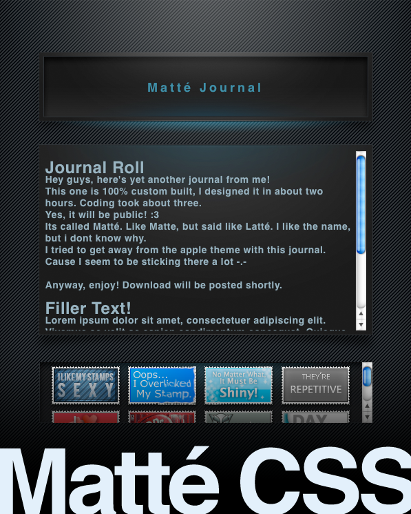
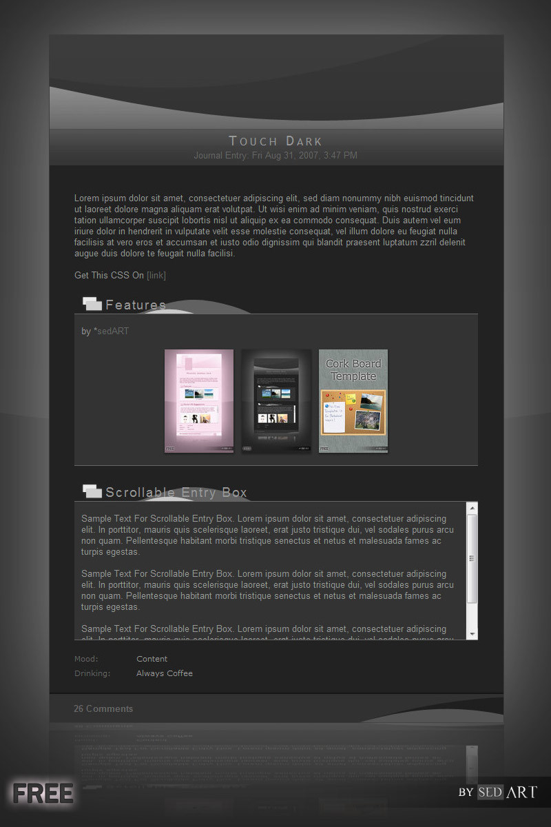
Hey guys, here's yet another journal from me!This one is 100% custom built, I designed it in about two hours. Coding took about three.
Yes, its public! :3
Its called Matté. Like Matte, but said like Latté. I like the name, but i dont know why.
I tried to get away from the apple theme with this journal. Cause I seem to be sticking there a lot -.-
Anyway, enjoy!
Live preview: [link]
dA doesnt allow the character é in its titles. >:C
Related content


Comments: 22

Hey thank you man! +Fav from me! I will be using this
I changed it up a bit too!
👍: 0 ⏩: 0

I love this.. Can you make a matching gallery css for it?
👍: 0 ⏩: 0

Hi.
I'm using modified version of that skin here [link]
Though I fucked up somewhere, since I don't know CSS, and the comment text is too low.
Could you help me on that?
👍: 0 ⏩: 1

Hm. Look for the .journalbottom tag in the CSS, and find padding-top. And make that amount a little lower. I havent worked with this CSS in a while, but I assume thatll fix it. Itll probably take some tinkering with values.
👍: 0 ⏩: 1
Turns out I had to change margin-top, as there is no padding-top.
But thanks for the help.
Could I post this CSS for other deviants to use, off course crediting you as the creator of the original?
👍: 0 ⏩: 1
Well im glad you got it.
I guess you can, although its only a color change really.
👍: 0 ⏩: 1

awesome work !! clean neat and I looove the scrollbar
 (Wink)")
👍: 0 ⏩: 1


Nice job! The blue highlights work excellently, and the drop shadows are subtle enough not to look silly. Have you thought about trying other colours?
👍: 0 ⏩: 1
Thank you! No actually I havent thought about other colors. Yet I may look into it, I think it may look great with some reds and oranges. Thanks for the suggestion
👍: 0 ⏩: 1
They'd look excellent! If you go with your bright colours, I don't think you can go wrong.
")
👍: 0 ⏩: 0

It looks really cool and i think i'm gonna use it but i would like to set the font smaller, how can i do that?
👍: 0 ⏩: 1
Which font would you like to make smaller? If you want the main font, I think in the CSS under "p {", change where it says font-size to what you want it to be.
👍: 0 ⏩: 1