HOME | DD
 Squiddosnazz — Rain
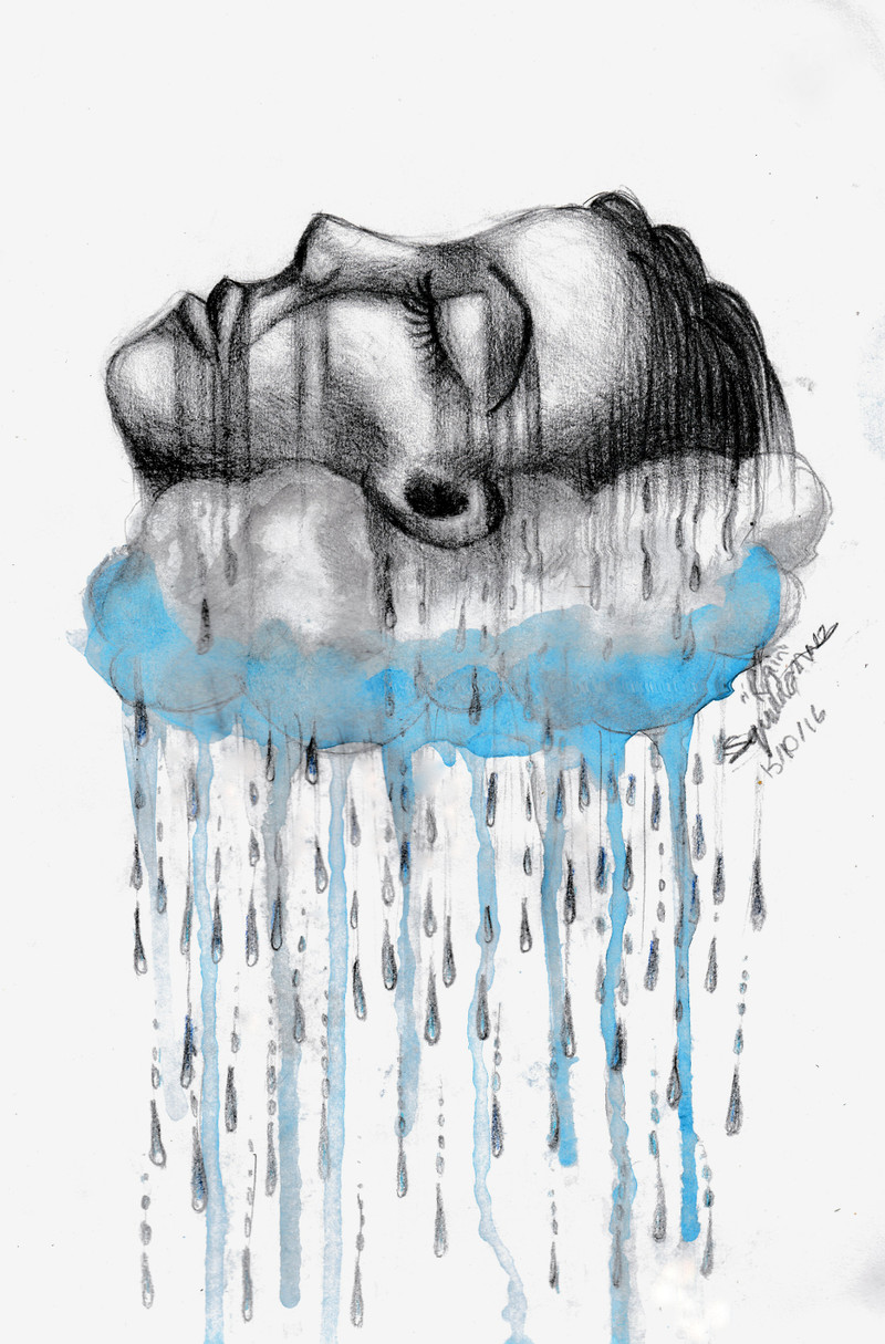
#cloud #goddess #pencil #rain #watercolour
Published: 2016-10-15 05:39:48 +0000 UTC; Views: 309; Favourites: 13; Downloads: 0
Redirect to original
Description
I've been working on this all week, so I hope you like it.Mediums:
B graphite pencil
Ultramarine and Kingfisher Blue coloured pencils
Watercolour paints
You can see a progress layout for this on my patreon at www.patreon.com/squiddosnazz
Related content


Comments: 11

I see you alredy got a comment about propotions, but here is a litle guide I find helpfull;
fav.me/d458bx9
I like this peice, it's very serene and calming, and you managed to give it a sense of softness. Good work!
👍: 0 ⏩: 1

Thank you for an excellent resource! I've read it and I learned a lot from it. Now I'm onto reading they're other tutorials
 (Smile)")
👍: 0 ⏩: 1

I love the idea you're working with, just a purely emotional piece. The upturned face looks like it might be surfacing for air or just trying to rise above depression. The bleeding shadows moving into the cloud are also a nice touch. I think a darker, muddier blue would have worked a bit better, especially along the bottom of the cloud as shading and the contours of the face aren't quite right. A bit more observation and trial would fix that. The two things that stick out are the line running along the cheek to the mouth. It's heavy, and the angle at the mouth is off. The other thing is the ear, which is too far up the face. The ear would also line up with the corner of the mouth (earlobe) and the brow (top of the ear). Keep getting better, keep learning. You have a lot of creativity and vision in your work, and you clearly put a lot of effort into it.
ProjectComment
👍: 0 ⏩: 1
Thank you for your critique! I agree with your view on the face proportions - I don't often use references, so my proportions need some work. I actually like the blue as it is- it was supposed to be more of a serene emotion. If there's anything you think I should do to reinforce this, please let me know!
Thank you again for your comment!
👍: 0 ⏩: 1
There's a lot of material online and in books covering how all the different parts of the face line up and finding those little tricks, like with the ear lining up with the lips/brow is always helpful. As for my misinterpretation, I'll start by saying that to a degree people are always going to see different things no matter what, and that's not necessarily a bad thing. It means they're connecting to your work on their own level. Still, aside from me being just a little dower, there are a couple of details that keyed me into "sad" over "serene." The streaks were one, though I can't say I would change them, and the other would probably be the dark, heavy graphite lines and shadows. Softer details (through blending or dabbing with kneaded rubber, using H pencils, etc) on the face might make the face look more at ease, and maybe a slight smile (the line that marks the top of the upper lip appears to curve down). This might be more of a stretch but the addition of "happy" colors like pinks or yellows in the background might add a different layer to the mood, though they could also take away from the one that you were working toward. I hope that makes sense. The fact is, the line between "sad" and "serene" is actually very fine, and the commenter above seemed to pick up on what I didn't, so you don't have to worry overmuch as long as you're happy with the result
👍: 0 ⏩: 1
I actually really like the way people see my art differently, I find it really interesting. But I will check out some online material on face structure next time, so thanks
")
👍: 0 ⏩: 0

While rain can be a very gloomy thing, it can be one of the beautiful things nature can do in the physical world. The title really shows the theme of rain and gives the piece more energy to seep into the psyche. Every detail within this makes the atmosphere of rain more grainy yet magnificent at the same time. The graphite pencil has the look like its being washed down with the dark streak-lines on the lady's face. The feeling of wetness is amplified with the splashy use of watercolor seeping downward. And the minuscule use of only one color show the duality of dark and serene. In short form, you did a beautiful job in making this piece.
ProjectComment
👍: 0 ⏩: 1
Thank you so much! That's pretty much everything i was trying to get across, so it's nice to know it worked!
👍: 0 ⏩: 0

Wow. I love this piece... There is so much emotion evoked from the streaming, well, everything. I don't know if that was your intent, but I find it very fitting. I love how the grays and blues look side by side. Just, the composition of everything just make you want to stop and think about the details of everything. I really love this. ^^
👍: 0 ⏩: 1