HOME | DD

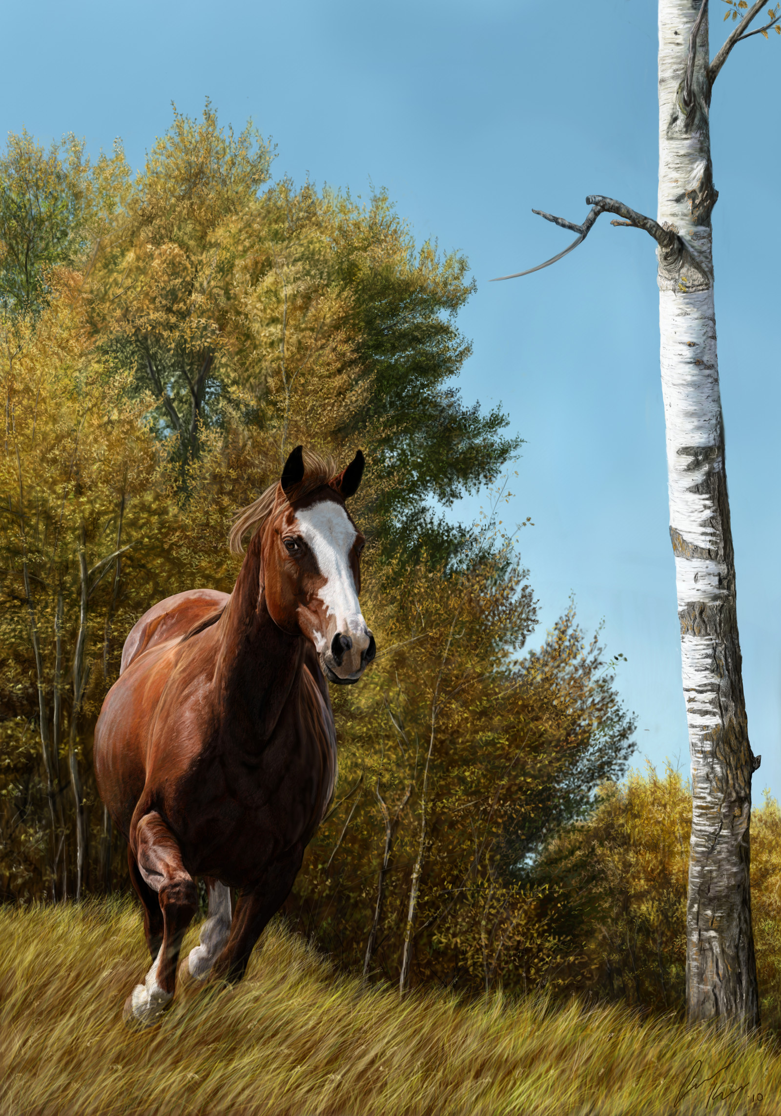
sunwolf29 — Bay Overo

Published: 2010-01-10 01:01:19 +0000 UTC; Views: 4558; Favourites: 194; Downloads: 0
Redirect to original
Description This is fun working without a reference. Yeah I know I have a problem with too much contrast but eh, Its fun lol.

I have to thank everyone for the anatomy corrections - they were just great! I am debating keeping the paint markings, i love paint horses and its hard to spend time on a random drawing and not put them in lol.
Related content
Comments: 98

Maddolito [2010-07-11 15:02:19 +0000 UTC]

can you please give a suggestion of a good brown colour to a horse? This one is really nice

👍: 0 ⏩: 0

Horsesnhurricanes [2010-04-12 20:49:14 +0000 UTC]

GAH! The details are simply unbelievable! You got a lot of talent. :3

👍: 0 ⏩: 1

sunwolf29 In reply to Horsesnhurricanes [2010-06-01 02:48:56 +0000 UTC]

Thank you so much!

👍: 0 ⏩: 0

TomWilcox [2010-01-31 07:02:04 +0000 UTC]

Amazing!

👍: 0 ⏩: 1

sunwolf29 In reply to TomWilcox [2010-01-31 21:16:08 +0000 UTC]

Thanks!

👍: 0 ⏩: 1

TomWilcox In reply to sunwolf29 [2010-01-31 22:28:06 +0000 UTC]

Always a pleasure!

👍: 0 ⏩: 1

TheCreativeJenn In reply to TomWilcox [2010-02-01 14:02:48 +0000 UTC]

.. And another pleasure. but your spirit is soaring like the flight of a determined eagle.

👍: 0 ⏩: 1

TomWilcox In reply to TheCreativeJenn [2010-02-01 17:43:03 +0000 UTC]

👍: 0 ⏩: 0

arionquill [2010-01-25 01:27:54 +0000 UTC]

You can really feel the horse's power and speed in this painting - and you did this WITHOUT a reference?

👍: 0 ⏩: 1

sunwolf29 In reply to arionquill [2010-01-31 21:10:18 +0000 UTC]

yeah no reference, but 30 years of practice lol. Thanks!

👍: 0 ⏩: 1

arionquill In reply to sunwolf29 [2010-01-31 21:28:20 +0000 UTC]

I guess that'll do it then

👍: 0 ⏩: 0

Starstallion [2010-01-23 05:23:55 +0000 UTC]

Mmmm detail

👍: 0 ⏩: 1

sunwolf29 In reply to Starstallion [2010-01-31 21:06:18 +0000 UTC]

LOL, Thanks!

👍: 0 ⏩: 0

casca-x [2010-01-20 05:14:51 +0000 UTC]

Too much contrast my foot!

That's what artistic license is for, am I right? Accentuating the parts of your subject beyond reality to portray a certain 'feel' is what separates a work of art from a copy of a photo

I also love the muted swirls of greyish green you used in the background The slight green tint really brings out that delicious rich red in his coat!

👍: 0 ⏩: 1

sunwolf29 In reply to casca-x [2010-01-31 21:06:09 +0000 UTC]

Thank you so much for your kind words!

👍: 0 ⏩: 0

Eviecats [2010-01-19 15:32:03 +0000 UTC]

Your work never fails to remind me satin Beautiful as always!

👍: 0 ⏩: 1

sunwolf29 In reply to Eviecats [2010-01-31 21:05:53 +0000 UTC]

Thank you so much!

👍: 0 ⏩: 0

winaty [2010-01-19 12:08:52 +0000 UTC]

Wow great!! i like him!
good work

👍: 0 ⏩: 1

sunwolf29 In reply to winaty [2010-01-31 21:05:46 +0000 UTC]

Thanks!

👍: 0 ⏩: 0

IviiK [2010-01-16 19:59:53 +0000 UTC]

Amazing

👍: 0 ⏩: 1

sunwolf29 In reply to IviiK [2010-01-31 21:01:44 +0000 UTC]

Thanks!

👍: 0 ⏩: 0

AmandaDrage [2010-01-16 18:11:56 +0000 UTC]

I just love all the detail - even working without ref, you're so thorough with everything. You have a great basis of understanding. Um I'm really not feeling very good with my sentence structure tonight but I hope you know what I mean. Something to aspire to, at any rate!
I don't think the contrast/highlights are a problem, it's like they add another layer of interest... kind of a fantasy-reality effect. And it's always nice to see such attention to detail. Also I vote keep the paint markings!!

👍: 0 ⏩: 1

sunwolf29 In reply to AmandaDrage [2010-01-31 21:01:39 +0000 UTC]

Thank so much for the kind words and the help! I have no problem understanding your sentence structure - it is right in line with mine most of the time lol.

👍: 0 ⏩: 0

EternalHourglass [2010-01-16 02:30:43 +0000 UTC]

It's not normal for people to be that good. O.O

👍: 0 ⏩: 2

sunwolf29 In reply to EternalHourglass [2010-01-31 21:00:23 +0000 UTC]

LOL, Thanks.

👍: 0 ⏩: 0

WickerWolfArt In reply to EternalHourglass [2010-01-16 03:28:23 +0000 UTC]

I know right, so not fair! This is fantastic btw, more than fantastic, may have to event a new word for this one . . .

👍: 0 ⏩: 0

Dioptasy [2010-01-15 23:39:55 +0000 UTC]

It's so realistic! Don't worry, I'm a big fan of contrast too!! ^^

👍: 0 ⏩: 1

sunwolf29 In reply to Dioptasy [2010-01-31 21:00:06 +0000 UTC]

Thanks

👍: 0 ⏩: 0

Undefined-style [2010-01-15 22:03:37 +0000 UTC]

It's fantastic! Without reference is not possible. Great, I can't say something differnent...

👍: 0 ⏩: 1

sunwolf29 In reply to Undefined-style [2010-01-31 21:00:00 +0000 UTC]

Thank you so much!

👍: 0 ⏩: 0

hennap [2010-01-15 21:50:24 +0000 UTC]

It came out gorgeous and I do like the contrast. Can't wait to see more

👍: 0 ⏩: 1

sunwolf29 In reply to hennap [2010-01-31 20:59:48 +0000 UTC]

Thanks!

👍: 0 ⏩: 1

hennap In reply to sunwolf29 [2010-02-01 18:25:16 +0000 UTC]

You are welcome

👍: 0 ⏩: 0

TrustLoveFaith [2010-01-15 15:41:32 +0000 UTC]

I despise you! because your soo good at this stuff!! *I was just kidding about the whole despising thing* I actually admire you

👍: 0 ⏩: 1

sunwolf29 In reply to TrustLoveFaith [2010-01-15 20:13:18 +0000 UTC]

LOL, Thanks so much!

👍: 0 ⏩: 0

Shinymane1 [2010-01-15 14:04:36 +0000 UTC]

Absolutely stunning. How long did this take you?

👍: 0 ⏩: 1

sunwolf29 In reply to Shinymane1 [2010-01-15 20:13:37 +0000 UTC]

About 10ish hours I think, I was just playing around with it.

Thanks!

👍: 0 ⏩: 1

Shinymane1 In reply to sunwolf29 [2010-01-15 21:48:44 +0000 UTC]

Wow I thought it would have taken a lot longer lol.

👍: 0 ⏩: 0

WhiteSpiritWolf [2010-01-15 12:26:58 +0000 UTC]

great pose...and beautiful coloring

👍: 0 ⏩: 1

sunwolf29 In reply to WhiteSpiritWolf [2010-01-15 20:13:42 +0000 UTC]

Thanks!

👍: 0 ⏩: 0

Silharai [2010-01-15 12:23:34 +0000 UTC]

You are amazing. Never ceases to thrill the crap out of me and my friends. We are always eager to see your work.

👍: 0 ⏩: 1

sunwolf29 In reply to Silharai [2010-01-15 20:14:01 +0000 UTC]

Thank you so much! I can say the same about you.

👍: 0 ⏩: 1

Silharai In reply to sunwolf29 [2010-01-15 21:01:58 +0000 UTC]

I'm not really that good! But I'm getting better! Thanks!

👍: 0 ⏩: 0

zapxfire1 [2010-01-15 12:23:03 +0000 UTC]

I'm not to keen on the background right now but the horse is amzing!

I love how you pay so much attention to detail that you work always looks better than a photo. If I were you, i'd keep the markings. they kind of make the horse stand out more.

👍: 0 ⏩: 1

sunwolf29 In reply to zapxfire1 [2010-01-15 20:14:31 +0000 UTC]

I did slap the background on there, and it shows lol.

Thank you so much for the advice and kind words!

👍: 0 ⏩: 1

zapxfire1 In reply to sunwolf29 [2010-01-15 20:58:24 +0000 UTC]

you're welcome

👍: 0 ⏩: 0

Fates-Broken-Wings [2010-01-15 05:59:06 +0000 UTC]

Absolutely breathtaking.

Your attention to detail just blows me away. You don't forget a thing! From the tightest wrinkles to the smallest little veins, you've got it all covered. And that muscular definition is lovely.

You never cease to amaze me. Gorgeous work!

👍: 0 ⏩: 1

sunwolf29 In reply to Fates-Broken-Wings [2010-01-15 20:14:55 +0000 UTC]

Thank you so much!

👍: 0 ⏩: 0

kaiter [2010-01-15 05:44:03 +0000 UTC]

Your work ALWAYS amazes me. Like... wow.

👍: 0 ⏩: 1

sunwolf29 In reply to kaiter [2010-01-15 20:15:01 +0000 UTC]

Thank you so much!

👍: 0 ⏩: 1


| Next =>