HOME | DD
 superkev — Landscape of Denial

Published: 2003-08-24 15:34:25 +0000 UTC; Views: 1049; Favourites: 21; Downloads: 333
Redirect to original
Description
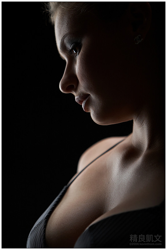
I thought about this one for a long time. Black and white or color? The color is rich and sensuous, but the black and white conveyed the emotion and bodyscape feeling more effectively. So, here it is. The model is, of course, ^hesitation .Related content


Comments: 33


I cant believe how sensual this is even though it is a small part of the body and looks so simple. amazing
👍: 0 ⏩: 0

To me this is a very strong piece. (I... just...)
It screams uncomfortableness... the unknown... (don't want to hear it)
Turning away from you, the truth, turned to stone
Said something that I just don't want to know about...
I love the texture in the skin, this piece just comes to life with that, I can almost see her breathing.
Those lips...
And the little crease in the skin where her head is turning is very touching...
Great piece.
👍: 0 ⏩: 0

Another beautiful form shot. The black and white goes well with the outlines of her face and shoulder.
👍: 0 ⏩: 0

")

Very good! :claps: Black and white is definently the key to this picture. Good work. 
👍: 0 ⏩: 0

wow, absolutely gorgeous! i love the black and white.
she looks like marble.
👍: 0 ⏩: 0

that is very cool. hoorah for black and white. such smoooooooothness.
.dot
👍: 0 ⏩: 0


wow. your skill with ... well, exposure and levels in the black/white area stuns me each time. perfect white skin, like ... pearls, and strong black. i love the contrast - the black makes her look all the more delicate.

👍: 0 ⏩: 0

I haven't seen the color, but this one kinda freaks me out.
The shoulder area looks a bit washed out - to the point where it reminds me of that movie "Powder"
👍: 0 ⏩: 0

Beautiful use of negative space. Nicely composed. There really isn't anything I could suggest to make it better in my eyes, so, bravo!
👍: 0 ⏩: 0

Wow! I love the simplicity and how you've brought out the skin's texture.
👍: 0 ⏩: 0


i'm not a big fan of this one. this is rare enough to mention
 (Wink)")
👍: 0 ⏩: 0

I guess with out the colour to distract it brings out the texture and lines better. Good stuff.
👍: 0 ⏩: 0

Love it kev. Where the black meets the white... gorgeous.
-John
👍: 0 ⏩: 0

Black & White is definitely the way to go with this. The contrast and lack of color makes the view focus on the lines between them, which is quite cool. Following the curves down her face and then to her shoulder is very interesting.
Nice work on this, though you have an advantage with ^hesitation as your constant model.
👍: 0 ⏩: 0

another capture of a beautiful female form... bw works  (Smile)")
👍: 0 ⏩: 0

this is fantastic 

👍: 0 ⏩: 0

this really played a neat trick on my eyes when i first viewed it. it was as if you had captured a negative image. excellent choice in using black and white.
👍: 0 ⏩: 0

Yay! This is finally the proof that the photos of my bottleneck series are indeed looking a little bit like a woman (abstract, of course).
Very well done!
👍: 0 ⏩: 0

I agree! Black and white certainly is better in portrait shots of people! Definitely adds emotion and bodyscape to the photograph. Magnificent shot!
👍: 0 ⏩: 0


Hez looks sculpture-esque here. I love the composition, there's something about it that's unique.
👍: 0 ⏩: 0

black and white, no doubt, is working best here... I wouldn't even have to see the color to decide that, but i'm a b/w fan to begin with
👍: 0 ⏩: 0

I like how you captured these curves without the need of capturing her entire body. It looks great. The contast helps accentuate the softness of her skin. Wonderful picture!
The only negative thing about it are those 2 light spots right in the middle of the picture. A long one right above her shoulder, and a smaller one right in front of her chin. What are those?
")
👍: 0 ⏩: 1

Wow you must really have your brightness on your monitor cranked up to see those! They were small problems on the background, which I couldn't see on my monitor. I've fixed them and updated the deviation. Thanks for pointing them out.
👍: 0 ⏩: 1
Thats better
I have my brightness set to 20, maximum being 100
👍: 0 ⏩: 0

mmm yummy. I'd like to see the color version too.
👍: 0 ⏩: 0

