HOME | DD
 sVa-BinaryStar — In Darkness Wip

Published: 2012-01-23 05:22:53 +0000 UTC; Views: 862; Favourites: 40; Downloads: 0
Redirect to original
Description
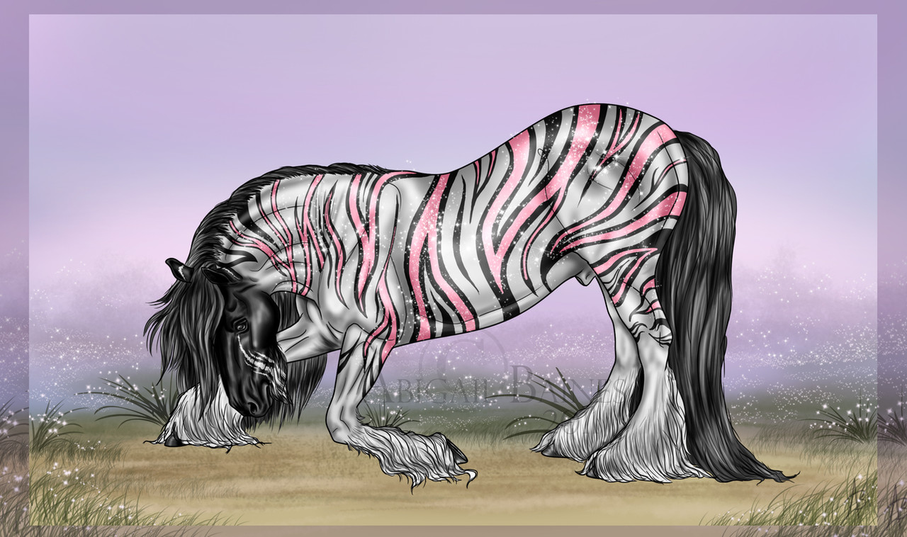
Edit: This was lost when I lost my hard drive. I no longer have the file.Before I move farther on this image I thought I would post and ask for opinions. It's not quite coming out like I wanted it. It's supposed to be a follow up image after the Flying Feathers Light Show of Savannah and Braydan having a moment after the hectic show day. There's a parting going on in one of the main barns but instead of joining, Savannah has a quiet moment with Bray outside the doors. The light from the room is the only lighting.
So here's my problems:
A.) The wall doesn't look supported, or even like a wall. This is one of my big questions, the next two I can play with more and eventually get it. But this wall, not sure how to make it more solid seeming.
B.) Seems like her left side of her face is off.
C.) The party people are just blurred clip art people I used for placing to get the picture, but are they too distracting form the main picture and if so, how could I replace them but still have that "party" feel on the inside.
Related content


Comments: 16

The biggest issue I see is that the people in the barn are not on the same floor plane as Savannah and Braydan. The blurred figures are fine, but they need to be on the same plane, especially since Braydan's knees and hocks tell us very clearly that the plane is more horizontal than sloped backwards as the barn floor. The barn floor's horizon line should probably be more in line with Savannah's knee maybe as high as the base of her buttock, but I don't think any higher works visually.
As others pointed out the wall needs thickness. It would be okay if the wall were parallel to the picture plane, but it is not, made obvious by the fact that Savannah is leaning against it.
On Savannah's face, it's because her eyes are not on the same line. If you bring her right eye down level with the left one that should fix it. Her upper arms are also a bit on the short side. The elbows generally fall about level with the base of the ribcage.
Have fun with the rest of it!
👍: 0 ⏩: 0

with the chick I would have to redline it to help xD sorry forgot to add that.
👍: 0 ⏩: 0
shading on walls is more precise, make it thicker and make the shading less fuzzy to portray support/strength and it will help define it was a wall. It needs to be foreshortened more, I'd drag the back end of the wall to about the horses withers or mid neck, since shes leaning on the wall at an angle, you have to match that angle, what you have done currently is make it look flat, which doesn't reflect the angle she is leaning on it which gives it a curving/wrapping around look. Horses are big, and the position of the horses neck in relation to her body makes the horse look a) small b) human large c) people in the background look too big d) skews wall perspective. You could try making the female smaller, and the people in the background smaller, then scale that to how much you shrank the female in the foreground.
Also angle in which you have the people in the background should be brought down, the way I am interpreting it is that you are looking down into the room, which doesn't match up with the perspective that is presented in the foreground (looking straight on). You could try shrinking the people farthest and maybe dragging them down a bit, whichever looks/works best.
Just what I saw :] hope its helpful.
👍: 0 ⏩: 0

My advice would be to maybe make the wall look thicker, lower the eye on her left side, and maybe lighten the people a little bit. I think they are do dark against the bright colors and that makes them distracting
 (Smile)")
👍: 0 ⏩: 0

For the last one, maybe just darken up the room a bit?
👍: 0 ⏩: 0

I don't know if its been said yet but the contrast on with the dancers is why they are standing out so boldly and drawing your eye away from Savannah and Bray, you need to mute them out or up the contrast on Savannah and Bray.
If you still need help later let me know and I can do a redline or something for you.
👍: 0 ⏩: 0

The left eye is too high.
Maybe if you add another line that is on the wall near the edge, it would make it more three D and show width...?
👍: 0 ⏩: 0

I'd shift the wall over some to the right, giving more focus to the left side of the image. For making it more sturdy, perhaps give the edge some sort of finished look, like the frame around a door. Without the depth of field with the floor or ceiling, it's hard to see the short few inches on a walls edge, so a frame might help add those few angles it's missing to really have depth and structure.
👍: 0 ⏩: 0

make the wall 3D solid by
1. make an end to it. As make the width of it show some. Right now you have leg og the L - you want the short leg on the L to be the end of your wall showing how wide and massive it is.
2. Color the end darker. So long leg on L has backlighten (color as is) - but the short leg on the L has no backlighting and will seem darker.
3. Then put a very thin rimlight on the part of the short leg that is towards the partyscene. Like a few pixels and only a touch of blur on it.
👍: 0 ⏩: 0

B.) I think that if you simply placed her left eye down a little bit it would look better.
C.) Personaly, I didn't really look at those people because I was sooo amazed by your turely amazing hose!
👍: 0 ⏩: 0

A) Try and make the end of the wall more boxlike, like you can see that it ends there.
C) Make the people near the entrance have their back turned to it, since the way their standing now is an eye invitation to notice them.
👍: 0 ⏩: 0

It looks gorgeous, tip on getting the back party to be less stand out, make the color a little more dim, and maybe get a bright color on the side you want focus on, the wall looks great, just add dimension, and the horse, I have nothing to say about thr horse other than it looks fantastic.
👍: 0 ⏩: 0

It looks amazing to me 

👍: 0 ⏩: 0


")