HOME | DD
 TheArtrix — Inspector Iroh
by-nc-nd
TheArtrix — Inspector Iroh
by-nc-nd
Published: 2008-02-07 00:13:38 +0000 UTC; Views: 21227; Favourites: 292; Downloads: 221
Redirect to original
Description
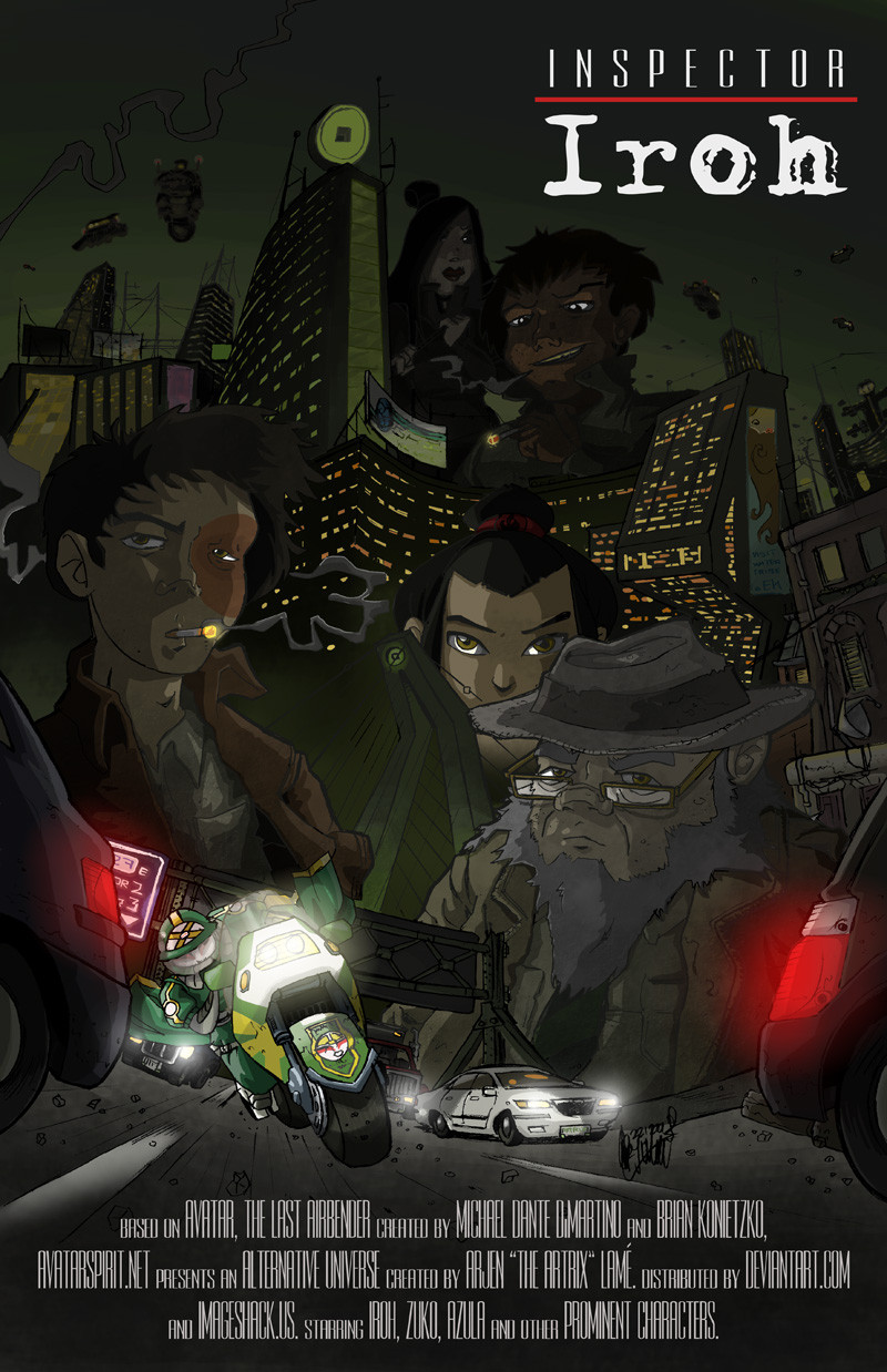
Holy crap, Artrix submits something that does not start with "Artrix's take on"!But the situation is somewhat more complicated than that. It's true that Artrix's take on Danny Phantom is similar to this one, in that I molded the actual series into something dark, so technically, it's still a "take on".
Except that the Danny Phantom piece, or rather, it's back story, never took off. I'm glad it did not, because it was the lamest piece of shit back story I've ever written.
Admitted, Inspector Iroh pretty much started the same way. It started with a brain fart of combining Avatar with Baantjer, a Dutch television series about two murder investigators in Amsterdam city. The initial sketch that started it can be found here . Notice that the filename is still "baantjer".
Instead of disappearing into obscurity, it took off and developed into something that many Avatar fans can enjoy. I was surprised that people were actually drawing fan art of what is essentially fan art, and things started to heat up when Rufftoon herself decided to post her take on the franchise. Seeing as Rufftoon actually worked on Avatar, it meant that Inspector Iroh was now a fraction of a percent canon. Okay, so maybe not, but it's an amusing thought.
Instead of keeping it all to myself, I decided to pull a Linux and made the franchise "open source" by creating an round robin comic that runs to this day. Simply visit ~InspectorIroh to see the result thus far.
Now, after a previous, but failed attempt, I created a movie-type poster for the franchise. I wanted to create something that would set the tone of this particular universe, and to show some of it's features, like the upgrading air bisons and the Kyoshi bikes.
This isn't necessarily something that I spend a lot of time on. I wanted to a rougher look and experiment with pencil-inking and rough, grainy effects. This is also the first time I take full advantage of my new line-art-to-transparent technique, which combines the freedom of paper and the flexibility of computer-drawn lines.
That's enough image description. Enabling advanced criticism for obvious reasons. Hope you guys enjoy :]
Related content


Comments: 61


It looks absolutely great Artie! XD Awesomeness!
👍: 0 ⏩: 0

Haha! That's a fantastic idea!
And how can I be one to offer "advanced critique" when I'm not even superior to your artistic skills?
👍: 0 ⏩: 0

*SQUEEEEEEEEE*
This is stunning!
The mood is perfect - the Kyoshi bike is AWESOME, the EK bridge thingy is wicked, and the city at night with the lights...oh man....")
My only criticisms are that somehow, Jet and June come off as looking like these giants behind the buildings, but that might just be me ")
I noticed that you very awesomely put 'IROH' in that typewriter font, like in that TV series that inspired Inspector Iroh
Man, I still can't get over your cityscape....

👍: 0 ⏩: 1

Yes, I was afraid Jet and June would appear like giants. I think it's mostly a composition error, as placing them differently would create a stronger sense that they're not on scale.
I'm thinking of re-doing the EK sign, which isn't exactly rocket science. It's supposed to be a rotating object, which makes it more difficult perspective-wise.
It's also highly amusing that you actually checked the TV series it's based on, you're the first one outside the Netherlands who did that.
👍: 0 ⏩: 0

The whole thing and idea is just so freaking awesome.

👍: 0 ⏩: 0

It almost looks like an Akira poster, what with the motorcycle.
👍: 0 ⏩: 1
In the sketch dump, I introduced the Kyoshi bikes, and I thought that it would be an interesting "foundation" to work my way up to the top of the image. My problem with the first poster was that just showing characters in very dull, so that was my motivation to spice things up a little. Less characters and more motion and scenery.
I do see where you get the Akira vibe from this. The bright lights combined with grim background are a phenomenon that can easily be associated with the aforementioned movie.
👍: 0 ⏩: 1
By the way, since this is now the official Inspector Iroh logo, if you could link me to where you found the text type I'd be grateful.
👍: 0 ⏩: 1
But of course.
All fonts can be obtained from Theme World , just search their library for "Adler" and "Rothman".
👍: 0 ⏩: 0
<= Prev |