HOME | DD
 Timothi-Ellim — Circe Bell - The Summoning

Published: 2013-07-06 09:10:16 +0000 UTC; Views: 5396; Favourites: 896; Downloads: 0
Redirect to original
Description
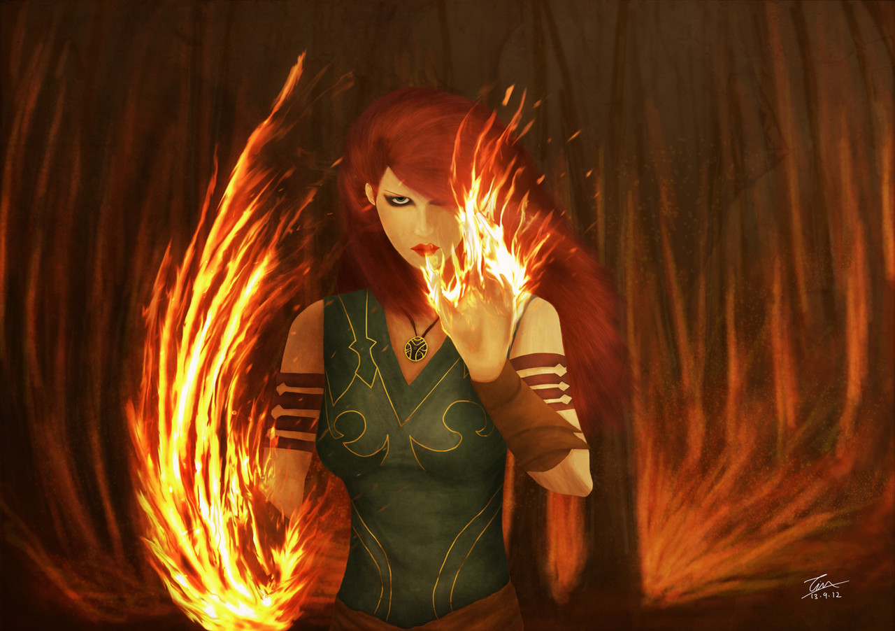
"Do you just expect me to step into this circle and start chanting? I don't remember every spell in the book - that's why I lug this tattering leathery thing around with me! Magic is like cooking, there's a process and a recipe to be followed. If you mess up during the process, it's not going to turn out well. Now give me a few minutes while I read through this."Flustered, Circe sits in the center of the marble circle and opens her grimoire. Setting the grimoire floating in front of her face, Circe focuses and her breathing relaxes. As she reads through the complex spell, she chants softly and black lines appear in the marble. The black lines run and weave through the stone till they finally settle in the shape of Circe's own personal emblem. As Circe mutters, symbols of magic appear in the emblem, becoming brighter with each sentance. Matching Circe's breathing, the symbols pulse with a fiery glow...
---
To help with the war effort, Circe remakes one of her personal spells and further develops it into an instument of death and destruction.
I wanted to portray Circe in a time of focus and meditation. This would be a scene that shows her spiritual side rather than her usual dogmatic and destructive personality.
Circe is a woman who is burdened with all this magical power and it's only too easy to use that power for war and death. To create and to mend is much harder than to destroy and this is the struggle that Circe has to contend with and a choice she must make. When asked to create a spell for war, Circe agrees to do so but has to deal with the emotional burden of creating a weapon that can only take lives.
---
Artist Notes
Took me around 10 hrs over 3 days to complete this.
Pose took me longer than it should've and I had a couple of problems with her nose and her arms. (Also I rushed her ear)
Coloring was a real pain here as the colors didn't come out right at first but in the end I got it just right.
Decided to go with a simplistic background to draw focus to Circe.
I love Circe's "flame" skirt here and I feel it is my best render of it to date.
Overall I feel that the work has enough power to capture your eye but not enough detail to keep you looking at it for hours.
It is also, in my opinion, a balanced piece of work that is fitting for the spiritual scene it wants to depict.
---
Want more Circe Bell?
Related content


Comments: 21

Overall
Vision
Originality
Technique
Impact
Wow! She looks like a really powerful magician. I feel that you did a great work on this art. I was reading your artist notes and I see you had your struggles, but that okay, without them we cannot improve. I also see that you are aware of some mistakes on your art, and that's good too, because when you are aware of your mistakes, you improve them.
Now, I'm going to list some things that must be improved:
•Need to work more on the characters feet, they don't look that natural.
•the jawline is too long, you should make it around one eye of distance between the ear and the eye.
•the pose is unnatural.
•the skin painting looks rusty.
Now, all that been said, I have to highlight some things that I like:
• the small details on her skirt look really nice, I like them.
• the book came out good too.
• the chanting circle is awesome.
• her clothing is nice.
In conclusion, It will be great if you look up some tutorials for anatomy, painting and perspective. Besides that I think that you did a good work and I can see the passion you have for things you do.
With our best intentions,
Critique by Critique-for-All a.deviantart.net/avatars/c/r/c… " alt=" " title="Critique-for-All" />
👍: 0 ⏩: 1

Thanks for critiquing this! I agree with all points!  (Smile)")
Yes, the anatomy of drawing this still boggles my mind. I think I really need to get a model/life reference if I want to do this pose. It was a stretch to draw it out as my imagination had envisioned. The problem I had with the jaw was that I tried to go for a natural kind of 3/4 view where her head is tilted slightly towards the viewer. It's kind of like an inbetween 3/4 view and it didn't work out very well for the face anatomy.
Haha "skin painting looks rusty"! Now that you mention it! It's probably because the color palate I used where more natural skewed this time with an emphasis on red and brown to jive with her clothes.
Every work I do is one step towards better art! Why submit perfect art when I can discuss the imperfections with people and learn more?
")
👍: 0 ⏩: 1
Yes, I like that you took the risk of tying something different. And you have a really creative imagination.
Is good to have imperfections, because that means we can improve
I'm glad to know that the critique helps.
👍: 0 ⏩: 0


Technique
It looks like you really took your sweet time on this one! Now, here's what I like about this picture: I like how the book itself is levitating in the air; I like how she's looking at it like she's got it memorized; I like the pose; I like the clothes she's wearing; I especially like the floor. The floor looks great! Now, the only thing I don't like about this picture is the background. I think that looking back you could have gave the background a more autumny feel to match the outfit she wears, but that is entirely my opinion.
Overall, this is a very, very decent picture that you've composed here, so great work; as for the rating on a scale of one to five, I would give this picture a four-and-a-half. Had the background been a little different than the original grey, this would have been an easy five out of five, to be honest with you. With that said, excellent job on the picture, and may you be blessed with many more great works to come.
👍: 0 ⏩: 1
Thank you for critiquing this! I really appreciate it!
I love your point about the background! It is true that a less colder background could've worked well. I was a little worried that a warmer background might make the piece too warm and give it less depth.
All in all, thank you again for the great critique!
👍: 0 ⏩: 1
Anytime, my friend. Also, if you want to, feel free to check out my new web-comic, Confessions of a Sociopath, by either going to my gallery and clicking on the folder entitled 'COAS GodSight' or by clicking on the link to it in my signature. Have a happy!
👍: 0 ⏩: 0

Overall
Vision
Originality
Technique
Impact
I think your time with the pose really paid off! I love the autumn colors, and the fact that there is such a detailed story behind her, and how intently she is looking at her book.
I would recommend adding a bit more definition to her hair. Where you gave a lot of detail to her clothing and shading, and even where she sits, I feel like her hair lacks texture. Her foot which is pulled around it looks like is still angled slightly awkward. Perhaps look at some feet, or someone in this position.
I would also suggest brightening the background just a smidgen, it would make the colors of her dress and even her hair pop! Overall it's a very good piece, and with some touch ups it will be fantastic!
👍: 0 ⏩: 1
Thank you so much for taking the time to critique this piece!
This piece took a toll on my imagination and even though I tried to spread it out over three day, I think I burnt out nearer to the end. I do agree that more texture to her her would have helped.
Oh man, this pose was a killer! I couldn't find an accurate reference so I had to draw from my knowledge and imagination. It was kind of a "ok let's improvise this" for the foot so I guess that sticks out somewhat. Personally, I think I didn't get the shading right for the feet so it looks a little odd. Got to work more on those feet!
Ah the background, it was almost equally a dilemma as the pose! Problem with brightening it is that Circe would blend into the background too much (due to her bright colors and the lighter value of the background).
Sadly I don't do touch ups, well at least not for personal work, I like to leave my work untouched so it remains a marker of my progress! I hope you understand
👍: 0 ⏩: 0


Sorry it has taken a bit of time to get to you. The contrasting red and green works really well at making the image stand out up close and as a thumbnail. Someone has already commented on the anatomy to some degree, but be careful with pose work. You can slightly fix the pose by having the arm above the leg and just paint over the leg tucking under her on the ground with the dress and background. With the position her torso is facing you wouldn't see this leg.
When it comes to painting figures try to work out where you want the focus to be, is it the head, the book or the details on the dress? Ask yourself what is the most important thing in this painting. Everything else should be considered as a soft edge compared to this. So with this in mind the ground should have no hard lines and if you want the viewer to look at the face first then add the hard lines, highest contrast and detail in that area. The like th circle bell one in this series my flat is full of nouveau paintings so i've got a soft spot for them.
👍: 0 ⏩: 1
Ah you didn't have to do this if you were busy you know!
Well thank you so much though!
Yea that pose is a little risky, it's easy to get thrown off. I wanted to challenge myself haha, I'm still learning after all. Hmm I like the suggestion about the arms, I was actually going to hide them but I can't keep hiding things forever haha!
I totally agree, I lost focus here, I guess I wanted it to be the figure in general and didn't really have a certain part I wanted to focus on. I find myself looking at the skirt more because of the added details I added.
👍: 0 ⏩: 0


Well, First of all - I really like the colourscheme of this piece. It looks really natural and down to earth - in a magical sort of way! Perfect for someone with magical powers. I can tell you put a lot of thought into making this piece. As for crits, there are some parts of the pose that could use a going over, I'm trying to pinpoint it (by trying to pose like her haha xD) ")
ANyways, great work on this!! Redheads rock! Aand.. Keep the good work up ^^
👍: 0 ⏩: 1
Thank you! I'm glad you took the time to comment!
Can't believe you tried posing like she did! I actually tried doing the pose too while I worked on the sketch for the piece (even though I'm a guy, I just wanted to see if it was natural at least)
I get what you mean about the pose though. I've noticed that problem myself. Apart from the anatomical errors, the perspective for the legs and arms, like you said, is in a profile view. I think the reason for this is due to the back leg being the same color as the front, so there's a lack of depth there.
👍: 0 ⏩: 1
Haha, well, I had to see for myself so I wasn't just imagining things
It could be because of that, I think it's hard to pinpoint these things sometimes because really small things or details can have a huge impact on how you perceive things... Which is why it's so important to never stop drawing from life and practicing
👍: 0 ⏩: 0

I agree with what you said about how it is powerful enough to catch the eye but not detailed enough to keep you looking at it for hours. Of course, being drawn to color and having always wanted to have red hair (I have a tint of red to it but it isn't that obvious) I might have noticed this drawing sooner than others. Thank you for sharing!
👍: 0 ⏩: 1
As an artist, I still have a long way to go before I can render what my imagination can think up. Some important stuff just isn't "second nature" yet. It's a hard journey but I find it enjoyable that I can share this journey with everyone
Haha I don't think there's any natural red-head that has a hair tone this dark! It has to be at least dyed.
👍: 0 ⏩: 0