HOME | DD
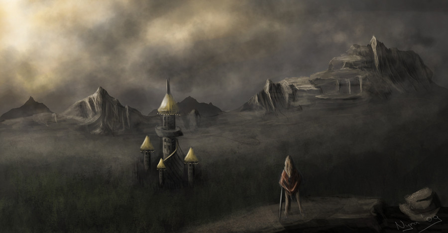
 Vaghauk — howling mountain

Published: 2009-09-03 23:21:37 +0000 UTC; Views: 3010; Favourites: 49; Downloads: 82
Redirect to original
Description
tried to give more depth in this newest version. Some distant birds instead of the raven and better clouds.Related content


Comments: 15

You are featured overhere >Super feature 6 months collecting <
👍: 0 ⏩: 0

This looks like a scene out of Bram Stoker's Dracula, very eerie. I like the painterly and misty look a lot, what kind of technique do you use to achive it?
--
[link]
👍: 0 ⏩: 1

thank you very much for your kind comment!!  (Smile)")
When i painted this i was very inspired by "The Dream-Quest of Unknown Kadath" from h.p. Lovecraft - and i did two more paintings in this mood: [link] and [link]
i guess i got to read that book again... it´s really one of the most amazing books i ever read.
")
👍: 0 ⏩: 0

That is actually very, very good. The concept sits there the way it should. I love the ruins in the distance. The city and the rock in the foreground could actually be a bit sharper, as two focus points, to add some depth and perspective. You could add a hawk to the rock in the foreground, to add some empathy and life. Brushwork could be a bit wilder to add some weight and definition, but if you like the traditional feeling, then its quite alright.
Great job and thanks for sharing!
👍: 0 ⏩: 1
Thank you !!! I really appreciate that you took your time to look at the details !
this pic is actually the most commented in my gallary and it changed a lot since the first upload.
You are right - the city looks to foggy and something is missing on that rock.I had a Raven sitting on it - but it made the city look tiny if it was in a recognizable size..... well,i´m going to find some solution....
thanx a lot for the help - i´m going to upgrade the pic with your suggestions in mind.
[link]
👍: 0 ⏩: 0

Very cool. The distant clouds look too low to me, somehow, as if they're not all on a plane. Because of the fog, and our altitude, I think the horizon is a bit higher than the most distant visible hills.
👍: 0 ⏩: 1
yeah... - think you´re right man ! thanx for pointing it out . going to change it as good as possible ----
👍: 0 ⏩: 1
Cool, glad you were open to it (it sounded like it from your description here).
I wonder, since the clouds are backlit, would they look dark against the sky, rather than brighter?
It's misty, so lighting would be diffuse, but we can still see a bright sun behind the mist. Makes me think there would be deeper shadows (e.g. behind the large terrain features) and more reflected light (along the edges of the mountain, any ground sloped away from the viewer, etc.)
The raven's tree is a bit problematic; the base tells us how far the tree is away from the viewer, relative to the city. There's not a lot of distance between it and the city, so it makes the city look like a miniature. Consider moving the base of the tree off-canvas? Or put a big altitude difference between the nearer tree and the farther ones, so it's clear the raven is much higher up.
👍: 0 ⏩: 1
sure ! I´m really glad to get help like this - sometimes it seems impossible to see my own errors .It´s the main reason why i´m here on deviantarte - to learn. (and to inspire others - if i can)
So i really appreciate that you took the time to look closer and analyze my painting !!!!! going to upgrade this as soon as possible !!!
👍: 0 ⏩: 1
No problem. Also check out the critique center on conceptart.org, it's very good for detailed criticism.
[link]
And you are inspiring!
👍: 0 ⏩: 1
concept art.com looks quite interesting- thanx for the link! got one question though-if you don´t mind. i´m looking for some friendly competition like contest´s with fantasy themesor such. Would you know how i can find out about something like this ?
👍: 0 ⏩: 1
Check out the ArtOrder, run by a WOTC art director, here: [link] They're just finishing up a round of Owlbear, but do go back and look at the Drow vs. Mind Flayer contest, some jaw-dropping stuff there.
Also check out the COW (Creature of the Week), CHOW (Character of the Week), etc. contests at conceptart.org.
👍: 0 ⏩: 1
thanx ! i just checked it out.looks fun - I hope my howling mountain painting improved - tried to keep your suggestions in mind!
👍: 0 ⏩: 0

glad you like the new verion aswell !
👍: 0 ⏩: 0