HOME | DD
 whispwill — How to Color Part 1

Published: 2013-04-18 20:50:03 +0000 UTC; Views: 26677; Favourites: 1858; Downloads: 0
Redirect to original
Description
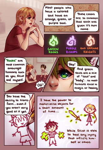
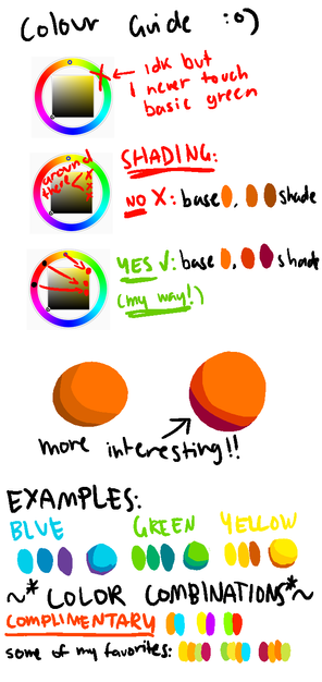
What you will need for this tutorial:• Access to an art program of some sort
• A drawing tablet ((not really needed, but recommended))
• Full color vision, sorry color blind people... haven't finished my optical implants for you yet.
Trick to art, make everything look like barf colors!! Muhahaha xD
Weh too much guys OTL ahah
It's wordy I know, I'm sorry xD
I'll try and get part 2 up by tomorrow, and part 3 on sat and part 4 on sunday!
Related content
Comments: 71

i can't see the part 2/3 T.T whereee? (im new at deviantart btw.)
👍: 0 ⏩: 0

good advices, I was looking something like that for a long time
👍: 0 ⏩: 0

This is really super helpful, thank you so much for making this!
👍: 0 ⏩: 0

that opacity method is actually a really good idea.. i never thought to do it like that.
👍: 0 ⏩: 0

Wow, the first Tutorial about color that i understand...great job 
👍: 0 ⏩: 0

I have trouble with picking colors a lot, so I've been trying to find tutorials like this to get a better grasp on building up a palette. While I think I have a pretty good grasp on color theory and stuff, the actual choosing and and 'merging' of the colors to make them look nice tends to escape me.
Until now! (hopefully)
This tutorial, at least from what I've seen, really has a different angle, especially since it's all about choosing colors that look good together. And the transparency trick is genius, I can't wait to try it out myself!
👍: 0 ⏩: 0

It's a wonderful tuto !
I think I could see which colors match in my head but it's always too dark (yeah I know it's an other problem but if I follow these steps maybe it could help me..)
Could you (if you like to do it of course) make a tuto for skin tone ?
I know there is a lot of tutos for that but I really like how you explain your theory, it's really easy to understand !
Thank you !!!
👍: 0 ⏩: 0

...where are the other parts...?
it was really helpful, I want more!
👍: 0 ⏩: 0

Oh wow thats great! Thank you so much for sharing - the different is speechless!
👍: 0 ⏩: 0

...
/just learned how to neutralize colours in high school arts
orz
👍: 0 ⏩: 0

/favorite x a billion. Thank you so much for pointing all of this out. I sort of knew this off of the back of my head but it really helped me learn more, especially in this clean and clear way that you've shown it! So thank you so much for this awesome tutorial!
👍: 0 ⏩: 0

Excellent trick! I've always been wondering how to get that soft, professional look into my drawings/paintings...
👍: 0 ⏩: 0

WHISP YOU'RE AMAZING
This tutorial is so helpful that I can't put it into words adjksagfld
👍: 0 ⏩: 0

This is the answer to all of my prayers ;w; thank you (and that 1st left color palette ALMOST looks like Google Chrome XD)
👍: 0 ⏩: 0

Thank you for this very helpful tutorial! :3 I always have issues painting pieces and trying to make the colors harmonious, and these tips will help.
👍: 0 ⏩: 0

This has solved every problem with colours that I ever had D: Thank you!
👍: 0 ⏩: 0

the background and the font makes me dizzy @_@ thanks but,, dont mix points with that font @_@, plus is 2 am here lol
👍: 0 ⏩: 0

Ah, the joys of color theory. Wonderful tutorial here. You intuitively hit many points that a color theory class will cover. The suggestion of using the opacity to create a new color is something I never considered and an awesome idea.
The rest of this is just going to be me blabbering on about color, so feel free to ignore me. 
When two colors are fighting for dominance, it's called color vibration. This can have painful repercussions on your artwork if you let it happen. At it's worst, color vibration can cause major headaches.
Saturation can also be used as a way to express depth in a piece of work. Having bright saturated color on objects in the front and desaturated colors toward the back gives the feeling that those objects are further away. Over saturation is typically 'worse' then under saturation because of color vibration. Under-saturated colors just don't shake it like the neons do, so when they're misused, the repercussions on the piece aren't as severe. The best artists eventually find that happy medium.
Anyone interested in color theory should defiantly go learn about the classic color wheel as well. It's the most basic tool for any artist when picking useable colors. Most of your classic color schemes are used with the color wheel, hence it's importance.
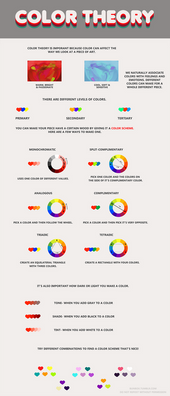
There are three types of colors on the classic color wheel.
Primary: These are colors that you can't create by mixing. For example: You can't mix two colors to make blue.
Secondary: These are colors you get by mixing two primary colors. Green, for example, is a mix of blue and yellow.
Ternary: Pretty much everything in between the secondary and primary colors. Blue-green, red-orange, etc. On a color wheel, there is typically one ternary color in-between a primary and secondary that is visually about half way between the two on the color spectrum.
Some of the schemes I've learned:
Monochromatic: Pick a single color, and use it throughout the entire piece of artwork while adjusting only the value and saturation. Grey-scale, for example, is a monochromatic scheme that has no saturation or hue.
Analogous: Pick a few colors that are next door neighbors on the color wheel such as red, red-violet, and violet.
Complimentary: Pick two colors directly across from each other on the color wheel. Red and green are an example.
Split Complimentary: This is sort of a hybrid of complimentary and analogous color schemes. Pick a color and it's complimentary. Rather then using that complimentary, use it's two neighbors, creating a three color scheme. I personally call it the peace sign scheme because if you drew lines over the three colors you're using, it looks like a peace sign. Blue Violet, Yellow, and Orange for instance.
Triadic: Pick three colors equal spacing apart. Red, blue, and yellow are the best example of this.
Tetradic: This one is the hardest to explain for me. Pick a color and it's compliment. Then move to the side two colors, and use that color and it's compliment as well. For example: yellow, purple, orange, blue.
One other thing to consider is that colors have certain emotions they can attach to. Picking colors based on the mood of your piece is important. A dark mood piece isn't going to benefit from nothing but neon. Use color to your advantage to help further express the emotions you want your piece to exhibit to the audience.
[link]
This site goes into color meaning very well. I would say yellow surprised me the most when I first learned all of this. Trying to turn yellow, generally a cheerful color, into something that feels oppressive can be a challenge and a lot of fun.
👍: 0 ⏩: 1

ahah well thank you for all the information! I've never learned the technical terms
just kinda went with the flow
I suppose I will learn all of that upon entering art school this fall ♥
👍: 0 ⏩: 1

Ooh, you're going into artschool? It's a ton of fun, even if I did change careers at the end. Your artwork is great, by the way.
👍: 0 ⏩: 1

hehe thank you ; v ;
and no no, im finally transferring to an art school in the fall aha
im super excited as I really want to improve my artwork and I'm hoping to learn a lot more then I ever could teaching myself eheh x3
👍: 0 ⏩: 0

Dude. o.o That's cool. How did you come up with that?
👍: 0 ⏩: 0

I found this so helpful! What font did you use (or could you add it to the description)? Thanks! ^u^
👍: 0 ⏩: 1

it's my handwriting lol i made it a font for me to use
👍: 0 ⏩: 1

are you kidding omg its like the most perfect handwritting i've seen
👍: 0 ⏩: 0

wow, this is an AWESOME tutorial! thanks so much whispy!! <33
👍: 0 ⏩: 0

Don't scare people away from saturated colors, there's nothing wrong with saturation if you know how to use it effectively (though I think you over-saturated just to bias a point). Your own colors just look like pastels.
👍: 0 ⏩: 1

i did over saturate and even under-saturated the pictures lol, and i mentioned in there that they aren't a bad thing and that you should only use them when your good at choosing colors that work well together
👍: 0 ⏩: 1

You know what saturation is right? I hope you'll grow to understand that colors would look the same together if they're all saturated or all un-saturated. Even saturated with unsaturated can be perfectly normal depending on what's being accentuated. It's not the saturation that defines what colors look like next to other colors, it's based on opposites and compliments of the color wheel.
👍: 0 ⏩: 1

Ah I see, looking at your work I can see what kind of artist you are now- if this sort of thing works for you it's fine, on one's judging it critically, right?
👍: 0 ⏩: 0
| Next =>


