HOME | DD
 chicinlicin — Colour tutorial...kinda

Published: 2013-06-29 09:28:00 +0000 UTC; Views: 7417; Favourites: 452; Downloads: 111
Redirect to original
Description
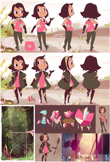
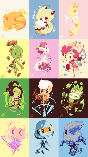
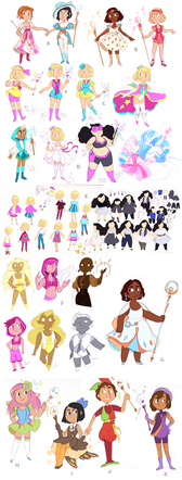
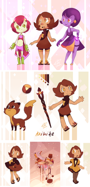
Something I put together to answer how I pick colours, you can look at both parts on tumblr here and here .Sorry if it's a bit long


 I tried to compress it more but the text started to be unreadable...or at least more so


 oh and try to ignore all my spelling errors, the first part was made just before I went to bed last week, and the second part was made this morning when I woke up...if anyone happens to have anything else they'd like to see a tutorial or whatever on then just ask


 heh
heh
Related content
Comments: 13

jesus your shading style is so colorful!
(I'm gonna use this for future art :3)
👍: 0 ⏩: 0

Hurray!
Might be just me but I didn't have any problem reading it
👍: 0 ⏩: 0

I tend to use several analogous colors and complementary colors to shade myself. I like the concept of using the gray-scale. I always forget to try and use that. Do you have a particular single color that you seem to use over and over in your work?
I find that I always end up using a lot of reds lately. I really just enjoy warmer temperature colors it seems. I am trying to use more blues and greens-but I always end up gravitating back to reds it seems.
Thank you for the nice tutorial and insight on how you go about approaching colors yourself! It always seems to vary from artist to artist-but the basic overall concepts nicely overlap<:
👍: 0 ⏩: 1

Analogous colours is how I tend to work as well, I just find it easier to explain this way 

I need to get used to more greens. Usually after finishing a picture I'll make a compressed version and level out the colours, I always add more red or blue but never any green 
I quite like seeing how everyone handles colours 
👍: 0 ⏩: 0

Very nice! I love this. The colors as gray scale is pure genius! Anything to help me work better color is fab. C:
👍: 0 ⏩: 1

Thanks 

👍: 0 ⏩: 1

You can also if you choose a colour for your light source fx light yellow and then make the shadows the complementary colour which would be some sort of Dark violet 
👍: 0 ⏩: 1

Oh yeah, I've been meaning to try something out like that 
👍: 0 ⏩: 1

Yes 


👍: 0 ⏩: 0

I just realised the colours when put in grayscale order is the colour test card pattern for TV *3*
👍: 0 ⏩: 1

Whoa, it is 
👍: 0 ⏩: 0

