HOME | DD
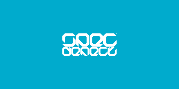
 woweek — Cyfer: Logotype

Published: 2008-03-25 05:36:56 +0000 UTC; Views: 2273; Favourites: 28; Downloads: 77
Redirect to original
Description
CyferClient: Cyfer. Electronic dance music internet podcast.
Copyright © Vladimir Ilnitzki 2008 March
Related content


Comments: 40

I like it man! very minimal; but very tight! 
Keep it up!
👍: 0 ⏩: 1


rootout, bro! thankew! how are you?
👍: 0 ⏩: 1

u r welcome!
fine, im fine... working on music video right now and its an animation... ahhh 5 minutes long!! man, I'm soooo tired of drawing ...but it looks kool and i got money and im satisfied and... so i guess its not that much pain at all
 (Wink)")
hey what r u up to dude?

👍: 0 ⏩: 0

Well yes as other say its hard to read.. but we need to stop thinking Straight... and go SIDEWAYS! I love it dude.. but please try this.. take out those very very light lines that are still there.. and remove that left icon/symbol . it would be much much better!
Will collect it!
👍: 0 ⏩: 1
thanks mate! really appreciate your opinion))
but it lose meaning, because client reject this one...
👍: 0 ⏩: 0

")
thank you! btw freaky avatara you have)))
👍: 0 ⏩: 1
")

the first seems better to me!(it has more simetry!)
but is hard to read the "y"!
cool style man!

👍: 0 ⏩: 1
thank you mate!
'y' looks like 'g' sometimes )
👍: 0 ⏩: 0

")
easy man! ) slowly... from the left to right. thank you for comment
👍: 0 ⏩: 1


 (Smile)")
thank you very much! appreciate your opinion
👍: 0 ⏩: 1

I agree with alisalem it is very difficult to read but looks awesome. Nevertheless that's the current modern style as I have seen from other logotypes so great job!
👍: 0 ⏩: 1
thanks) yes, alisalem opinion is important for me. and which logotypes you mean?
👍: 0 ⏩: 1
I mean logos that are not easily identifiable, like this : [link]
[link]
👍: 0 ⏩: 0


haha you did one too?.. much better than mine anyway
👍: 0 ⏩: 1
hehe) thanks) can you show me your cyfer logo?
👍: 0 ⏩: 1
sure here [link]
but i wasn't happy with the result... but my friend who owns a music store decided to buy it with a few little changes.. so it's not a total waste
👍: 0 ⏩: 1
nice! i really like your variant. is it handmade type?
👍: 0 ⏩: 1
thanks...
no it's a typeface called HarlowD.. but i've made some changes didn't use the type exactly...
👍: 0 ⏩: 0

Если бы не название, я бы не смог прочитать что там написано.
👍: 0 ⏩: 1
во всем нужна сноровка, закалка, тренировка
спасиб за коммент
👍: 0 ⏩: 0

