HOME | DD

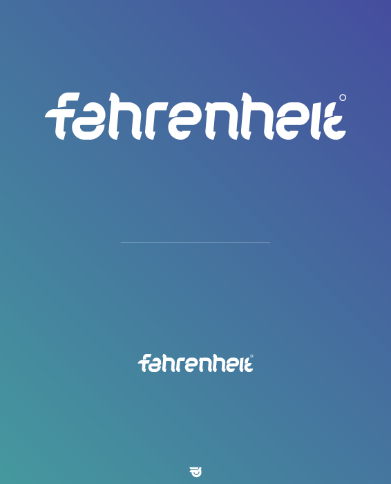
woweek — Fahrenheit: Logotype

Published: 2009-10-31 17:57:20 +0000 UTC; Views: 3023; Favourites: 47; Downloads: 109
Redirect to original
Description Fahrenheit°

--

Copyright © 2009 Vladimir Ilnitzki
Related content
Comments: 15

LSP-C [2013-11-17 22:57:11 +0000 UTC]

est tres bone

👍: 0 ⏩: 0

ahsinasemanis [2013-01-14 09:13:27 +0000 UTC]

what is the name of the font you used?

👍: 0 ⏩: 1

woweek In reply to ahsinasemanis [2013-01-16 15:42:08 +0000 UTC]

That's handmade typography, not an existing font.

👍: 0 ⏩: 0

teyoliia [2011-04-09 23:32:40 +0000 UTC]

awesome! love the letters :) very well done!

👍: 0 ⏩: 0

ENightmare [2009-12-02 22:31:08 +0000 UTC]

nice

👍: 0 ⏩: 1

woweek In reply to ENightmare [2009-12-03 19:15:25 +0000 UTC]

Thanks!

👍: 0 ⏩: 0

grafix19 [2009-11-04 21:19:18 +0000 UTC]

nice character

👍: 0 ⏩: 0

superbonder [2009-11-04 01:20:37 +0000 UTC]

Very cool bro!

👍: 0 ⏩: 0

dr4oz [2009-11-03 09:00:12 +0000 UTC]

нра!
только последняя t не читается, было бы наверно интересней использовать часть первой f, как уже писали в первом комменте.

👍: 0 ⏩: 0

mikofierro [2009-11-02 04:46:42 +0000 UTC]

Great & fresh logo!!!

👍: 0 ⏩: 0

ivan05 [2009-11-01 18:14:17 +0000 UTC]

sick!

👍: 0 ⏩: 0

encoretheangel [2009-10-31 22:47:40 +0000 UTC]

really awesome the logo looks professional and minimalist

👍: 0 ⏩: 0

shadyau [2009-10-31 21:34:10 +0000 UTC]

nice mate,,

👍: 0 ⏩: 0

no-preview [2009-10-31 19:10:23 +0000 UTC]

Awesome work .. I it.

👍: 0 ⏩: 0

evil-pumpkin [2009-10-31 18:17:40 +0000 UTC]

The typo is really nice...but imho the ending 't' is not easily readable. Have you tried using the bottom part of the first 'f'?

👍: 0 ⏩: 0