HOME | DD
 woweek —
Logotype03
woweek —
Logotype03
Published: 2009-03-05 06:00:53 +0000 UTC; Views: 37703; Favourites: 244; Downloads: 455
Redirect to original
Description
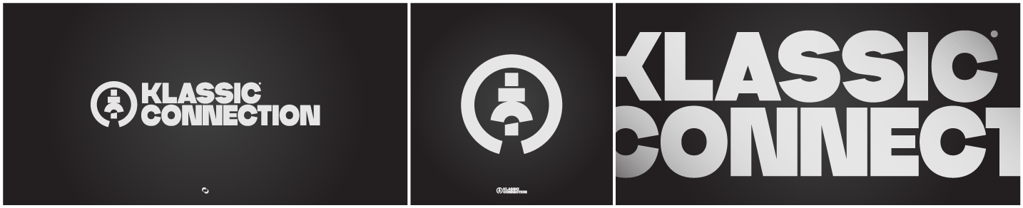
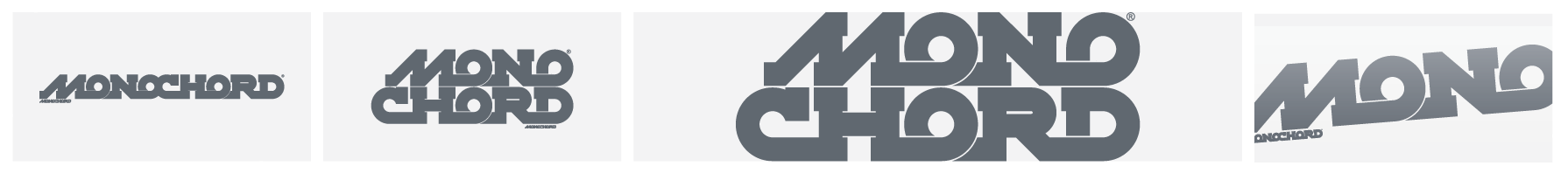
Holla guys!I'am still in a logotypeface's business too. )
Another digital release this time for a client.
Pure handmade vector logotype.
I really like this letters so i hope to end a whole typeface based on them.
I hope it readable and i hope You like it too.
")
I know my english sux, vektor rox! Cheers!
Copryright © Vladimir Ilnitzki, 2009 March
Related content


Comments: 62

i very much in admiration of your skill. you are a great designer.
👍: 0 ⏩: 1

Thanks! Hehe, but i am not a designer to be honestly
👍: 0 ⏩: 0


Охренеть!! Поздравляю с ДД, 2010 год начался для тебя просто афигенно!!!
👍: 0 ⏩: 1
С новым годом! Чуствую для тебя он будет успешнее всех остальных, раз он начался так (:
👍: 0 ⏩: 1
Да, Дневная Девиация 1-го января тыщь-десятого это круто! Но это не показатель, если еще к тому же ничего не делать весь этот год
HAPPY NEW 2K10 YEAH!
 (Wink)")

👍: 0 ⏩: 1
Ну я в прошлом году 2 дд сорвал, буду в этом бить свой рекорд (:
А работы я чуствую будет по уши у всех.
👍: 0 ⏩: 0


does the little circle emblem mean something or is it just a cool design??
👍: 0 ⏩: 1
I don't design it meaning somthing, just trying to make logotype looking cool
👍: 0 ⏩: 0


Is one of the amazing logos that you have on your gallery. I love the clean and simple shape. Everything fits very well.

👍: 0 ⏩: 1
Thanks a lot! Really appreciate Your words!
HAPPY NEW 2K10 YEAH!
👍: 0 ⏩: 0

Thank You man! Glad you like it
👍: 0 ⏩: 1

I featured your work here [link] - Hope you don't mind  (Smile)")
👍: 0 ⏩: 0

нормуль!!! поиграй с толщиной линий....она не всегда должна быть одинакова. а так фава!
👍: 0 ⏩: 1
Спасибо большое!) Знаю, но данное начертание букв мне показалось в достаточной степени гармоничным
👍: 0 ⏩: 0

well, english sux, vector rox i would say 
awesome logo 
what's the clients branch?
👍: 0 ⏩: 0

Thank You mate!
👍: 0 ⏩: 1


classy type. the N-N-E kerning is perhaps too tight, it kind of stands out too much... But I have no clue how would it look with bigger spaces, maybe this is just the best way. awesome as always, faved as always.
👍: 0 ⏩: 0


it is great. readable of course a 100%
maybe the kerning is very close but looks still awesome
👍: 0 ⏩: 0

Thank You! I haven't any ideas for the typeface's name now. Any ideas?
👍: 0 ⏩: 0


| Next =>