HOME | DD
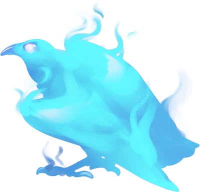
 WridianGrey — Crystal Core Currier Bird Color Concepts Round 2

#bird #birds #characterdesign #conceptart #conceptsketch #creaturedesign #creatures #crystalcore #gameconcept #gameconceptart #mystical #phoenix #creatureconcept #videogameconceptart #conceptartcharacter #conceptartdigital #thecrystalcore #raven #silhouette #space
Published: 2018-06-25 11:28:24 +0000 UTC; Views: 2560; Favourites: 224; Downloads: 0
Redirect to original
Description
And with this image, I've posted the last of the work I did on The Crystal Core that's worth sharing, which was also the final set of concepts produced in my time there. From here on out, expect a return to my normal posting schedule.After the previous round of currier bird concepts , its form went back toward the vaguely raven-ish direction I first sketched, and the coloring went in another direction entirely. These were my ideas for the "cosmic silhouette" look, for lack of a better term.
Related content
Comments: 22

👍: 0 ⏩: 0

ooh, looks like an interstellar phoenix, I love it!
my favs are 3 and 5, they're a good mixture of contrast and color, yet leave the body itself a bit of a mystery
👍: 0 ⏩: 1

Even now, I still have a hard time picking a favorite between 3, 4, 5, and 6. Which is weird, because picking a favorite is usually something I can't help but do.
👍: 0 ⏩: 0

Another vote for 3, sounds like light wings over a dark body is the winner on that row. Care to weigh in on why you think 3 worked better than 4? Because I could go either way on that. Beside that though, people are evenly split on whether white or blue tips worked better.
Of course, the votes aren't exactly all that numerous to begin with, so the data isn't exactly conclusive so far anyway. And it doesn't matter in the end since the final design decision isn't up to me, but still, the opinions are appreciated. Knowing what people like will help when the designs are my decisions.
👍: 0 ⏩: 0

4... So that means you think dark dark wings and a light body worked better than the other way around. I couldn't decide either way, so I'm curious what your thinking is there, if you don't mind.
👍: 0 ⏩: 1

It seems more not only more aesthetically pleasing. But ( and excuse me here but I'm pagan and working on feeling different energies) it feels more true to a sunset if that is what you are going for. The darkness is slowly enveloping the bird, although it still has it's light in the center, while it's counter part 3,which feels like it's almost forcing the light to leave it's body.
👍: 0 ⏩: 1

No need to excuse the musing on energy, I'm totally into that stuff. And on that note, very interesting observations. I never even considered the implied dark-light transitioning of the different variations before.
👍: 0 ⏩: 1

I know right but just oh my gosh the beauty of it ! I totally forgot about commenting on this and I'm still in love with them
👍: 0 ⏩: 1

It's cool, I fell behind on things here (again) and took forever to reply to you so I'd only have been surprised if you still remembered. But I'm glad you still enjoy them!
👍: 0 ⏩: 0

1 and 5 huh? Guess that means you definitely think dark colors were the way to go? They do add the the mystique.
👍: 0 ⏩: 0

As far as 5 goes, I'd agree that the blue tips worked slightly better than the white ones on 6. But I could never find a clear preference between 1, 3, and 4. Or decide whether it looked better with the bottom row colored feather tips or without them.
👍: 0 ⏩: 0


