HOME | DD
 Yasuelf101 — Caged Hearts

Published: 2006-01-29 22:49:53 +0000 UTC; Views: 5952; Favourites: 77; Downloads: 611
Redirect to original
Description
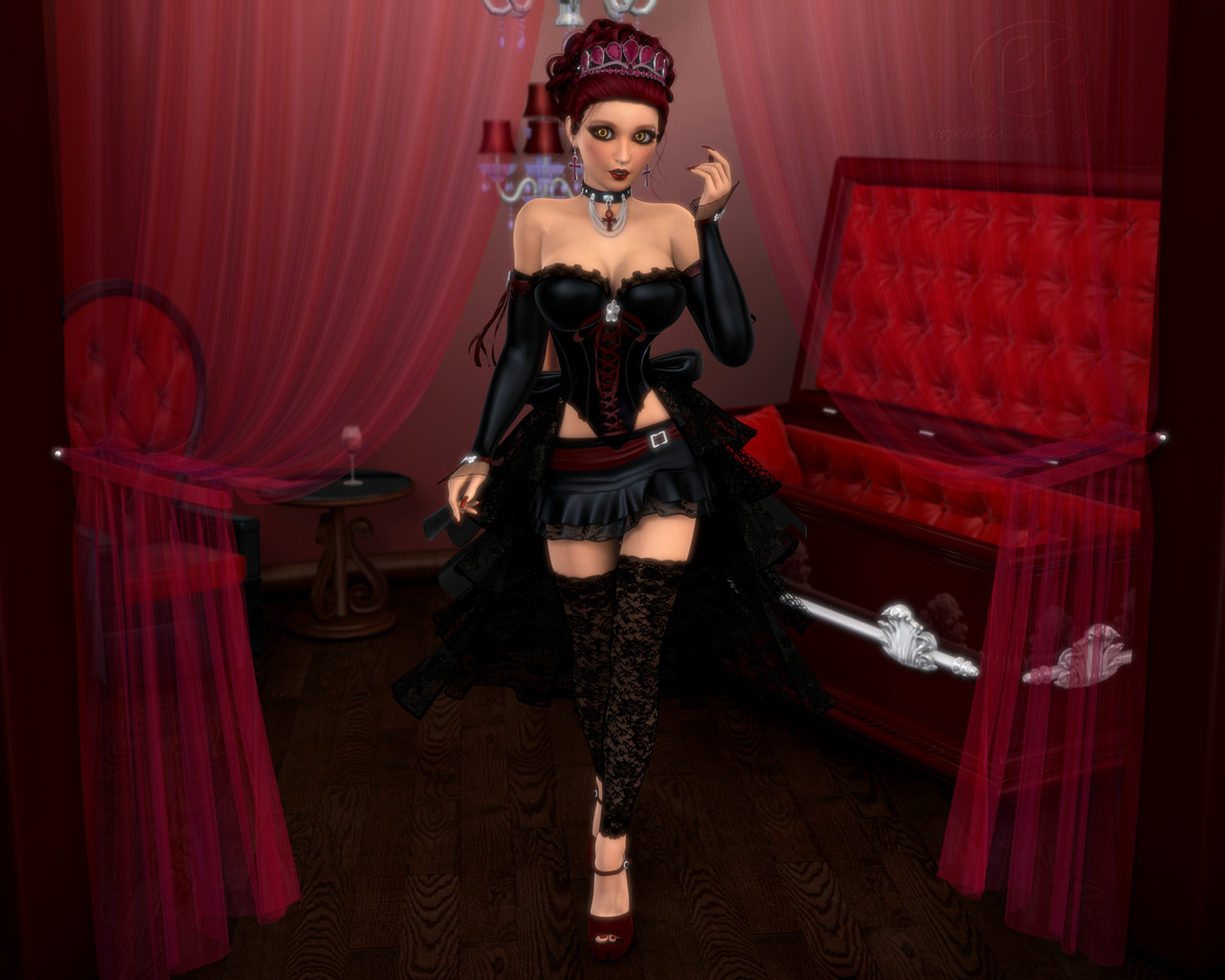
This is a picture of the Queen of Hearts as I would picture her. Sitting upon her throne she waits for the next person for her to play with and steal thier heart, and not by the means of love. This Queen has no love, and she lost it long ago when another had stolen her own heart and now she steals other to try and find something to substitute for her own which is missing. Along the way she picked up gunnary (which she has quite a collection of). She steals hearts and locks them away for all eternity and for those who attampt to get them back must make a deal with the Queen much like you would if you were to make a deal with the devil, which means there are consiquences to getting it back. Most people don't survive long enough to get thier hearts returned to them and the queen sees to that.I worked 40-50 hours on this piece, and I like it very very much. I never worked so long or so hard on a piece before and I think from now on I am going to work on pieces much like I did this one. I like the quality of it much more then I do some of the other one's I did. So please tell me what you think of this piece! Full View Please! You get to see more detail! I think I am going to add a little more to it but not much.
If anyone would like a print of this piece let me know or a shirt and I will set it up so that you can get one, as long as there is enough demand for it.
Related content


Comments: 304

The reflection on her boots looks very realiztic, the smoke in the backround not so much though. I dont even think you need it.
👍: 0 ⏩: 0


nice work....looks like a rouge in ragnarok...

👍: 0 ⏩: 0

very nice job! the charecter is excellent!
👍: 0 ⏩: 0

She's cute that's for sure, great design. The candles and the webbing is a nice detail too. But I'm not too keen on the floor, it's too distracting for me, maybe the white can be toned down a little on it.
👍: 0 ⏩: 0

Wow this picture is awesome. He pose is so suductive and tempting no wonder she can steal so many hearts  (Wink)")
👍: 0 ⏩: 0

This picture is actually pretty cool. I really like the pose you put her in. I suck at drawing people in sitting poses like that, so I give you a big thumbs up. The spider webs look cool too.
👍: 0 ⏩: 0

Awesome work. So many hours on that...
Great details too... 

👍: 0 ⏩: 0


Oh wow! I love the shading on this!
I really love the strings in the background and her pose. Not to mention her outfit, it's very sexy. =3
She looks as if she could shoot you without remorse... or a broken heart.
👍: 0 ⏩: 0


This is really neat! I love the look and the theme. Nice details incorporating hearts and I also really like the checkered floor. ^^
👍: 0 ⏩: 0

background is great
and everything is amazing except the background candles
because everything else is black and red and i like it like that
👍: 0 ⏩: 0

amazing pic. It looks great. I love the detail
👍: 0 ⏩: 0

now that ive read the other comments i also noticed the other leg which looks just a bit out of place. Still all together nice looking picture! very atmospheric colours!
👍: 0 ⏩: 0


I Loved this one.. it really pops in ur gallery.. i like the concept of it, although i wonder if u can make the style of the threads the same as the whole drawing, they look a lil bit off.. other than that, i really find it perfect and i really appreciate the amount if time it took u, the girl figure have been drawn really good
👍: 0 ⏩: 1

To tell you the truth, the actual drawing looks like...well you know. LOL! I can draw people but when it comes to drawing faces they always come out wrong. It is wierd though because when I get a picture into photoshop everythign just clicks and I can do a face pretty well, now that I have played around with all the brushes and everything. You know what I mean?
👍: 0 ⏩: 0

Interesting perspective going one here, I'm really digging the candles in the background. Her toso seems to be at a very awkward angle, not so much because of the line art but because of how you've placed the belly button and shading. My eye tells me that the belly button should be under the corset and not in view at all. So the skin showing should actually be a hip and the top part of her thigh. I think what happened was you shifted perspective as you were painting. Instead of the dynamic angle you were using on the torso, your eye got confused and reverted back to flat frontal perspective for the lower body.
The shoes are melding a bit too freely into her tights, you should re-enforce a contour line there to show whre the shoe begins.
Other than those little perspective / proportion issues it's a very nice work. I wouldn't bother changing it, just keep what I've suggested in mind for the next time you do one of these pieces
If you do continue having issues with anatomy and the like, remember there is no shame in using a model or a reference. It is really hard to pull convincing weight and limb angles out of your head
")
👍: 0 ⏩: 0


Good colours and perspective, and a generally cool idea! I love her pose, and the background is interesting.
👍: 0 ⏩: 0

Very cool!! At first, before I looked cloesly, I thought the candles were a cityscape at night~ All of the detail in the wax of the candles is awesome. But my favorite part is her hair!! The little strands that are hanging down, just as they would if this hairstyle were pulled off in real life, are great ^^
👍: 0 ⏩: 0

I think this is very cool ")
Very nice job.
")
👍: 0 ⏩: 0

This is most impressive. Quite the step up from all your previous pieces. Excelent work with the CG. The time you spent on it really showes through. Great job.
👍: 0 ⏩: 0

Her face appears really cutsey in its look, I guess its to make people think she is innocent thoguh the clothing she is wearing tells her lie. The other thing is her pose looks kinda of uncomfortable as the leg underneath appears to be going too far to the right while she is turning. Her Right arm disappears but if she is sitting back in the chair then she would be crushing her arm. I tihnk this is a nice concept peice I just think some of the pose needs to be worked out to make it appear more natural.
👍: 0 ⏩: 0

This has a great feel to it, nice work!

👍: 0 ⏩: 0

Oh wow I love this!! The colors are amazing, the theme is right in time for V-day, and I love her pose.  (Smile)")
👍: 0 ⏩: 0


Well, i checked all your gallery b4 posting this ; amazing to see how you have progressed !
This piece is quite professional looking, good lineart & composition and amazing colours & shading !
Definitelly your best work !

👍: 0 ⏩: 0

The character itself is VERY well done. I kinda agree with most everyone about the caged hearts thing, it is poor quality. The reason people are commenting on it is cause it just stands out too much. Anyways, kickass!
👍: 0 ⏩: 1
I took the caged hearts out of the picture... O.O *is confused*
👍: 0 ⏩: 0

This is beautiful, theres so much deatil in it

👍: 0 ⏩: 0

Ah, very gothic lolitish (I know it's not a real word so don't bring that up).
Although the problem is the picture doesn't fit the character description very well. The overall picture is rather bright. To fit the character, try making it darker. But that would alter the picture too much.
Sorry I don't sound like too much help.
👍: 0 ⏩: 0

I really like the environment and the atmospheric effects. The imagery is very nicely done too. Love the webs and her "innocent" expression. Your hard work definitely paid off!
👍: 0 ⏩: 0

Wow, that's pretty. She looks really cool, and you did a good job with the checkered floor. As mentioned before, the hearts could be tweaked a bit, but the picture as a whole is really good.
👍: 0 ⏩: 0

Very cool, I like it. I love the candles, even if a lot of them are duplicates. They just look sweet.
I'm not really liking the whispy fog stuff, but it's pretty good overall
👍: 0 ⏩: 0

i love your drawing style. definitely wish i can draw like this. did u color this with or without photoshop, or did you use both. also the perspective of the checked floor looks kinda off, not sure if it's just my eyes. keep up the excellent work in your future deviations.
👍: 0 ⏩: 0

Very nice its apperent that you put alot of work into this !!
👍: 0 ⏩: 0

Wonderful! I'm off to fave her but I wouldn't wanna meet her - especially not if I was a bloke
👍: 0 ⏩: 0

Very nice colored, I really like the candles on the background.
👍: 0 ⏩: 0

Your depth looks stunning, very well drawn out character and nice highlights. Tough I think the bg could use some work.
👍: 0 ⏩: 0

This is rather impressive. I really love the candles in the background. I see why this is your featured work.
👍: 0 ⏩: 1
Ok, not your featured work...sorry, im a ditz sometimes. But it should be your featured.
👍: 0 ⏩: 0

very very nice work!!
a few nitpicky comments though: i love the detail you're striving for, but you don't convince me when it comes to the cloth (the pink swirly cloth especially and the base of the robe). Much of hte hightlists are a little too fuzzy to make it seem textured as it appears you were going for. You have great detail in the hair, face, and candles and that gets lost when it comes to the clothes. Normally, i would also comment about the structure of her body, (her right leg looks extremely awkward) but i think that if you added a left arm kind of lazily resting on the armrest of the throne, it would fixed the overly twisted feeling in the form of her body. The tile floor could also have more depth by fading it back into the shadows more, and blurring it out as the recedes.
I love your concept and the direction you are going in all the same, but i think you still need quite a few hours in this to really make my jaw drop. All in all though, i think it is an excellent work.
👍: 0 ⏩: 0

This is definatly my Fav piece in your gallery ... Very good job
👍: 0 ⏩: 0
<= Prev | | Next =>