HOME | DD
 yienkeat — Experiment of Typography
by-nc-nd
yienkeat — Experiment of Typography
by-nc-nd

Published: 2006-11-27 13:58:32 +0000 UTC; Views: 67273; Favourites: 650; Downloads: 46
Redirect to original
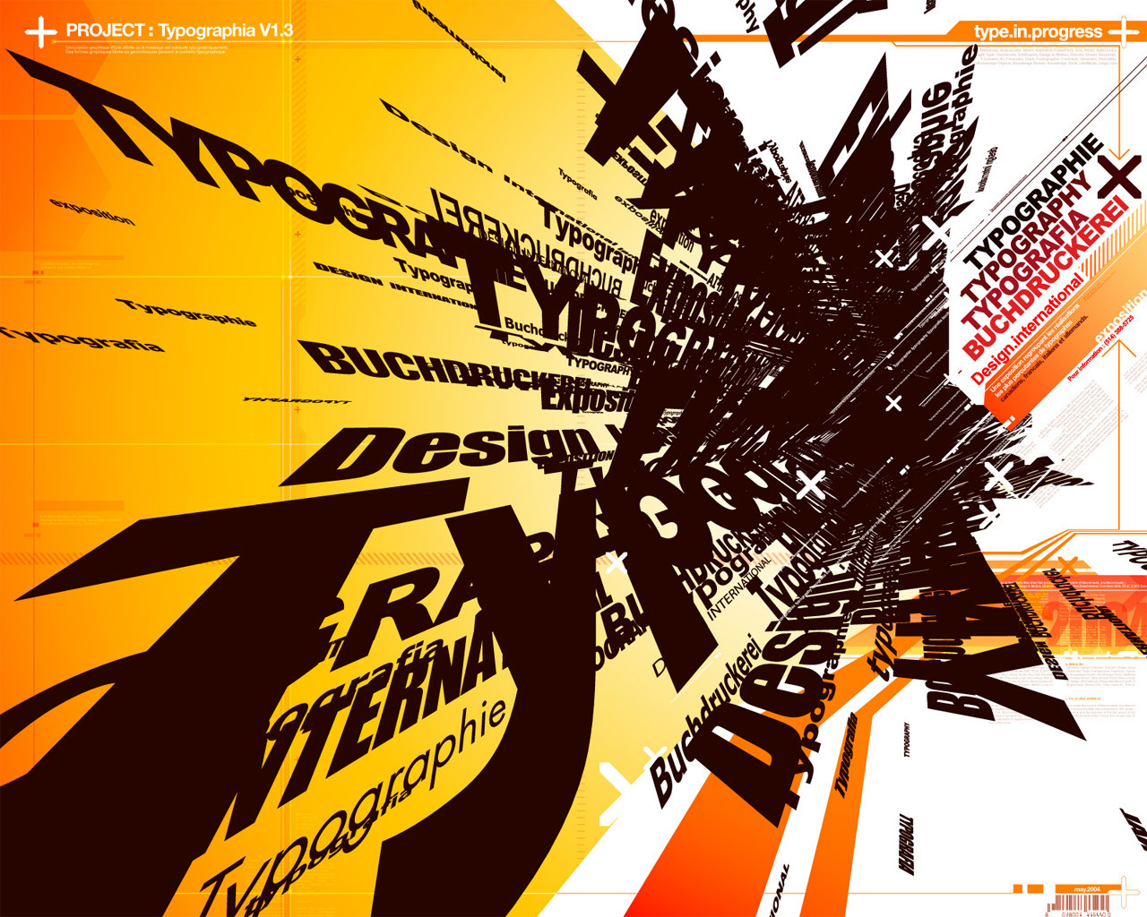
Description
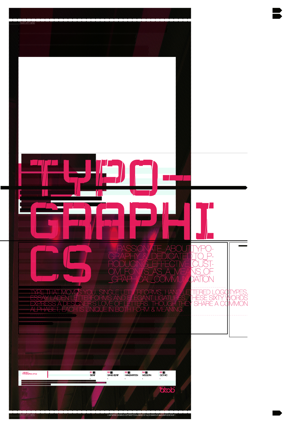
My student work. a bit poor huh? (Smile)")
Update 15 FEB 2008:
Featured via news [link] by
Update 20 AUG 2009:
Featured by on [link]
Related content


Comments: 149

 (Wink)")

")

Nah...its not poor. I like it. Nice job!
👍: 0 ⏩: 1

Great design, simple but beautiful!
👍: 0 ⏩: 1

very Bauhaus. I love it. I'm also faving it
👍: 0 ⏩: 1

thanks a lot! i am glad you love it!
👍: 0 ⏩: 0
PixelHex In reply to ??? [2007-04-09 07:11:50 +0000 UTC]
very nice. flawless and breath taking.
👍: 0 ⏩: 1

I actually like how you type set the words and letters and have it tilted at an angle. It looks great. *thumbs up*
👍: 0 ⏩: 1

Very good use of the bauhaus style. I feel the sheared "cybrer" text in the background is a bit distracting. The piece could be just as dramatic and still retain its depth without it. Good job.
👍: 0 ⏩: 1
I know it could be better by reducing different font size and font types.
But i have to do it according to the project requirement, i consider this as my basic.
👍: 0 ⏩: 0

Pretty innovative piece you've got here!

👍: 0 ⏩: 1


It might not be spectaular but I do like what you were trying to do.
👍: 0 ⏩: 1


Hardly poor, I think it's fantastic, really great typography, which tends by be badly underused. Nice one!
👍: 0 ⏩: 1

very good work. you said poor?! no... remember the bauhaus "less is more"
👍: 0 ⏩: 1

it's only black and white and font based only... so it's pretty damn good. like how you used sizing, positions and angle to make it cool
👍: 0 ⏩: 1


I like a lot, the tensions are well developed. I really enjoy it.
👍: 0 ⏩: 1
Yep, Im beginning with my own experiments with typo at class and you are a good example to follow. Im a bit more conventional for now. Maybe you could take a look of some of my works (I'll posted it soon) and give me your opinion, I'll be glad if you can pal.
👍: 0 ⏩: 1
would love to, cant wait to see!
👍: 0 ⏩: 0

i think this is a very good typography.. but u should add some colour
👍: 0 ⏩: 1
haha, u r right! but we are only limited with b/w inthis project. weird huh?
👍: 0 ⏩: 2

Be a rebell and add some colour, go on, you know you want to!
Nice work
")
👍: 0 ⏩: 1
this is a very old work, not planning to add on colors initially. I would reconsider about it, thanks! LD
👍: 0 ⏩: 0
a lesson in my school too.
We only allowed to play with type. boring huh?
👍: 0 ⏩: 0

considering it's only type and nothing else, and no color at all, i wouldn't say poor at all.
👍: 0 ⏩: 1
This is a lesson in my school too.
We only allow to play with fonts in this project. Really boring huh?
👍: 0 ⏩: 1
actually... not boring at all... i love words, letters, and fonts...
i also really love pens... yes, pens.
👍: 0 ⏩: 0
<= Prev |