HOME | DD
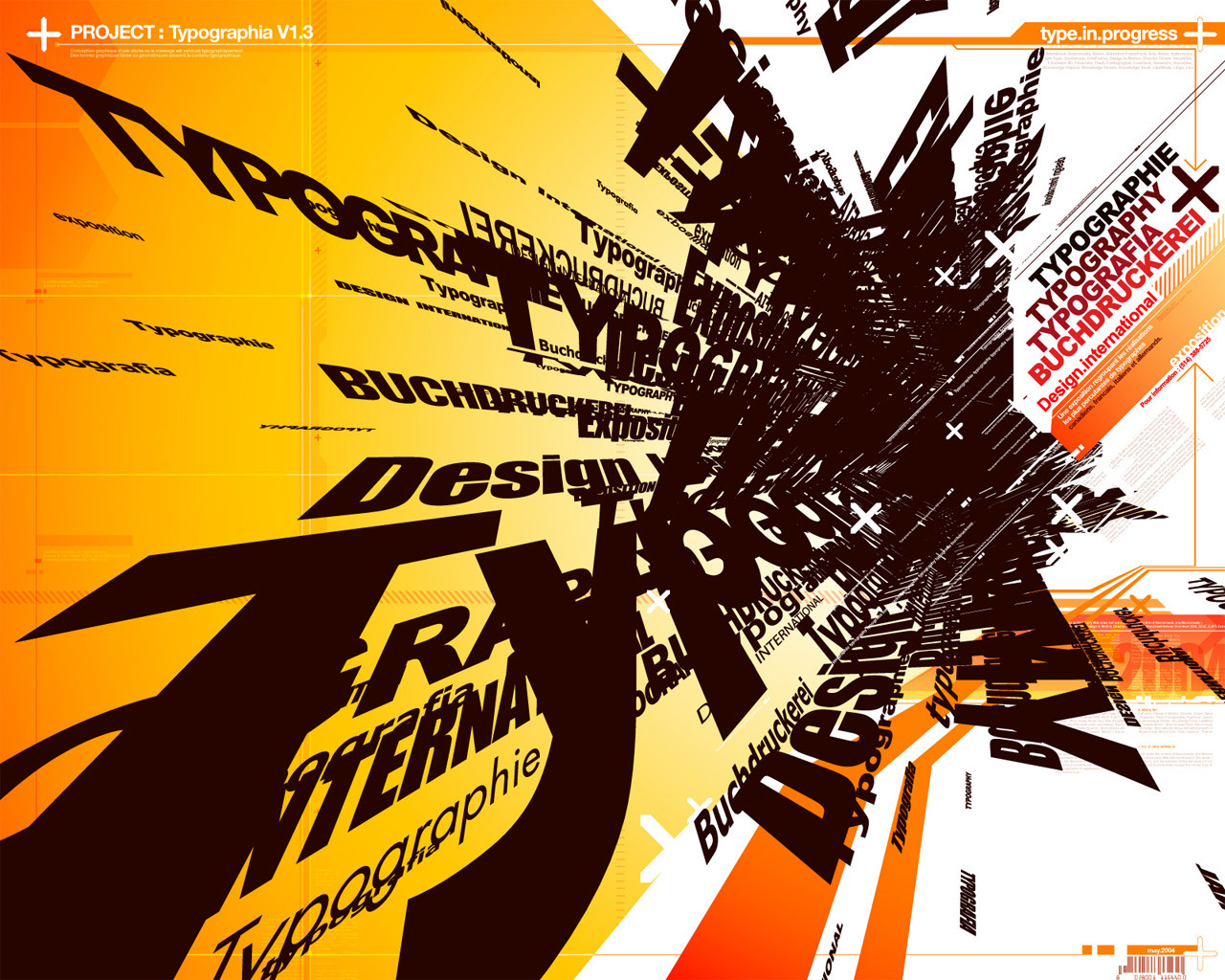
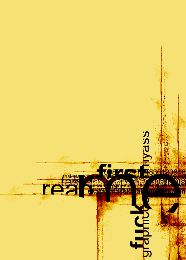
 yienkeat — Experiment of Typography
by-nc-nd
yienkeat — Experiment of Typography
by-nc-nd

Published: 2006-11-27 13:58:32 +0000 UTC; Views: 67268; Favourites: 650; Downloads: 46
Redirect to original
Description
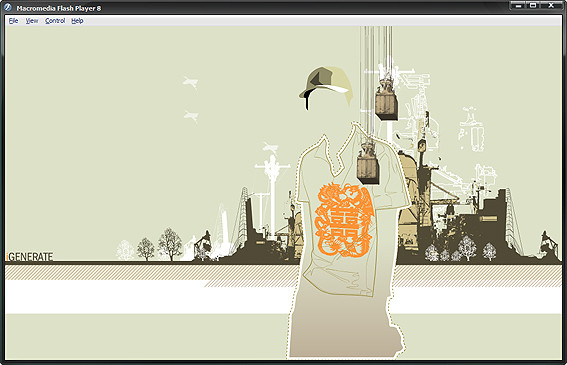
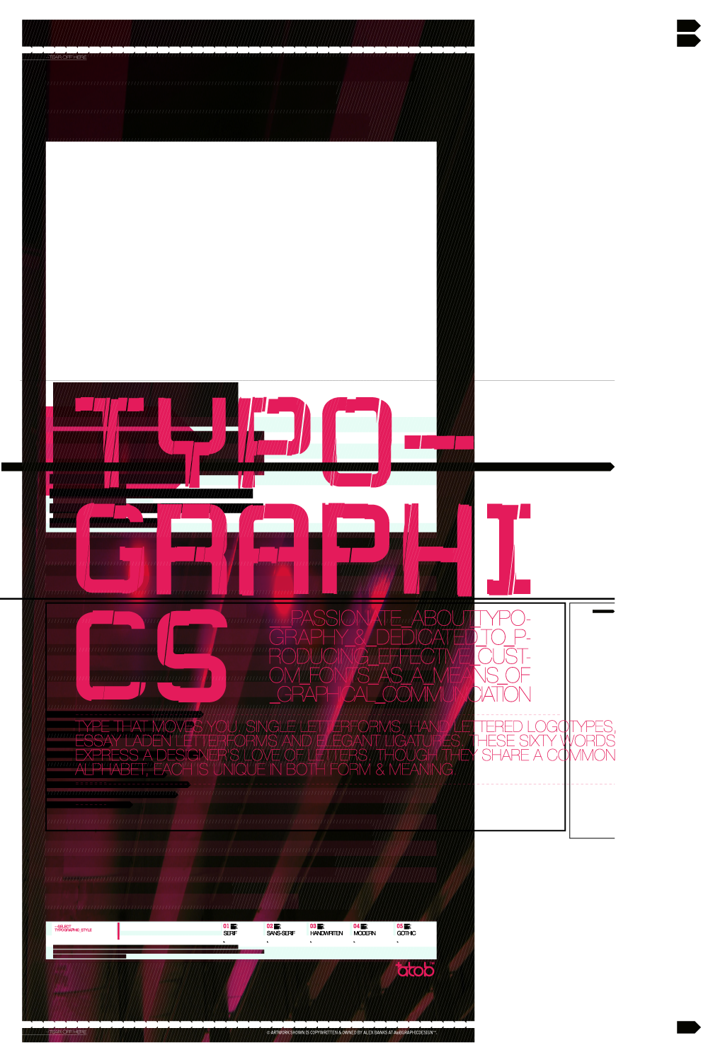
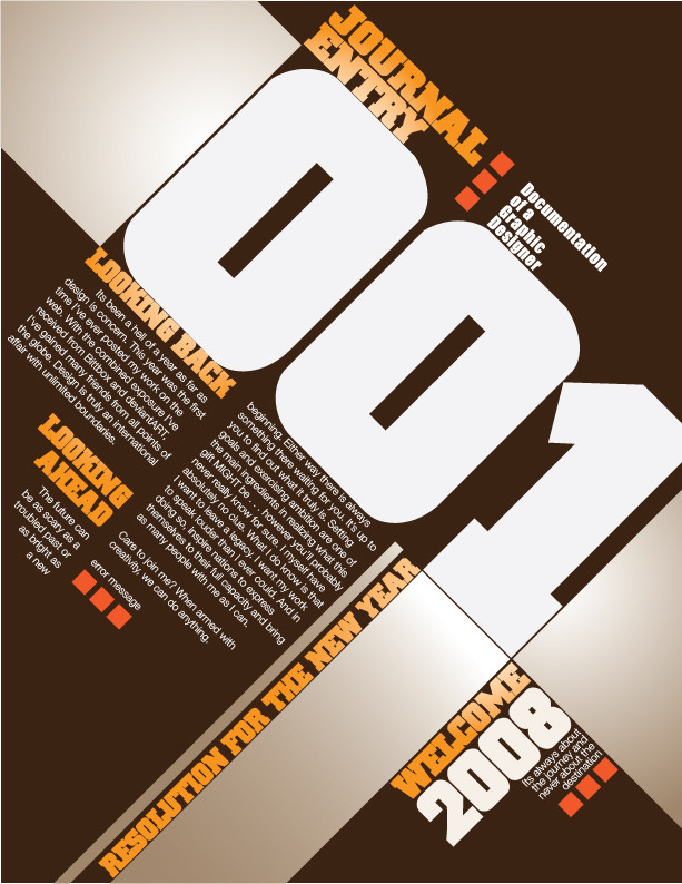
My student work. a bit poor huh? (Smile)")
Update 15 FEB 2008:
Featured via news [link] by
Update 20 AUG 2009:
Featured by on [link]
Related content


Comments: 149


Just To see the details more.
👍: 0 ⏩: 1

I see. I need to look back cause it was a very old work, probably 10 years.
 (Wink)")
👍: 0 ⏩: 0

brilliant composition. i love how dynamic it is and the contrast in font size and weight.
👍: 0 ⏩: 1
")


This image has been used in a blog post about typography. Hope you don't mind and keep up the great designs.
[link]
Dan.

👍: 0 ⏩: 1
that's my big pleasure! thanks a lot!
👍: 0 ⏩: 0

I don't think its poor! Like the most inspiration black and white type piece I have found!
👍: 0 ⏩: 1
thanks for the support, i will treasure this work!
👍: 0 ⏩: 0

nice typography applications!! I´m a little bit tired of so much colors and fireworks
cool!
")
👍: 0 ⏩: 1


sorry, i've forgotten 
👍: 0 ⏩: 0


| Next =>