HOME | DD
 Yokoboo — DBJ Line Test - In-Between

Published: 2017-07-25 11:08:37 +0000 UTC; Views: 515; Favourites: 24; Downloads: 0
Redirect to original
Description
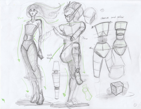
Due to migraines, I didn’t really have a lot of time to spare for the @doodleberryjam assignments this month- BUT I did work on this for a project of mine and since it’s all about line, I figured it’s relevant enough to submit/post.
In the comic project I’m working on, I decided that I wanted the art style to mimic traditional watercolors/markers and when I decided that, I knew I’d have to use something besides my default inking brush. On one hand time-consuming, on the other, fun and exciting because it’s an excuse to delve into the brushes I bought and like but haven’t had much excuse to use. When choosing to mimic traditional mediums, I knew the brush would need to be textured, and that while I don’t have enough confidence to use “lost lines”** efficiently I wanted the comic to give a dreamy/hazy feel, so the lines would need to be light for the most part. I also wanted to use black fill, another thing I haven’t had a lot of opportunity to do. So the brush I was looking for was something that could be light while still being compatible to sections filled in black.
**(”lost lines” being when you ink something and draw only the interior lines/shapes- containing/exterior lines aren’t drawn, letting shapes give the image form and blend into each other. EX01 EX02 It’s a very beautiful inking method that utilizes both positive and negative shapes)
**(I have no idea if that’s the right word for the technique, it’s just what I think I heard someone use and haven’t been using to refer to it ever since)
Because I hate having to redraw something if I’ve already drawn it once, I tricked my brain into being okay with drawing the same character in the same pose to compare brushes by changing the character’s wardrobe and hair to match their wardrobe/outfits for their outfit progressions/changes throughout the story. Which led me to the idea that it might be cool to change the linework between the two settings, to help the transitions between the two places be more apparent/clear.
Also if you’re interested in knowing more about this character/story, it’s a Patreon exclusive production (at the moment) currently in the scripting/conceptual design stage.


