HOME | DD
 zeruch — DamnLife David v4
Published: 2004-03-17 09:01:13 +0000 UTC; Views: 2016; Favourites: 62; Downloads: 538
Redirect to original
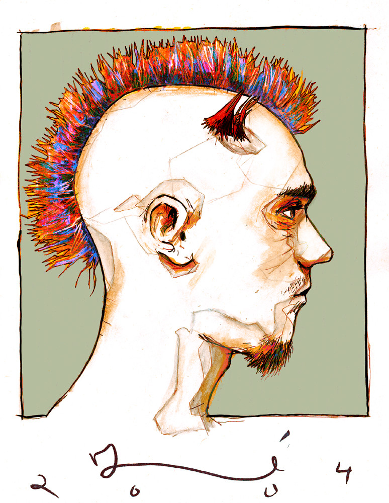
Description
as usual, i do a remix of each of these...here is one of two I did (the other may or may not show up, as its being a bit difficult)Related content


Comments: 30

that is hot,... the colors are so cool.. i would love to have a mohawk like thattt!!! hehehe.
👍: 0 ⏩: 0

Oh I just think I fell madly in love. Your colors are amazing.
👍: 0 ⏩: 0


Now this one sir... I would have to say is one of my favorites of yours. and will undoubtedly get a fave from me. Why? --- do you ask. well because good contrast of color across the entire composition and i enjoy how you tied it into the "framing" of the piece... great take on this. great job indeed.
👍: 0 ⏩: 0


This is definately one of my favorites from this series.
Very good.
And a nice choice of stock, as well, as far as pose goes.
The way you ran the neck into the border is really nice.
👍: 0 ⏩: 0

You seem to approach color without fear and your sketchwork is without hesitation and timidity as well. Incredibly strong work - I wish you many, many print sales!
 (Smile)")
👍: 0 ⏩: 0


the multicolored hair, the portrait view and the colors used here... its just very eye grabbing i find

👍: 0 ⏩: 0


")

fantastic piece love the composition, colours and fantastic linework, probably my favourite of your work.
👍: 0 ⏩: 0

")

Damn that hair looks awesome. I really like the colours but they don't seem to fit his pose. Or maybe that contrast of his rigid pose and eccentric colours and style was done on purpose?
👍: 0 ⏩: 1

it was very intentional...i think at a very subliminal level, i like to make thinks a little dissonant, just enough to where it's noticable, but not so much that it completely mucks things up.
👍: 0 ⏩: 0

Neet portrait, this one has sort of a more graphic feel.
👍: 0 ⏩: 0

interesting lines in the mohawk; excellent choice with the neon colors...
i really like how this feels like a quick sketch for a figure study class...
the coloring and shading are quite lovely..
great work!
👍: 0 ⏩: 0

As usual your line is fantabulously wonderrific. And everyone on the planet needs to view your work to see a GOOD EXAMPLE of signature integration.
👍: 0 ⏩: 0


Such awsome colours! You really have a way with them... Lovely lovely lovely!
👍: 0 ⏩: 0


this kicks ass. i love all the interesting lines running over his head.

👍: 0 ⏩: 0

*Dreamy sigh*
It's amazing how sophisticated and refined your work is becoming. This is the kind of stuff I can only drool over in art magazines!
The tiny bits of colour in the lines, the skritchy scratchy, the crazy, eye candy, hair mixy!
It's...so good that it's intimidating!
I truly think you're becoming an outstandingly original artists.
So yeah, keep up the good sheet mate!
👍: 0 ⏩: 0


I'm having seizures here. I'm probably getting on your nerves with the constant favs, but you have to understand, it's hard to resist.
👍: 0 ⏩: 0

that goatie rocks.
defintly impressive.
loving the colours you use... they compliment so well.
👍: 0 ⏩: 0

wow..thats pretty fantastic..(u dont use that word often)
👍: 0 ⏩: 0