HOME | DD
 zeruch — assembly by crisis v3

Published: 2004-02-27 03:22:46 +0000 UTC; Views: 3539; Favourites: 56; Downloads: 1530
Redirect to original
Description
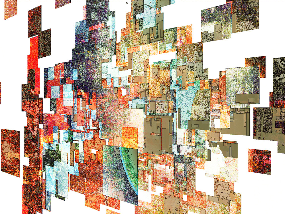
this is still in progress (some of the color seperation is not to my liking, but i am at a bit of an impasse and wanted to get it out for view before i change my mind for the umpteeth time and possibly scrap it altogether). this one is failry simple (only 3 layers) - 2 digital and onebase layer which is a scan of acrylic paint, screenprinting ink, and found objects onto a sheet of diazo paper.Related content


Comments: 41

I know little to nothing about creating visual art. I only got to your portfolio by initially viewing your portrait of Joe Henderson (very cool),
I can't take my eyes off of this.
👍: 0 ⏩: 0
I know nothing of visual art. I only got here through an initial viewing of what you did with a Joe Henderson portrait (very cool by the way).
I can't take my eyes off of this.
RSM
👍: 0 ⏩: 0


👍: 0 ⏩: 0


if you stare at it long enough it looks like 3d hahaha or maybe that’s just because I’m tired.
u know in the 30s during the depression the government bought hella artwork for people to boost the economy and well they just had tons and tons and tons of work and i guess after a while they had so much they ended up just auctioning every thing off in bundles for like extremely cheap. There were some amazing pieces from some extremely famous people in the bundles and crap. They just sold the crap just to get a tad bit of money back it was basically the price of the canvases and that’s about it.
👍: 0 ⏩: 0

I love the fractured nature of the picture, it's complex, yet uncluttered and to contradict myself, very simple at the same time.
I find the texture and the colours attractive, seductive even.
The way it looks like a perspective of a surface and suddenly changes to a plan or an elevation view of it.
I'm intrigued by it and wish I could touch the surface, a delightful picture, would love to see the finished version of it.
I know it can be odd, that people like something you're about to throw away or don't care for much, I'm surprised when it happens to me, can't explain it, perhaps it's something that needs to be left unexplained. It just caught my eye and my eyes enjoyed looking at it.
I don't remember how I came across your page, but I loved looking through your drawings as well, superb line work and the subjects are wonderful.
I find your work refreshing; it's odd that I never came across your work before.
-k
👍: 0 ⏩: 1

thank you for the exceptionally well written and thought out commentary.
as far as having not bumped into my work before (I am assuming you are accounting for the nearly stupid volume I produce), i really still view myself as a very small niche artist here at DA. My few prints are not sellers, I have fairly low page views per work (compared to the number of people who devwatch me...which I attribute to people liking one of my approaches but not liking any of the others, so I think I have several smaller niche audiences and many folks probably think I am more than one artist here....the result is I actually -and for the most part happily- travel under the radar of most folks)
👍: 0 ⏩: 1
I personally enjoy travelling under the radar, not that what I do is really eye catching or fascinating to anyone but me.
Your work that I've seen, I like, and I enjoy seeing a diverse range of picture, if it all looks similar I tend to lose interest... just like with my work.
Despite my absence, I support your work, I might get around to commenting eventually.
I don't get much time to think and write & hibernation has become my current hobby.
-k
👍: 0 ⏩: 0

this must be of the finest work I've ever seen on DA .....
really awesome.
👍: 0 ⏩: 0

Wow, nice work on making all those cubes.. Sort of reminds of the movie HyperCube (Cube2)... And the color and contrats makes it look kinda stick out like the green and the orange.
👍: 0 ⏩: 0

Gorgeous piece man, and glad to see you on the front!
👍: 0 ⏩: 1
thanks. surprised the hell out of me.
👍: 0 ⏩: 0

these abstracts are so cool. amazing colors and composition, not to mention texture. you make tons of these, yet they are all so different and have their own sort of mood and style, their own 'life' almost. very cool...
👍: 0 ⏩: 0

 (Smile)")


whoa..the colors are very vivid...and fall like....in the center...is that a man being crucified? it reminds me of jesus on the cross...
it's creepy...but beautiful, in a sad, lonely sort of way, though ethereal o_o
👍: 0 ⏩: 0


WOW! I really like this! It reminds me of a city street...I guess because of all the colors and shapes. Kinda like the hustle and bustle of the city...

👍: 0 ⏩: 0
holy jeebus, i didn't expect this strong a reaction to this...
👍: 0 ⏩: 1

Well it's a very strong piece visually

👍: 0 ⏩: 1
i'm still trying to fathom how the hell this thing became so popular (its my first 'up on the DA front page' daily deviation thing). it's like canon law..."anything zeruch thinks will go over well, won't go over well, and anything he doesn't, will."
👍: 0 ⏩: 0

The colors shine (heh) on this one. The best part has to be the dark contrast towards the bottom in comparison to the lighter colors on top.
👍: 0 ⏩: 0

wow it has awsome depth I love the colors and well every thing about it!
I don't know how you did it but, kick ass job!
# 

👍: 0 ⏩: 0

heh, spotted this from the front page
its beautiful, i hope you dont decide to edit it... if you do feel the need, maybe a version4?
 (Wink)")
👍: 0 ⏩: 0

what you do with how you do it=eye sex..heh
i love all the different levels in this..beautiful done, my friend
👍: 0 ⏩: 0

Simple, yet so intricate and creative. This would be a great print.
👍: 0 ⏩: 0


i like this!
i dont know why, but to me this is a beautiful "velve"!
👍: 0 ⏩: 0

great use of space and colors im loving this one.. it looks like layers of walls DOpe!
👍: 0 ⏩: 0


i can't believe you did that with digital (or mostly digital). love the textures.
something about the composition seems a little off. the bottom right corner feels a little empty. there is all these bright colors in the top left corner that tend to draw your eye up to that side and right out of the painting. maybe you could throw something into that lower right corner to draw the viewer back in.
i really like the concentration of reds that you've used.
marvelous
👍: 0 ⏩: 1
its not mostly digital....its very much a hybrid. i can't get the textures and dynamism without analog, but i cannot get the finished result without digital. i actually have a problem not with the contrast, but certain hues that I can't seem to balanec in a way I like.
👍: 0 ⏩: 0

cool! i am inspired! it looks like a fricken cool city scene

👍: 0 ⏩: 0


Man I wish I had your eye. Such great balance of tones and textures. It's really something for a work in progress.
👍: 0 ⏩: 0

It reminds me of a quilt, but a modern version that is kind of cubic. I like it--awesome awesome textures
")
👍: 0 ⏩: 0