HOME | DD
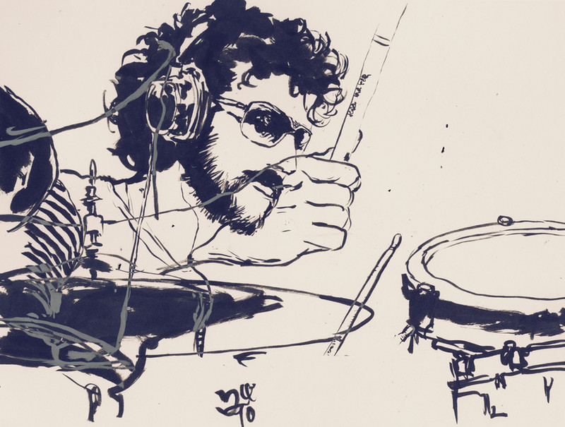
 zeruch — internal puzzle v6

Published: 2005-06-13 01:41:41 +0000 UTC; Views: 5808; Favourites: 198; Downloads: 641
Redirect to original
Description
Sitting for quite a while on my archive HDD, this has been meant to be submitted for quite some time. It is the natural offshoot of thisPer usual, a random mix of analog and digital media were slapped, whipped, beaten about the face and torqued into submission to get here.
Related content


Comments: 56

please email the request to joseph.arruda at gmail dot com and I'll formalize the allowance.
👍: 0 ⏩: 1

Hello, I have sent two emails to the above address and have not yet received a response (first one was sent 2 weeks ago). Could you let me know if you have not received it. Many thanks.
👍: 0 ⏩: 1
I responded to your email earlier today. Please let me know if it did not arrive.
👍: 0 ⏩: 0


This piece is being featured here: [link] If you want your piece removed please let me know. Thank you.
👍: 0 ⏩: 0
looks really great.
I like the way it seems so layered and transparent.
👍: 0 ⏩: 0

did you use a ruler or tape to get the lines so clean/straight, or was it through ps?
nice work, nice gallery.
👍: 0 ⏩: 1
did you use a ruler or tape to get the lines so clean/straight, or was it through ps?
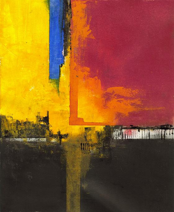
None. The geometry was done in Bryce (using scans of textures I did on bristol) and output as a raster/2d .psd, then edited with other handmade textures in PS.
👍: 0 ⏩: 0

You know one of the things i love about deviant is the great chence it gives to reach people who has already done things you are just creating in your imagination, this is a great composition!!!
👍: 0 ⏩: 0


very nice work. I am so impressed with your use of colour. Great work.
👍: 0 ⏩: 0

i dont really know how much time i spent watching this.. or maybe i should say 'in this'... becouse i felt like being in a somekind of 3 d megaroom, which is as big as a country, an these some sort of puzzleclouds were flying over the top of my head, and then i realized it was not over the top of my head, but right inside my head... it was-- my puzzling mind, the puzzle-like colors my toughts and realizing that finally got me out. I really dont know how much time i spent watching this.
👍: 0 ⏩: 0

I'm lost in its complex simplicity from light to bright to deep and dark.
amazing work.
👍: 0 ⏩: 0

")

 (Smile)")

I'm not so much into this "way of painting', but I'd be really curious to see it printed, or on board.
The strenght of this red and the other colors create an interesting vibration.
👍: 0 ⏩: 0


i love the layered distortion... it's like looking through a hall of mirrors, or a kaliedescope...
👍: 0 ⏩: 0


the coloorrrss 
I am in love with all your abstract pieces, but this one is just awesome
👍: 0 ⏩: 0


I have been browsing through your gallery for quite a while now, and I have to say that your abstract pieces are my favourite out of your entire gallery, especially this one.

👍: 0 ⏩: 0

This... would look spectacular on a huuuge wall in a ritzy lounge or club.
👍: 0 ⏩: 1
If you know of any, please feel free to drop my name to their decorator
👍: 0 ⏩: 0

Its like a blue summer day is exploding through a sunset cityscape (alliteration is good) Really awesome.
👍: 0 ⏩: 0

if i were you i'd put this on your wall very very large

👍: 0 ⏩: 0

I had to come back and mention that this has been my wallpaper since the day you submitted it, and that is a record. For someone who switches their wallpaper once every few days or so, it's amazing that one has stayed this long.
I just can't take my eyes off it. All the textures, the colours..mmm.
👍: 0 ⏩: 1
Well thank you kindly. Glad it has been of use.
👍: 0 ⏩: 0


There's something about this one that makes it seem ten times larger than it actually IS.
And I love the strange way the overlapping layers seem almost transparent.
And the way that in one moment, this is entirely flat, then the next, I travel right into it.
Your ability to handle what almost seems like utter chaos and create a strange sort of harmony is nothing short of astounding.
Oh yeah, and I'm a total sucker for these colours, as usual!
👍: 0 ⏩: 1
There's something about this one that makes it seem ten times larger than it actually IS.
Alas, it is but a lonely 8.5" x 11" original.
👍: 0 ⏩: 0

Lovely. I love all the forms and the vivid colours.

👍: 0 ⏩: 0


You're making these abstracts seem so effortless...it almost makes it hard to truly appreciate them. Almost. The amount of work you submit makes me ashamed of myself, thanks.
👍: 0 ⏩: 1
Ashamed of what?
I push a lot of stuff out because I have had 2 decades of hammering at this stuff to cut out a lot of inefficiencies in the way I work, as well as find methods more natural (hence able to get my ideas formed/developed faster), but that in and of itself does little to assure the quality of the work I produce.
That is still largely a crap shoot.
👍: 0 ⏩: 1
Haha, just ashamed that I'm not working as hard and getting so much work uploaded on here.
👍: 0 ⏩: 0


I hadn't noticed the white rectangle until ~negmass pointed it out, but now I agree- it might be better toned down very slightly. But anyway- this is fantastic. To me it has the sense of rapid motion which has suddenly been frozen, possibly in a snapshot.
👍: 0 ⏩: 0

Like most of your abstracts, I love the colors and composition. I have one thing though about this piece that bugs me. That one stark white rectangle upper right sticks out a little too much for my taste. It keeps drawing my eye to it. Since for me anyway I found it distracting and sort of kept my eye from efficiently searching the image field, I have to say that it detracts a little from the over all composition. Just a little constructive critique, take it for what it's worth.
👍: 0 ⏩: 0

Beautiful. I like the sense of perspective as well as the combination of all the graphic squares of color with the paint textures... It's very pleasing to my eyes.
👍: 0 ⏩: 0


i think this is the first of your more abstract stuff that i've really really liked. i liked other ones...just not as much as this. the colors/contrast and how it looks like it leads to the left. perfect. keep that shiznit up.
👍: 0 ⏩: 0
i think this is the first of your more abstract stuff that i've really really liked. i liked other ones...just not as much as this. the colors/contrast and how it looks like it leads to the left. perfect. keep that shiznit up.
👍: 0 ⏩: 0


Some sexy depth, there. Firey scheme, too... which seems a bit florrid.
👍: 0 ⏩: 0

ever been to a party and watched someone walk in who grabs your attention and you just cant take your eyes off them as they walk through the room?
well thats what the blue in this does to my eyes

👍: 0 ⏩: 1
ever been to a party and watched someone walk in who grabs your attention and you just cant take your eyes off them as they walk through the room?
Yes, when I walk past full length mirrors and notice I have a stain on my tie.

👍: 0 ⏩: 1
only you could come up with a response like that!!
have a blast at the summit btw, ill be with you there in spirit

👍: 0 ⏩: 0

| Next =>