HOME | DD
 zeruch — collide0scope III v2

Published: 2003-11-23 00:06:39 +0000 UTC; Views: 2959; Favourites: 50; Downloads: 273
Redirect to original
Description
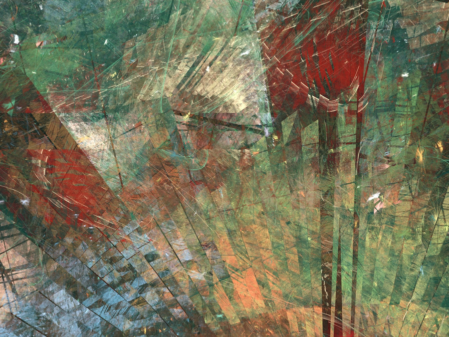
a fairly abrupt and probably too aggressive colour schema, but it felt right.complementary to [link] & [link]
acrylic paint, acrylic ink + digital
Related content


Comments: 28

Like it a lot!!! I dont find the colours aggressive, I think the form is, but in a good way!
👍: 0 ⏩: 0


A styrofoam ball with straws sticking out of it. I'd buy it if it were a print...

👍: 0 ⏩: 0


very nice piece.. I have trouble figureing out what you did on the computer and what you painted ")
👍: 0 ⏩: 0

Make this a print.
Goddamnit.
How can I have missed this?
Two words...
"Fucking intense."
👍: 0 ⏩: 0

how long did that take, exactly long enough I guess. damn that kick my ass It makes perfect sense to me- its awesome 
👍: 0 ⏩: 0

the paint dusty brown & blue, at first it looked like earth, well it looks good, all i can say , i know it doesnt make sense , deal with it Joe, your master, and creator
👍: 0 ⏩: 0

whoooa.... thats a LOT of colour there... I love the background! It's almost better than the streaking colours themselves (what the heck AM i supposed to call those???  (Wink)")
Steller

👍: 0 ⏩: 0

I love the colors and the perspective is great! Love it!
👍: 0 ⏩: 0

holy crap, another unbelivable abstract ")
this is simply awesome
FAV!
👍: 0 ⏩: 0


excelent colours and textures
im getting quite a retro vibe from it...
👍: 0 ⏩: 0

great work here. the colors are very pleasing to look at in those rod shapes, and set against what appears to be the earth seems to make sense somehow.
👍: 0 ⏩: 0

Hm. Acrylic ink. I wish I could see and use some. This is very strong. There's just atitude inside this. Lovely job as always.
👍: 0 ⏩: 1

im sure youve seen plenty of it. koh-i-nor and rotring are primarily what I use but its a pretty common material (Windsor & Newton makes a popular line of it as well). its just a waterproof, color-fast ink that mixes well will acrylic paints in sometimes pretty odd ways. in cases like these i use it to help create tonal shifts (i.e i will apply some paint, then drop a little ink onto that and being braying or moving the paint with a palette knife or stiff brush to get the sense of motion you sometimes see in these (for example, if my base acrylic paint is a verdant green, i might apply some lemon yellow ink - the varying viscosity of the paint and ink interact in interesting ways and the colours bleed into themselves in a way I like.
👍: 0 ⏩: 0

Very very cool. you must do a tutorial sometime soon, mate!
👍: 0 ⏩: 0

it feels completely natural.
you are like an art machine!!!!!! what do you eat for breakfast that lest you do all this work????
👍: 0 ⏩: 1
used to be gallons of coffee for breakfast...now its gallons of morroccan tea. caffeine and low sleep are the only way to maintain this level of production.
👍: 0 ⏩: 0

You've acheived a wonderful (and quite inventive) colour harmony in this peace. None of the colours you've used feels odd or out of place, and the piece as a whole, of course, is wonderful as always. Keep up the great work!
👍: 0 ⏩: 0

How the hell do you make these peices...
Whatever you're doing, keep it up.
I looks awesome...
👍: 0 ⏩: 0


Really cool sense of motion and pretty epic looking... like.
👍: 0 ⏩: 0

kinda looks like earth being atacked ... a sci fi-ish feel to me ... in a strange way ... i make odd connections i know
👍: 0 ⏩: 0

looks like invisible rockets shooting out from the earth. very loud and the cylinders really bring out the movement being loud in colour. red does make me think aggressive but a second look can look like love.  (Smile)")
evn
👍: 0 ⏩: 0

I dig it. The wild colors feel perfectly at peace here.
👍: 0 ⏩: 0

Geez. I don't know how you do these, but these are the coolest looking things.
👍: 0 ⏩: 0