HOME | DD
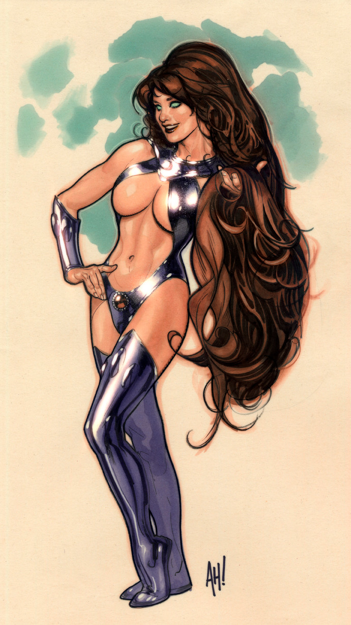
 AdamHughes — Power Girl Issue 2 Cover

Published: 2009-03-04 03:26:58 +0000 UTC; Views: 146128; Favourites: 2915; Downloads: 17358
Redirect to original
Description
This is my second POWER GIRL cover. As with the first one, these are variants; the book is actually being drawn by Amanda Conner and she rightfully gets the main cover.This is one of those exercises in creativity to get the job done. The end of February was a tad nightmarish; being the shortest month of the year, I was closing on a house, and I had MegaCon to head off to the day after closing.
I needed to hand in a Power Girl cover before I left, and I needed it to look decent. There wasn't time for anything elaborate or full of backgrounds. One option is to do a rougher cover like the one I did for CATWOMAN 79. Looser inks, less rendering, but still throwing in a background full of details.
The other option is: do something designy and graphic. All I had time for was a nice shot of her standing there, so I thought it'd be eye-catching of the parts of her that are lit by direct lighting are kind of washed out, but she is standing in the shade of her own logo. My art director kinda liked the idea, so the end was result this quickie.
17" X 21" pencil & ink on Strathmore series 300 3-ply illustration board, with digital colors in Photoshop CS2.
Related content


Comments: 282


")

I love how she floats on the white background. Her right arm has no edge. Beautiful!
👍: 0 ⏩: 0

Adam you are a talented man! Keep drawing those lovely ladies!
👍: 0 ⏩: 0


I like how the light and shadows make her breast seem bigger than they are.
👍: 0 ⏩: 0


Sweet cover man! I got the Power Girl: A New Beginning and your cover is there!
👍: 0 ⏩: 0


Fantastic job! This would make an excellent poster or even a life-size standup display.
👍: 0 ⏩: 0


This is one of my fav. PG pics. I bought this variant comic cover as well.
Can't help but admire her beautiful bust. this pic was nic enough for a statue to made from it.
👍: 0 ⏩: 0

Seeing this, I seriously consider of petitioning DC to re-name her into something like:
"Heart-Attack Girl", or "GASP", or "OMG...irl", or "The Stun!", or "Spotlight", or "Eyesuphere-Girl", or "Men-Trap!"...
👍: 0 ⏩: 0

Putz grilo!!! Caraca!!! Tá foda isso. Sem palavras.. (No words..) ¬¬
I back to my home no more coments.

👍: 0 ⏩: 0


very nice work but i thing lighting is not perfect
👍: 0 ⏩: 0


I love the smootheness of the piece and SPECIALLy the fact that there is no BLACk outline which Im soo used to.
Ill definetly have to try it out sometime.
FAVED
👍: 0 ⏩: 0

Gotta luv dem bewbs!lol In truth though I think they could do more with her though....
👍: 0 ⏩: 0

You are officially my favorite Deviant Artist. My biggest respects
 (Smile)")
👍: 0 ⏩: 0


the dreaded boob window of doom!
but wow, this is lovely, especially considering how little time you had to complete it.
i can draw fast and all, but damn. every time i start to feel my ego inflate a little, i just pop by and look at some of your work....it's quite humbling!
👍: 0 ⏩: 0

Awesome and clever as hell how you used PG's logo to shade her face.
I don't have photoshop cs2, but I color like Adam Hughes.....when he was 2.
👍: 0 ⏩: 0

she's totally my boyfriend's favorite DC character... mostly because she has giant spotlit masterfully rendered titties.
actually y'know i'd probably do her too.... o_O
👍: 0 ⏩: 0


As ALWAYS - incredible work to say the very least.
And yes, I too am looking at her eyes.
👍: 0 ⏩: 0

Well its you and Amanda that are my top 2 PeeGee artists. So its just pure Win x2 for me.
👍: 0 ⏩: 0


Hot! I love this one, m'man. Her eyes actually distract you from the magnificent breasts. And, THAT is a compliment. The lighting is neato, too!
👍: 0 ⏩: 1

Thanks, man, I appreciate it, coming from you.
(Check out his gallery, kids)
👍: 0 ⏩: 0


Very beautiful, Adam! Your girls are wonderful...BRAVO!
👍: 0 ⏩: 0

Gorgeous and delicious !
Any chance to see our Emma Roberts by you, Adam ?
[link]
Cheers !
Olivier.
")
👍: 0 ⏩: 0

btw ur hole power girl logo castin the shadow on her is freakin genius dude
👍: 0 ⏩: 0
hoss dis reeeal bad dude frik i hate u adam i hate u!!!!! keep doin work tho! hatein is gud
👍: 0 ⏩: 0

this is wonderful! I love powergirl, and you do her right.
The dark expression in contrast with the rest of her is really striking.
👍: 0 ⏩: 0


Hi just browsing through the sections and I came upon this. With such heavy digital attention I don't think it's fair to categorize this as traditional work.
I like the upper third of this image the best. There are dark colors, a range of contrast, and it's not overwhelming to look at.
I would have liked to see a background. I don't like the skin/floodlight rendering thing going on. It feels inconsistent without a full range of contrast to go with it. For example the cape has twice the range of her gloves, and black is absent from 2/3 of the image.
👍: 0 ⏩: 1
Thank you for your comments.
I am at a quandary as to exactly how to categorize my comic-book cover work, as they are mixed-media between pen & ink and digital coloring, and while it might be unfair to categorize my stuff as traditional, it's also unfair to categorize them as digital. They are a combination of both and DA doesn't have a category for that. I will continue to post as I do until DA comes up with a wider range of categories or they force me to re-categorize.
While I am not in the habit of defending the stuff I drew, as it is fruitless to argue intent, constraints, and artistic license with a stranger (because the best you can hope for is a deadlock like "Well, I still don't like it" and that's just a waste of time), the intelligence of your critical comments encourages me to respond.
This Power Girl piece is a comic-book cover, intended to help sell issues of a DC Comics comic-book; all other considerations as a work of art are secondary. As it was created under the constraints of a dangerously tight deadline, I was forced to make creative decisions that somehow enabled the main priority (the sale of the comic) to be fulfilled.
A background (which you would have liked to have seen) isn't always necessary. The majority of comics out there have covers that are garrish, over-rendered, and feature all the colors of the rainbow. Having an all-white background on a cover can make your comic SCREAM "Come look at me first!" from across a comic shop. It can be overused, so I tend to save it for emergencies. This cover was just such an emergency; it HAD to be done in a couple of days. So, there's no background for a reason.
You don't like the skin/floodlight thing going on; you would prefer a full range contrast to go with it. You cape has twice the range of her gloves, and black is absent from 2/3 of the image. I can't help you here. Your personal preference that you require full tonal range across an illustration isn't going to be altered by anything I have to say. Time was tight, and I made a decision to facilitate getting the job to my client on-time. As Power Girl wears a white costume, I felt that a white costume against a white background delineated by a black line could be visually dull, so I decided to go for a 'Coles Phillips' knock-out effect, where the foreground whits and backgroun white have little of no delineation. With that design idea in mind, the idea of blowing out the highlights seemed like the way to go. I didn't want to do that to her face, however, so my art director & I came up with the idea of her standing under the logo with her face being shadowed by it. Losing the blacks except for her head & shoulders helps sell the notion of the light washing out the image, and keeps the attention up near her face where I want it to be.
I would have liked to render the gloves as much as the cape, but I was up against the 5 o'clock deadline.
I realize that a majority of deviations posted are works that are created by amateurs and enthusiasts who have the luxuary of time. Those of us who are working professionals don't always have the same luxury, but still wish to share the work with the world at large, warts and all. I only say this because I know I will get more than a few notes about sounding defensive in my rebuttal or how I should let the work speak for itself. Normally, I don't comment in such a way, until called to the carpet for doing things wrong or in a way that disagrees with someone's persoanl taste. Then, I'm forced to explain why I did what I did, and the decisions I was forced to make. I've also learned that if you don't say everything in one giant post, you will get more people down the road asking questions that have already been answered or have not understood what you meant because of brevity. Consequently, you get one giant post from the artist.
Thank you again for your thoughst and insights.
-AH!-
👍: 0 ⏩: 1
Yours was the most detailed response I have ever received. It was in-depth and professional, I respect that very much.
👍: 0 ⏩: 0
| Next =>