HOME | DD
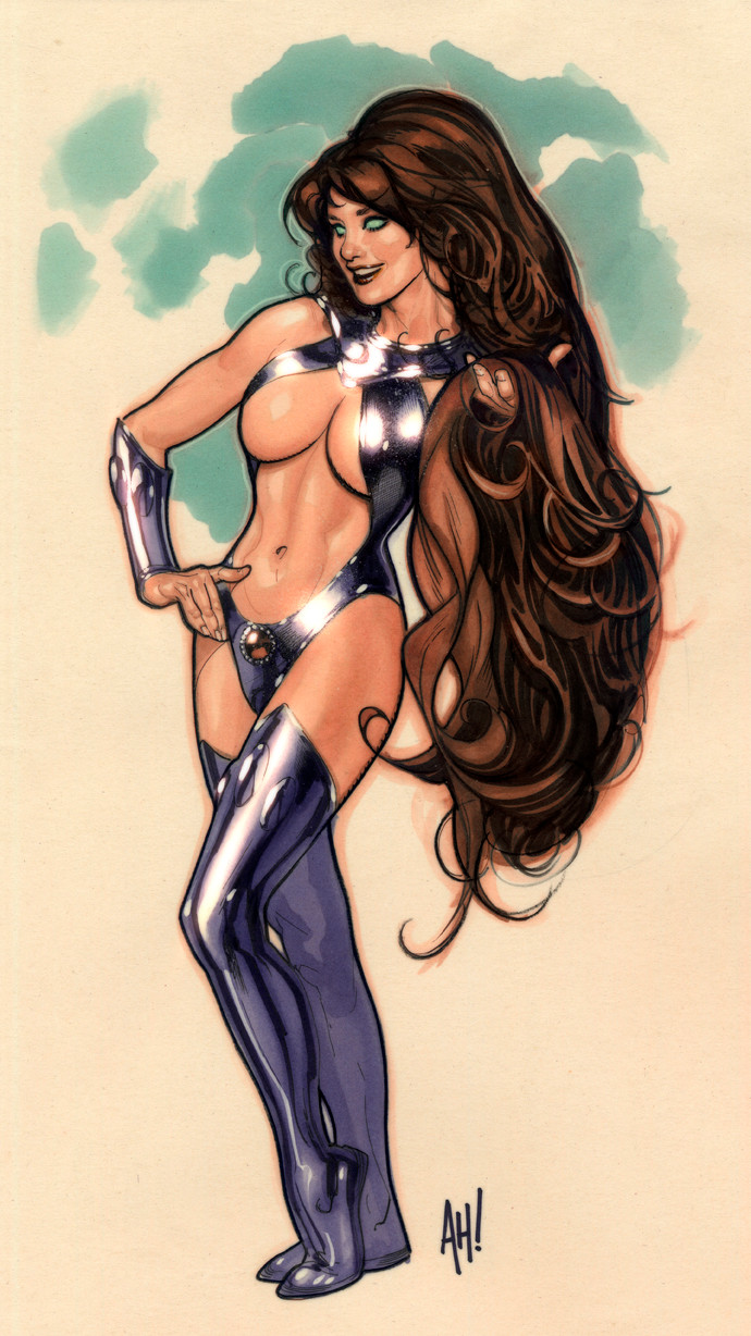
 AdamHughes — Power Girl Issue 2 Cover

Published: 2009-03-04 03:26:58 +0000 UTC; Views: 145652; Favourites: 2921; Downloads: 17357
Redirect to original
Description
This is my second POWER GIRL cover. As with the first one, these are variants; the book is actually being drawn by Amanda Conner and she rightfully gets the main cover.This is one of those exercises in creativity to get the job done. The end of February was a tad nightmarish; being the shortest month of the year, I was closing on a house, and I had MegaCon to head off to the day after closing.
I needed to hand in a Power Girl cover before I left, and I needed it to look decent. There wasn't time for anything elaborate or full of backgrounds. One option is to do a rougher cover like the one I did for CATWOMAN 79. Looser inks, less rendering, but still throwing in a background full of details.
The other option is: do something designy and graphic. All I had time for was a nice shot of her standing there, so I thought it'd be eye-catching of the parts of her that are lit by direct lighting are kind of washed out, but she is standing in the shade of her own logo. My art director kinda liked the idea, so the end was result this quickie.
17" X 21" pencil & ink on Strathmore series 300 3-ply illustration board, with digital colors in Photoshop CS2.
Related content


Comments: 282

Don't call me pervert, but I wonder how this girl makes to show THAT MUCH without a nipple... I guess she doesn't has.
👍: 0 ⏩: 0

Adam, you know I love your work, and that I adore everything you do. This works here... but I'm not convinced by the gloves. I can see the washed out look with the white bits of the suit and her belt, too, but I don't know what it is about the gloves that looks less like it's washed out than it it does just not as finished, which is odd, because the blues are exactly the same damn color as the belt blues. Honh... Weird.
BUT.
Again. Still fantastically amazing. Still so very lifelike (even with the giant bewbs), and as always, you're an inspiration, so... yeah. Yup.
👍: 0 ⏩: 0

Nice work! cool detail, subtle colors, and nice shade of the logo on her... Works nicely!!
Porps!
👍: 0 ⏩: 0


I also loved the idea of the shadow of the logo! Too bad the logo doesn't have more "holes" in the for the light to come through. I think it would look even cooler if there were more spots of light on her face/neck...
👍: 0 ⏩: 0

Adam other great pice composition of colors and draw very classic ^^
👍: 0 ⏩: 0

how do you take a character I care nothing about and make it look soo damn good, and seemingly effortlessly at that???
Hmm?
How long is that contract that you signed with Mephistopheles anyway?
👍: 0 ⏩: 0


cool drawing but where is that cast shadow on her head coming from?
👍: 0 ⏩: 1
 (Smile)")
oh Ok that's what I figured you got some awsome work by the way I'm hoping my skills will be there one day also I'm wondering do you have a formal art education?
👍: 0 ⏩: 1

Thank you for your kind words.
I am informally trained; I am self-taught.
-AH!-
👍: 0 ⏩: 1
Great do you actually answer notes Adam, i've wrote you several times.
👍: 0 ⏩: 1
I try to answer as many notes as I can, but I get a LOT.
👍: 0 ⏩: 1

Amazing how perfect is the design of this apparently simple pose. Not only the overhead shadow, but all the lights and shadows on the body create a very elegant design. Bravo!
👍: 0 ⏩: 1
That's always the trick, I feel. You can hand in a simple piece of art, as lon as it has so kind of bit of wit, whimsy, or imagination that keeps the viewer slightly in thrall....
👍: 0 ⏩: 0


logo? what logo ?
oh, okay, I get it now

👍: 0 ⏩: 0

wow....very nice...and i mean nice
👍: 0 ⏩: 0


that was a cool concept putting her in the shadow of her logo. you should change her name to "powerbosoms"! tig ol' bitties!
👍: 0 ⏩: 0

This looks great, she's pretty too
👍: 0 ⏩: 0

How I wish to attain that... A relative simplicity, relatively little number of lines... But a full realization of realism. Every piece I see from you is a pleasure, Mr. Hughes.
👍: 0 ⏩: 1
Man, it takes big brass balls to go simple on a composition. I don't have 'em, so I was forced into the simplicity corner out of desperation.
👍: 0 ⏩: 0

I know powergirl always had bigger sized boobs but who was it that eventually gave her those whoppers. Was it you?? Either way it was a pinnacle in my eyes. I don't even need a story with Powergirl just T & A. Sorry for being a goon just being honest...lol.
👍: 0 ⏩: 2
Actually, Power Girl's ample bosom is the result of the mad wit of a brilliant artist, the late Wally Wood.
Wally was drawing DC Comics' YOUNG ALL-STARS back in the 1970s, a superteam that Power Girl was a member of. One day, Wally came in and told his assistant (who told me this story) "Every issue, we're gonna draw them bigger until someone tells us to stop." Basically, a bit of mischief on Mr. Wood's part; it took DC something like 9 issues before they went "HEY!"
By then, the damage was done. Ever since then, every Power Girl artist has given her large breasts out of respect for Wally, who died in 1981.
It's only been in the last few years that Power Girl comics have acknowledged the size of her bust, and made light of it.
👍: 0 ⏩: 3

That was Keith Giffen that told you that story?
Do you have access to the issues(#58 through #65) that Wally Wood drew?
👍: 0 ⏩: 1
 (Wink)")
To bad. If you did I'd encourage you to review them.
I still have access to those issues. When I first heard this story, about a decade ago I guess, I reviewed these comics to see if this story was accurate. I'm sorry to say that the actual work shows quite a bit of both positive and negative variation in the amplitude of Power Girl's bust size. I don't think the work actually supports Giffen's story. If this did happen, it's too subtle for this aging perv to detect.
Now, I don't expect anyone to just take my word on it, but I would encourage anyone who can to review the issues in question themselves.
Oh, one possibly interesting aside. I know that Giffen wrote both JLA and JLE in the late eighties and early nineties. I believe that Mr. Hughes was the main artist on JLA during that time. Anyway, if anyone has access to the issues of JLE of around this time that Bart Sears drew they may find it interesting to review Power Girl's "progress" therein.
👍: 0 ⏩: 0
Wow...thats a pretty cool story...stories like that make the characters and the comics even better than they already are. I was always under the impression some artist later on said "ya know what since they are already kinda big why don't we just make them huge" cool to know it was Wally Wood right from the beginning, and I think your renditions pay great tribute to him and his mischievous plan.
👍: 0 ⏩: 0
Whoops.
That's ALL-STAR COMICS, not YOUNG ALL-STARS.
ALL-STAR COMICS #58, Jan./Feb 1976, to be precise.
-AH!-
👍: 0 ⏩: 0


👍: 0 ⏩: 0

It rocks per the norm! Nicely done.
👍: 0 ⏩: 0

I'm so glad you joined up to DA. Always great to hear about your processes.
")
👍: 0 ⏩: 0


Outstanding... my only criticism is: I'd like a background colour so that she "pops" a little more. It's a minor thing tho.
👍: 0 ⏩: 0

I doubt you need more praise, so as usual, I'll just give critique.
Maybe it's the shadow from the title (which is wierd in and of itself) but her hair looks a lot less blonde. Somehow it just doesn't look like her face either.
To me, this is more like someone else cosplaying as Power Girl, but I couldn't tell you what it is.
It's not like comics have a cheat-sheet for facial features anyway. Not like that would be an incredible brilliant idea. >.<
Cartoons do it! Why not comics?
👍: 0 ⏩: 1
The hair is darker because she is in shadow.
And I'm not sure why you think it looks like someone who is not Power Girl; she doesn't have any distinguishing facial features...
👍: 0 ⏩: 1
You could say I was making a jab at comic character designs in general, not at just this piece. After all, faces is certainly a strength of yours. I guess Power Girl's only distinguishing facial feature is that she has a heart shaped face, which you've nailed. *shrug*
I've noticed even well-known characters have a different face for every artist, like seeing the batman moves cycle through multiple actors. Some artists even have only one face for men and one face for women. The lack of distinguishing facial features in established characters, relying entirely on hair style and clothes, is pretty disappointing.
(I can't exactly disqualify myself from this fault either, as I've noticed a few trends in my own style and hope to change it...)
I think the only comic character I could identify without their clothes is Nightcrawler, for obvious reasons. That's pretty sad, but I don't know what it says about the superhero-genre.
👍: 0 ⏩: 0

beautiful work!! as always! i love your PG pics^^
perfect mix of sexy, cute and beautiful!!
PowerGirl rocks!!
👍: 0 ⏩: 0


When I spoke to Allison a couple weeks ago she said you hadn't closed yet. Did everything go okay with the house?
👍: 0 ⏩: 0


One day I shall have to figure out how in the hell you color some funtastically. 
Awesome idea with the logo shade. The missing bits of the arm scared me a tad. o__o
👍: 0 ⏩: 0


<= Prev | | Next =>