HOME | DD
 CGCookie — Pixel Characters Step by Step Tutorial
Published: 2013-11-08 20:05:25 +0000 UTC; Views: 35755; Favourites: 745; Downloads: 500
Redirect to original
Description
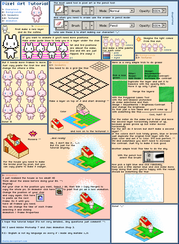
This week's exercise was on creating pixel art characters. This step by step image tutorial shows you how you can go about creating pixel art of your very own. Check out the full exercise if you're interested in learning more about pixel art: cgcookie.com/concept/2013/11/0…
Remember any of the characters on the bottom? A party of old Concept Cookie characters came together for this pixel tutorial.
Related content


Comments: 17

...Hmm. Yeah, I'd also say that at least mentioning and maybe explaining manual anti-aliasing is important, too.
Interesting range of styles and characters at the bottom! I particularly like the zombie boy and pot-headed robot, very cute. And the windblown details like the girls' hair and black ribbon are also rather nice to look at.
👍: 0 ⏩: 0


You're forgetting manual anti-alias among a lot of other things. Pixel art isn't just drawing but with the binary too, you know?
👍: 0 ⏩: 1

i dont think they forgot
not everyone likes to include manual anti-aliasing in their work
many people dont use just because they preer not to
👍: 0 ⏩: 1
Implies a lack of skill. "My style" doesn't excuse that, I find.
👍: 0 ⏩: 1
I dont think it does
What about the people that dither instead?
And this is a cell shading style
People dont have to add that into their art if they dont want to
👍: 0 ⏩: 1
You can combine dithering and manual AA.
You can combine cell-shading and manual AA.
They don't have to add it, no. But people also tend to not add things when they are unable to... due to a lack of skil.
👍: 0 ⏩: 1
thats not true atall,
i dont add a lot of things to my tutorials
that doesn't mean i can't do it
its their tutorial
they can add what they want, their not obliged to add anything more.
saying that they have a lack of skill just because they didnt put in one particular thing is ridiculous
👍: 0 ⏩: 0


Your tutorial has been featured in my weekly journal: Tutorial Tuesday #25!
I'd love if you could come take a look and support your fellow tutorial writers through comments on their deviations

👍: 0 ⏩: 0

BAAD example for pixel art. Layers are pretty much useless in pixel art since things are already seperated by colors, it's always possible to select what you want using the select tools without problems. So for composition they do more harm than good. For colors it's the same, low opacity layers will make it much harder to have good control over the colors, since you will have create shades you didn't intend to have. The less colors you have the easier it will be to change colors, and thus the whole feeling and contrast of the piece. Colors are very important in Pixel Art and as long you use this kind of workflow you will have a problem controlling them.
Have a nice day!
👍: 0 ⏩: 2

When working for a client sometimes certain elements will need to be removed at an instance and this can be done most efficiently with layers, even in pixel art. I understand what you're saying but not everyone starting to work in pixel art is confident enough to work on one layer and tend to be tedious or too safe when doing so. By allowing more layers, it puts the artist at ease knowing they can also delete the layer without deleting the entire concept.
👍: 0 ⏩: 0
So (without Layers):
1. Make Outline (I tend to use black for this)
2. Fill the insides of the outlines with a solid color (I tend to use white for this)
3. Use Select Color tool to select the white
4. Use a big brush to fill in all the colors
5. For every color choose a shadow color (a much darker version of that color)
6. Put down the shadow color depending on the light direction.
7. Create shades between the two colors to smooth the transition between them, in order to mix colors you can set the opacity of the pencil to 50%, place a pixel and pick it up again using Ctrl+Click (short cut for the Eyedropper, also don't forget to set the opacity to 100% again afterwards)
8. Experiment with pixel placing and colors until it looks nice
9. If you want colored outlines, select the black using the select color tool and paint over it.
👍: 0 ⏩: 0


Very simple and straightforward :3 thanks for sharing! <3
👍: 0 ⏩: 0

tim, you really should do a pixel Mudpoke, he misses you
👍: 0 ⏩: 0