HOME | DD
 ChaosFissure — Setec Astronomy
#apophysis #bokeh #chaotica #digitalart #fractal #glow #sneakers #space #toomanysecrets
Published: 2015-01-31 18:22:05 +0000 UTC; Views: 3786; Favourites: 170; Downloads: 0
Redirect to original
Description
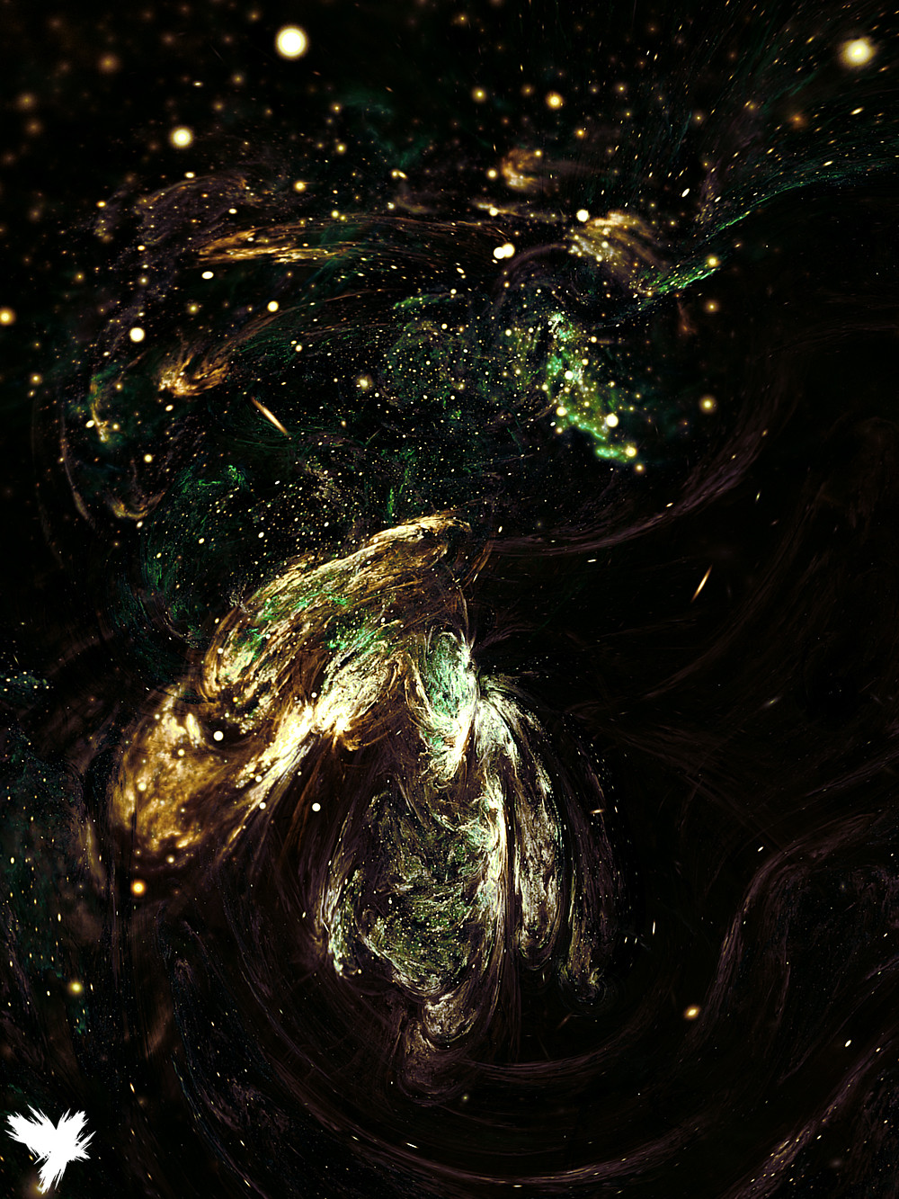
There's way Too Many Secrets.Apo + Chaotica
____________________________________
This image, or modifications of this image, is not to be used, reuploaded, or redistributed in any form without my prior, written permission. © ChaosFissure 2015
Related content


Comments: 16


Incredible. Looks like a still from an abstract dream. So life-like but otherworldly; you can discern some shapes and forms but ultimately it's a mystery. Love it.
👍: 0 ⏩: 0

You have used some bluring in areas to make the appearence of a camera "focus blur"... And yet, I doubt you used a camera at any point... Incredible ChaosFissure!
👍: 0 ⏩: 0

 (Wink)")


Firstly: amazing color combination. Secondly: beautiful stars. Thirdly: lovely blurring and motion. Fourthly: splendidly done!
")
👍: 0 ⏩: 1

It's just browns, greens, darkness, and light, the colors themselves really aren't that special XD I do love that bokeh effect for the stars myself; it was a last minute addition that ended up sitting really well with me, which is unusual for effects like that (and particularly with as strongly as I have them interacting with the base of the fractal itself o.o) ^_^ It did take a while to get the blurs in a state I was happy with, so I'm glad to hear that you like how they turned out! It's a case of "some transforms have 0.001333333 gaussian in post transforms because they're super fickle!"
👍: 0 ⏩: 0


The colors fit together -perfectly-. . . . fantastic job!
👍: 0 ⏩: 1
Thank you  (Smile)")
👍: 0 ⏩: 1
I think you did great with the yellow/red combination. I, myself, have struggled
a LOT with those kind of color mixes. . . . I never get them to work together
properly :S
So I sort of envy you since you got them to work together so well.
But yeah, "relaxed" describes this picture perfectly. . . . I honestly could stare
at this forever!
👍: 0 ⏩: 1
Red/yellow (wow, I originally wrote yed/rellow xD) color schemes are my bread and butter. Literally, I try to stick away from them, particularly utilized as fire, because I find them so flexible and easy to work with. That strategy prooobably isn't doing anything other than shooting myself in the foot.
The hardest thing to figure out about fire, in my opinion, was how to determine the range and saturation of tones to use for it effectively, and for what it's worth, Lament marks where I was comfortable working with those colors. If you're looking for suggestions on how to utilize colors in something, you're welcome to send me something to look at and I'll gladly let you know if I have any suggestions :3
👍: 0 ⏩: 0