HOME | DD
 CharlieKirchoff — Final Fight: Double Impact
Published: 2010-01-25 13:15:57 +0000 UTC; Views: 2193; Favourites: 34; Downloads: 91
Redirect to original
Description
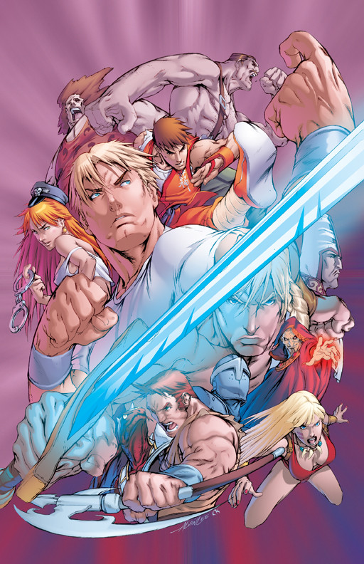
Earlier this month I saw this line art on 's DA. At the time I thought how this would be good practice for me to color since I don't often work with this style of art and it would require me to use techniques I don't often use. Plus, I liked the idea of challenging myself to see if I could make it work.Then I discovered that it was part of a contest through Capcom: [link]
Which meant that I was able to download the high res version of this. I did a little each day as a warm up and managed to finish it last night. So, I actually had time to submit it to the contest. Doubt it'll get anywhere but I'm happy with what I did here.
The challenge with this type of "collage" composition is to make it so that its not visually confusing. With the set of characters on the top I was able to do the sort of thing I would do as if it was just a normal scene and have the characters in the background recede. Howeverm the bottom characters aren't laid out with that same sort of logic so that was more challenging. I thought I had remedied that but now that I see it again this morning I wonder if its still a bit visually confusing.
Related content


Comments: 36


Man, you have great control over your values. Nice job!
👍: 0 ⏩: 1

Thanx, though that control is probably more forced than you think.
👍: 0 ⏩: 0

ah dude, amazing work on the textures and tones. Beautiful choices in the lighting design. great work!
👍: 0 ⏩: 1

I like the fact you did a Roxy instead of a Poison there, just a bit different
👍: 0 ⏩: 1
I just liked the red hair hair better.
👍: 0 ⏩: 0

 (Smile) - :-)")

Perfect palette for this. I love the subdued colors, plus the contrast of the warm red/orange and cool blue.
👍: 0 ⏩: 1
It kinda doesn't seem fair for someone like you to enter a contest like this.  (Wink) - ;)")
👍: 0 ⏩: 1
lol, thanx for the vote of confidence but I expect there will be others who have entered that will blow my attempt away.
👍: 0 ⏩: 0


I did this piece too. However I'm not posting it until I know for sure that it doesn't break any rules of the contest.
I personally opted for a more commercially recognizable piece. "Safer" I guess. I originally thought of doing color depth with the characters - like you did on the top part but I opted against it as I too realized the bottom wasn't set up the same way (as you also noticed).
So I chose to treat each one individually and I opted to go for tonal and color variances. and used a variety of effects to try and gain separation of all the characters. Treating them almost as separate entities on blue screens - then cut out and pasted together in this collage.
I like what you did here with the sword and the solid American comic book style coloring. It looks interesting to see it on the more Manga/Anime style Alvin has. I also like your cool color scheme and use of the swords glow to add highlights to the characters.
I too almost made my sword glow and for that matter I almost did it in blue as well; after an early test I thought it was too much so I instead opted for a refracted "glint" off the blade. It was big enough to be cool but didn't over power the piece. I think your's might border on overpowering but I like it none-the-less. The main reason I opted to not is that I felt it blocked the "Magic Sword" main character too much.
It's very skillfully executed Charlie. I wish you luck in the contest.
👍: 0 ⏩: 1
I look forward to seeing your approach on this when you do get around to posting it. Make sure you send me a link in case I miss your deviation. Like I said in my description, my main concern in doing this piece was as a learning opportunity which includes getting the reactions of others. So, submitting it to the contest is secondary for me. I don't expect to place anyways, though it would be a treat if I did. I did look through the rules a few times [link] but the only thing I saw in regards to the image being posted is that you give the rights to Capcom to do so and acknowledge that other people may download it and use it as well. So it doesn't sound like they are too stringent on that.
I think its a good approach to work on each figure individually. I did a similar thing in order to cut down on the confusion that could occur in such a busy piece. The only thing that I kept in mind was to have the natural light coming from the right and reflected light from the left so that they didn't look to alien from one another. Once I had done them individually I tweaked them so that they weren't competing with each other too much.
I'm not sure if I would define the style I chose as being American necessarily. I find that a lot of my work is actually European influenced, probably because my first paying jobs were with a French publisher. But in the case of this piece I noticed that Alvin's work was usually colored in either a cut style [link] or a painterly style [link] so I chose something that fell somewhere in between.
I completely agree with you that the glowing sword may be a bit overpowering. I was thinking that last night and even more so today when I looked at it with "fresh eyes". I would like to rework that and a few other things but I think for now I'm going to let this piece rest. If by some miraculous turn of luck happens and I win I would definetly ask to rework this before it goes to print. However, as I said earlier, I don't expect that to happen.
That being said, I still think its important that the sword glows. From my research, that seems to be the original intention [link] I just chose to make the glow blue because I felt it was more interesting than white and would fit better than a warmer color like red or yellow... though I could see purple possibly working as well.
Good luck to you as well, and remember, send me a link when you post your version.
👍: 0 ⏩: 1
I will absolutely do just that. I actually started to color just as an opportunity to color Alvin - who I've been an admirer of for a while.
He and I actually have a similar influential background when it comes to doing lineart. But our styles are still vastly different - go figure...
I looked as well for online source material to try and find what the color schemes were supposed to be even though I knew I might not keep strictly to them. I thought about trying for a more painterly look like a majority of his colorists seem to do but I figured best not to experiment too much when I realized it was also a contest for a box cover. Stick to your strengths (and think about marketing department feedback - comes from having worked for 6 years as a production artist at a small software company).
I approached my lightsourcing on an individual basis but I, in fact, used multiple light sources in my piece. I was trying for a blend between the subtle yin-yang design Alvin originated with the form and flow of his lines, and with the color. In the end I believe I was unsuccessful so I implemented a yinyang in the background behind the characters and tried to make it obvious enough so that if a viewer isolated it he might figure it out but at the same time made sure it was subtle enough to not detract from where the attention lies.
I should probably save all this stuff for when I post mine huh?
As soon as I can post it - I will let you know. Hey, did they reply to your submission and thank you for sending it in?
👍: 0 ⏩: 1
Yes they did. Which was nice, I was worried they wouldn't and then I would have to wonder if they got it or not.
👍: 0 ⏩: 1
Check this one out [link] ... this is probably my favorite so far... I thought about trying to use the sword like this guy did but I didn't have time to do it. Maybe in a newer color mix though...
👍: 0 ⏩: 1
Cool. interesting color choices on that one.
👍: 0 ⏩: 1
Posted mine up. [link] Alvin's apparently finding it... "...very difficult to choose my Final 7!"
That's a good thing!
👍: 0 ⏩: 0

Thanx, glad you like it.
👍: 0 ⏩: 0

Well done!
I also colored this piece for the contest, but I used quite a different technique. For each game ( top chars and bottom chars ) I simply used opposite rim lighting. D:
Doesn't really have as strong an effect as your shining sword!
Was it hard for you to find the character color schemes? I Think I got the hair wrong on some of the male characters... Blah!
Good luck, man.
👍: 0 ⏩: 1
I looked it up on the Capcom wiki for the reference. Even then some of the images were lacking some details. But my guess is that Capcom will judge by the overall execution of the piece and not the accuracy. The winner will probably be asked to make so adjustments to fit the way the characters look in the game. So, if you got a few of the characters colors wrong it shouldn't be a big deal.
Good luck to you too.
Let me know if you ever post yours. I would be interested in seeing your take on it.
👍: 0 ⏩: 1
That's what I've imagined as well. ( Quality over Accuracy )
I've uploaded mine to my scraps for now: [link]
 - :D")
👍: 0 ⏩: 1
Nicely done! And I think your colors are close enough.
👍: 0 ⏩: 1

Oh, very nice work on coloring this I wish you luck in the contest ^_^ !!!!!! ZZ !!!
👍: 0 ⏩: 1
Your welcome !!!!!!
👍: 0 ⏩: 0
