HOME | DD
 cheneymac — Age of Raster

Published: 2001-11-28 22:32:12 +0000 UTC; Views: 3094; Favourites: 13; Downloads: 943
Redirect to original
Description
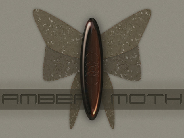
This image was included in the first chapter of Raster. I am uping it for those who have not had a chance to stop by and check out Raster at [link]I hope you guys enjoy...
Related content


Comments: 26


Don't know what to say. Awesome - Going on my favs.
👍: 0 ⏩: 0


in time we always find the answers..well in other words the first wallpaer i ever used for months when i got my first computer about a yr and a bit ago was this pic a friend had showed it to me and it inspired me tons!...and today i finally can give comments to the creator
👍: 0 ⏩: 0

I love this WP, I've used it for a while as my desktop. You do great work.
👍: 0 ⏩: 0

no comments...
very good
-----
Eduardo - Focka
www.focka.na-web.net
👍: 0 ⏩: 0


Very very cool ....awesome work. The lighting and textures are magnificent....I love it
........Extremly good....5 Stars
-----
👍: 0 ⏩: 0

*cries*
its not fair!!!
hehe this is great, ive loved this for a long time and never knew who did it, then it turns out to be you, who i meet on irc and turn out to be l337!!
its not fair!!
*favouratizes* its just too cool for words, the shine r0x and the textures cant actualy look better. Nice simple design done with lots of detail, thats what i like!
-----
/¯¯] /¯¯¯¯] THE-FAUN /¯¯¯¯]
/¯¯]
👍: 0 ⏩: 0

wow, that thing in the middle is awesome, and the background looks great! classic cheney!!
-----
º¤~tùñä~¤º
👍: 0 ⏩: 0

amazing!
+teknoledge v.2 : http://www.shadowness.com : advanced design.
👍: 0 ⏩: 0

suparb !
bimbi...
https://bimbi.deviantart.com/gallery
👍: 0 ⏩: 0

ya i really enjoyed this one, looks so Indiana Jones-ish and shit
.:9/11/01:.
👍: 0 ⏩: 0

what can i say? IT'S A CHENEY! i love it - especially the choice of amber and green along with the marble and granite textures.
actually, this is my current bkg. except my version is the one you sent me via irc (no the bug or 'raster' on it).
:: paroxysm ::
Visit the Hub of Creativity
http://www.digitexturia.com/
👍: 0 ⏩: 0

Looks great cheney, love the detail and colors. Solid design, as always.
http://www.metadream.com metadream - Sal Loria
http://www.deviantmag.com deviantMAG - Sen. Editor|Software Reviews
https://www.deviantart.com deviantART - Addict
http://crazysunart.narod.ru CrazysunArt - Member
👍: 0 ⏩: 0


Yah I seeen this at raster... Very clean and seksy.
-'. idlejam
-'] http://www.idlejam.com slave
👍: 0 ⏩: 0

Austin I love the colors used here. Good work!
.:schrunk:.
Where news and graphics connect!- http://www.PerfectCircleDesign.net
👍: 0 ⏩: 0


You guy make me sick....
I give you a A+++++++++++++++
Anyway, I think I am going to throw my computer, burn PS and go hung myself...
sick....
Art is endless, life is too short
👍: 0 ⏩: 0

this whole thing is just incredibly awesome. The textures, the lighting, the colours. Very nice.
=============
Save Our Sewers
..... a
.....
=============
👍: 0 ⏩: 0


Those textures are awesome, I like the contrast the ring adds.
KrasH
~We are the music makers and We are the Dreamers of Dreams~
👍: 0 ⏩: 0

I'm not quite sure if the ring has to go. But it would sure help if it was more decidedly opaque or not. Other than that, this piece is well done. Green and gold almost always go good together. And finally someone with a heart for larger resolutions
Now doesnt that make you feel better?
👍: 0 ⏩: 0

God thats sweet, would be perfect if the gold ring was either removed, or as detailed as the rest.. just doesn't fit. The reflection on the other object is outstanding.
R|107
h
o
w
👍: 0 ⏩: 0

nice man. I like the lighting in it. good texture for the backround as well
((( Omega Penguin(((
PIXEL-CRAFT
http://www.pixel-craft.com/
👍: 0 ⏩: 0