HOME | DD
 ConceptualMachina — Warlord Concept

Published: 2011-08-20 12:44:21 +0000 UTC; Views: 13584; Favourites: 390; Downloads: 206
Redirect to original
Description
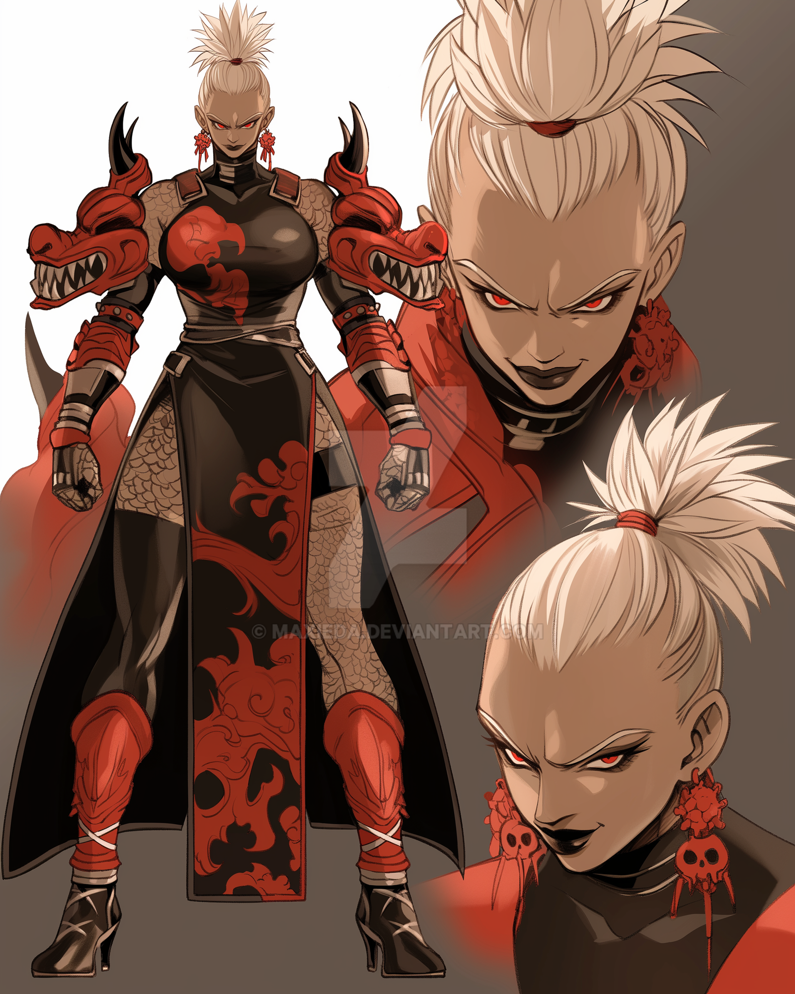
Concept for a humanoid type warlord. i'll be modeling/texturing this very soon. maybe even animating it.I've been having trouble getting the values to stay consistent on this one...in photoshop it appears much lighter than when i save it out as a jpeg. very strange :s
Related content


Comments: 41


hey there awesome work! how would you like to work with us as concept artist? we are making an mmo called omuni online!
👍: 0 ⏩: 1

Thnx for the support, i appreciate it! i'm not sure if i can accept any freelance gigs at this point in time, but try asking me at the end of the year. hopefully i'll have a better answer then
👍: 0 ⏩: 0

Hmm, this is quite a good concept, and i definitely am looking forward to the model. What i find strange in it is, though, the feet - they don't really seem like they can hold the weight of this colossal beast. What i mostly like about this concept is the way you made his cape - short. Very cool, very creative. The sword/axe/halberd/whatever concept is decent - it looks nice and all, but it just seems a bit overused in my eyes. It's like I've already seen it countless times before. Still, very interesting to look at, and definitely pretty.
As for the head, i recommend doing both this and a helmet-less version. It looks quite awesome, and i can just imagine how awesome he looks without the helmet.
The body anatomy looks quite Tauren-ish - The oversized arms, the legs (kinda) and the bulkiness enhance him. By the concept itself you can say how strong he is. The armor looks nice and shiny, and the muscle definition is great too.
All in all, a great concept for a great (to be) model.
👍: 0 ⏩: 1
Cheers for the critique! The feet/legs being smaller than the rest of the body has always been a recurring design element when i try to design hulking/large frames simply cos i like that kinda trapezoidal shape you get (his legs are spaced out so u can't really see the shape tho), but your observation is definitely valid regardless. always the case with functionality vs fantasy - i tend to drift towards the latter.
Hahah, funny how u mention the 'genericness' of the weapon; even tho it's not run-of-the-mill, i still know exactly wat you mean, and you need only play games like WOW to see many weapons designed in a similar fashion. unfortunately, i couldn't think of any truly unique designs this time
Concepting a helmetless version is a good idea actually (will add more to the character), tho i don't intend on modelling the head without the helmet.
Glad u like the concept
👍: 0 ⏩: 1
I know what you mean - The fantasy vs functionality is something I had to deal with for a year or two while i was concept drawing. I've seen countless concepts out there that have so much potential (they look quite detailed and nice) but the muscle positioning is quite wrong. I know this one guy, who drew a dragon, and added 50 or something muscles (much like the biceps) to his neck on both sides of the neck. And instead of making it be in a fashion of "body-skull-connect" he drew them to connect his neck to his... well, neck. I right out said that it is a great drawing, but the concept is horrible. If a creature like that existed, it would die because of the lack of Head movement. All it kinda could've done with those muscles is... nothing.
So, my biggest advice to anyone who draws concepts (Fantasy creatures, to be more exact) is to place the muscles on it in a way that makes sense. The small feet don't really dis-balance him, more or less, i'd say because of his tail, he'll most probably stand as a 3-legged creature (backing up his stance with his tail). If you did not draw the tail, for instance, then it would be a problem.
Hmm, when it comes to swords, basically, you can always use this trick i do - If it's supposed to look quite evil, use as much sharp edges as possible. Something "Z" shaped (note how sharp the "angles" of "Z" are). For something good looking (good as in, alignment) use soft edges. For instance, Anger is reflected by sharpness, while happiness and hope is reflected by softness. You can basically see that in someone's writing. Sharp edges mean anger, soft mean "a positive mood" etc. see where i am going?
I also think DeviantART lags constructive criticism by ordinare users. If i was a premium users, i'd never comment. I'd always type critiques.
👍: 0 ⏩: 0

wow!this is a thrilling piece of high quality work!!!!!!!astonishing!!!!!!
👍: 0 ⏩: 1
lol, really? thank u!
👍: 0 ⏩: 1
very welcome!inspirational work!!!!!!!!!
👍: 0 ⏩: 0

Is this creature supposed to have a shark head with horns growing out of his eyes? I'm interested I just don't know. Or is that his helmit.
👍: 0 ⏩: 1
The horns are meant to be part of his helmet, but it can also be interpreted that way too
👍: 0 ⏩: 0


*bows back* rargh!!!
👍: 0 ⏩: 1

argh! >")
👍: 0 ⏩: 0

he looks like a mad crazy killing machine. good job!

👍: 0 ⏩: 1

Hey dude, another strong design! Really well balanced. I love his horns. Some of the armour design around the serratus muscles area is a little ambiguous (weak shapes) but that should even itself out in 3D. Also, your edges... check this DD out, a good example used in concept art >> [link]
👍: 0 ⏩: 1
Thnx Phil, and cheers for the critique  (Smile)")
")
Pretty cool concept for a demoness. her ummm...breasts are surprisingly well-rounded in contrast to the rest of her figure
👍: 0 ⏩: 1
Her breasts are indeed questionably round for an otherwise pokey figure, lol. But t least they're not like this >> [link] (A pic, ironically, I think is fantastic.)
As for edges, I'm a pretty big believer in them. The example I gave was perhaps not the best... looking at it now, I see that some of the edges are indeed not really rendered at all(!) rather than actually properly controlled. But still, he's got the right idea. I see what you mean about the design being the primary idea to be communicated, but edges come down to lighting as well. Anyway, I won't harp on about it
👍: 0 ⏩: 1
lol, awwww Phil, ur opinion's always welcome my friend ")
Round breasts?!? i ain't complaining  (Wink)")
👍: 0 ⏩: 1
Haha, no worries. The Mr Jack pic pulls out all the compositional stops.
👍: 0 ⏩: 0
lol, glad u like it
👍: 0 ⏩: 1

your freakin welcome mate!
👍: 0 ⏩: 0

no probz, have a llama!
👍: 0 ⏩: 1
