HOME | DD
 DamaiMikaz — [Tutorial] Beginners mistakes, and how to fix them
by-nc-nd
DamaiMikaz — [Tutorial] Beginners mistakes, and how to fix them
by-nc-nd

Published: 2014-03-01 20:18:22 +0000 UTC; Views: 63611; Favourites: 3797; Downloads: 613
Redirect to original
Description
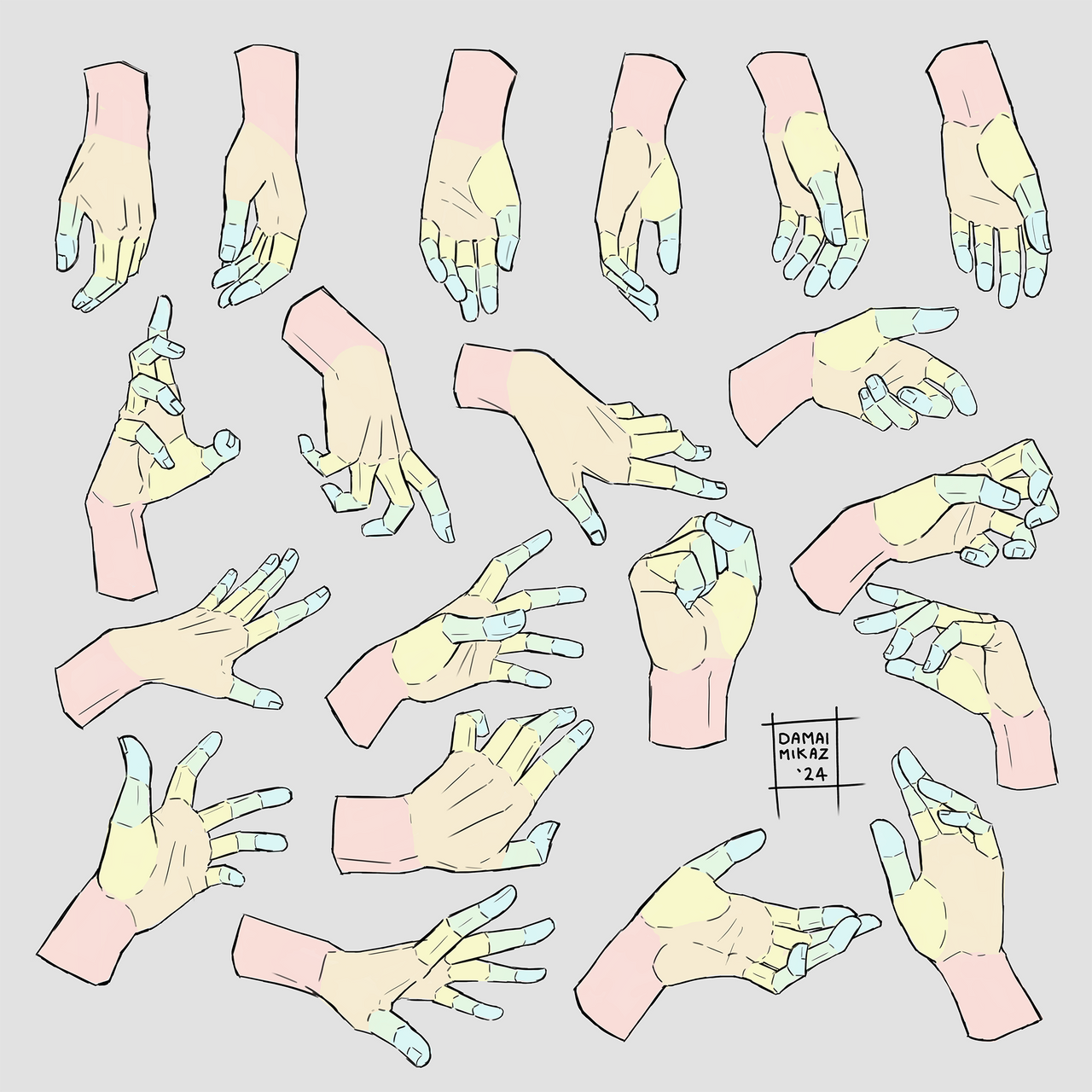
I came up with the idea for this tutorial a while ago, when I was giving drawing workshops on another convention.I noticed that a lot of beginning artists that I met actually made the same type of mistakes.
The mistakes listed here are the ones that I used to make as well, when I was younger.
Things that took me quite the time to learn, because these are the things people often don't tell you.
I can still remember having an Eureka moment when I discovered these simple things. I hope you will have the same.
(PS: this tutorial is aimed towards beginners in art. If you're advanced, you might know this already)
Just to rule out a few things:

Related content


Comments: 583


Originality
Impact
While I wholeheartedly agree with your last three tips, I think your first two were a bit unfair. Many anime are extremely stylized, and I think of the things you mentioned not as mistakes but as part of the style, so you might as well criticize the lack of tear ducts or the missing bits of flesh around the nostrils, or the abnormally large eyes, or the weird hair. Learning how to draw anime by looking at real people is like learning how to draw mice by looking at Mickey. Excluding your first two, your other tips are very well chosen. These are things I have also often noticed in drawings, and I appreciate you taking the time to put these nice images as examples next to the text. The entire thing was neat, well organized, and demonstrated your points well.
👍: 1 ⏩: 0

I am very much a beginner, and I found this to be one of the most helpful tutorials thus far. I've looked at other people's artwork, but just seeing it isn't as helpful as someone pointing it out (especially for someone as dense as I am). I especially found the shading and the clothing parts to be helpful, since I just barely started adding color, and your humor is good as well. I'm just glad there's someone out there willing to say they made stupid mistakes in the past and also willing to point them out so clueless people like me don't spend years perfecting them. I look forward to seeing your other tutorials.
👍: 0 ⏩: 0


Vision
Great job, a tutorial with a great technique, that gives you a big impact and makes you want to go check out if these mistakes are found in your own art.
As always expected from the great Damai Mikaz, this tutorial is a succeed and it helps a lot, especially for beginner artists....... All new deviants should check out this tutorial.
And we all will be expecting a new tutorial from Damai Mikaz about body and poses, after she made us almost master the faces, and the outfits, and that part about the ironing abilities it was funny, and that's what gives a tutorial it's taste.
Hope you good luck Damai Mikaz.
👍: 0 ⏩: 0

Overall
Vision
Originality
Technique
Impact
First off, I appreciate seeing all the effort you put into this!
I understand what you were going for, but all of your information seems like it is strictly based off fact, or what you believe to be factual. It's not a "how-to." Considering most tutorials are based on personal opinion, that's not necessarily a bad thing. However, all that you've gone over isn't exactly "wrong" either.
Anime is a very simple style, and at it's basis, every anime-artist shares the same approach. Side-noses are a basic part of the style.
As a matter of fact, in most cartoons, noses are really subjective. Have a look at Timmy Turner's nose (from the Fairly Odd-parents.) bbsimg.ngfiles.com/1/22729000/… if his nose actually existed in reality, he probably wouldn't be able to breath out of it. We know it's a nose, does it matter if it works? No, it's meant to be nose, only because if it's positioning on the face. (With that said, it could be anything, but because we are familiar with where the nose is on the face, that's what we see it as.) some characters don't even have noses! Have you seen the cartoon versions of Spider-man? He lacks all detail in his face, even if all that's covering his face is a mask.
The infamous (and lacking) cheek!
Though the first example bothers me, it's not actually "incorrect." If we were judging Anime on anatomical accuracy, we'd have to fail the entire style! Anime isn't known for realism, it's known for it's big eyes, tiny waists, and small mouths (all of which are so distorted, that they'd never work in reality.) the only reason why we don't usually appreciate differences in the anime face, is because we were taught, or grew up with it looking a certain way. Just look at their chins, if you're going after their lack of cheeks, then you may as well go after their lack of chins.
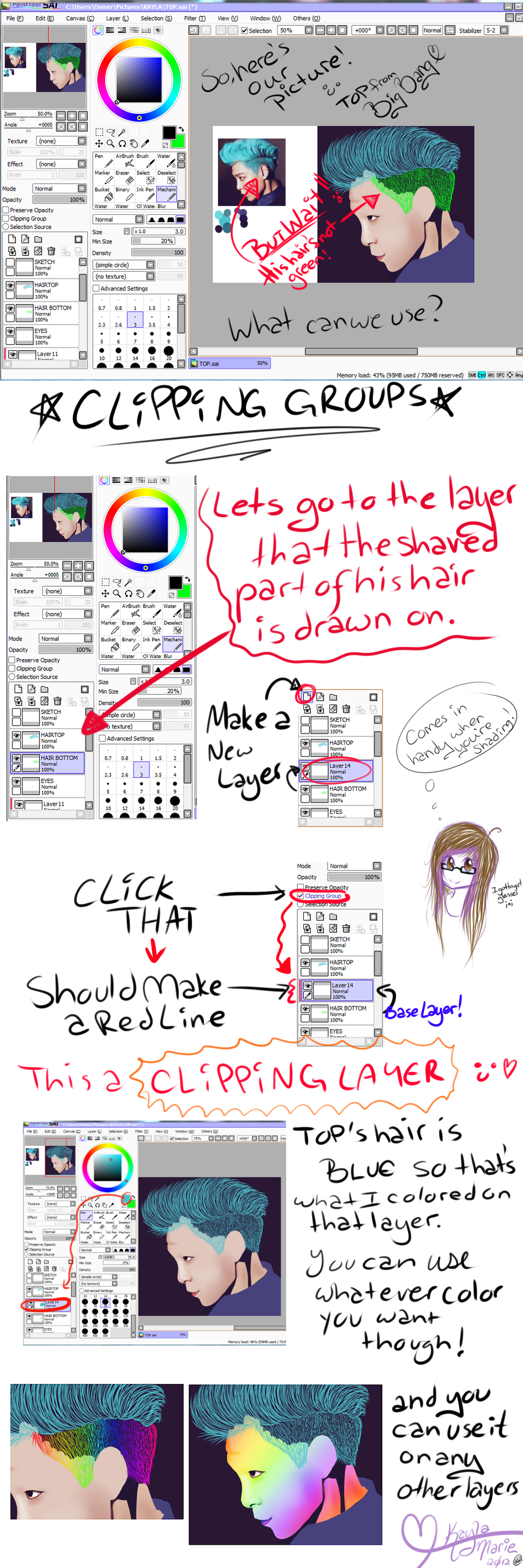
Too-little shading.
Though in these examples, there's not much going on, they're not incorrect. What's incorrect, is the artist's lack of understanding in color theory and light placement. You can shade as lightly as you want, leave as little detail as you wish, but if you don't understand how they work, or how to place them, they're going to look funny. You don't necessarily need shadows under the breasts or arms, but you do need to show that there's a defined shape (breasts stick out, and arms are basically cylindrical.) All of this can be achieved through line-weight, overlapping, etc, which your example lacks. It's not all about shading, but the way lines and shapes are approached.
Clothing
This is a big, big stylistic choice. Clothing without creases is up to the artist. Have a look here: 25.media.tumblr.com/e948fd8185… for the most part, the clothes are flat (with only slight detail of creases) it works well. We know they're clothes, we see how they fit on her body, and they...just work! (Not to mention, what I said before about lighting and shading...There's minimal usage of any, but the way they used color makes the piece feel complete.)
Finishing up
Your targeted audience may be amatures, but these guidelines do nothing more than preach about what they "should" be doing. They need to experiment. It's okay to help out fellow artists, but saying that they're doing something "wrong" is entirely an opinion. I see that some other artists have had their opinions against you, and I think that's because (despite you saying you don't want amatures to copy, etc), you're doing the same thing, perhaps worse. The best way for an artist to learn is by trial and error, what they enjoy, and what they hate. It's an emotional ride, they'll do what feels right, that's what artists do.
👍: 0 ⏩: 0

I loved this tutorial. I think that more people need to see this when starting off, I know I certainly did. It's helpful in so many ways, and gives good insight as to what a person might be doing wrong. Not to mention the presentation is given in a wonderful, clean way.
However, flip side to this, the wording was slightly condescending and in my own view intimidating to the beginning artist that this is in mind for. That said, this is going to sit in my favourites for a long time to come, as it really brings home most of the techniques that even today I still struggle with.
Good job overall. Striking imagery and words really drive home what it means to 'art at things' successfully.
👍: 0 ⏩: 0

Overall
Vision
Originality
Technique
Impact
Apologies in advance, because this is quite a harsh review and I know it. (It's also quite long, because I'm awful at being concise.) However, I'm only being so harsh because this tutorial is aimed at absolute beginners. I think it's important in beginner-level tutorials that all information presented is accurate and it doesn't turn into a case of teaching beginners a new set of mistakes.
I feel like this tutorial is something of a mixed bag in its usefulness - the mistakes it covers are definitely common ones, and some of the segments offer very handy insights into things beginners often overlook. For that, I think you did very well and I don't want you to think I outright dislike your tutorial!
With that said, I'll do a little mini-critique for each section:
1) 3/4 Disappearing Cheeks
I can't really fault this section, the explanation of the mistake is to-the-point and the photographic examples are clear. (I would say the manga picture used actually has more of a problem with the position of the brow than the cheek, the cheek shape seems simply stylised but that might just be me!) Well done!
2) Sidenose
Section 2, I have mixed feelings about. Though I entirely agree that it's not good to stylise without knowing the rules, and how-to-draw books really shouldn't be teaching that, it does feel somewhat like you're invalidating a perfectly fine stylistic choice. Manga and anime's "weird noses" may have come about from necessity, but they stayed as a frequently-used part of the style itself. I wouldn't call the stylised side-nose a 'mistake' in and of itself.
As for the matter of shadow placement, it's sort of inaccurate to say that the most natural direction for light to fall is from directly overhead. It's rare that anyone is in a situation where light is shining straight down onto them, unless they are standing right under a lightbulb (how often is the sun really directly overhead?). The most common direction of light would surely be a high diagonal rather than straight down.
Shadow placement on a nose really should be down to angle of lighting in the end, though, so it's best not to generalise.
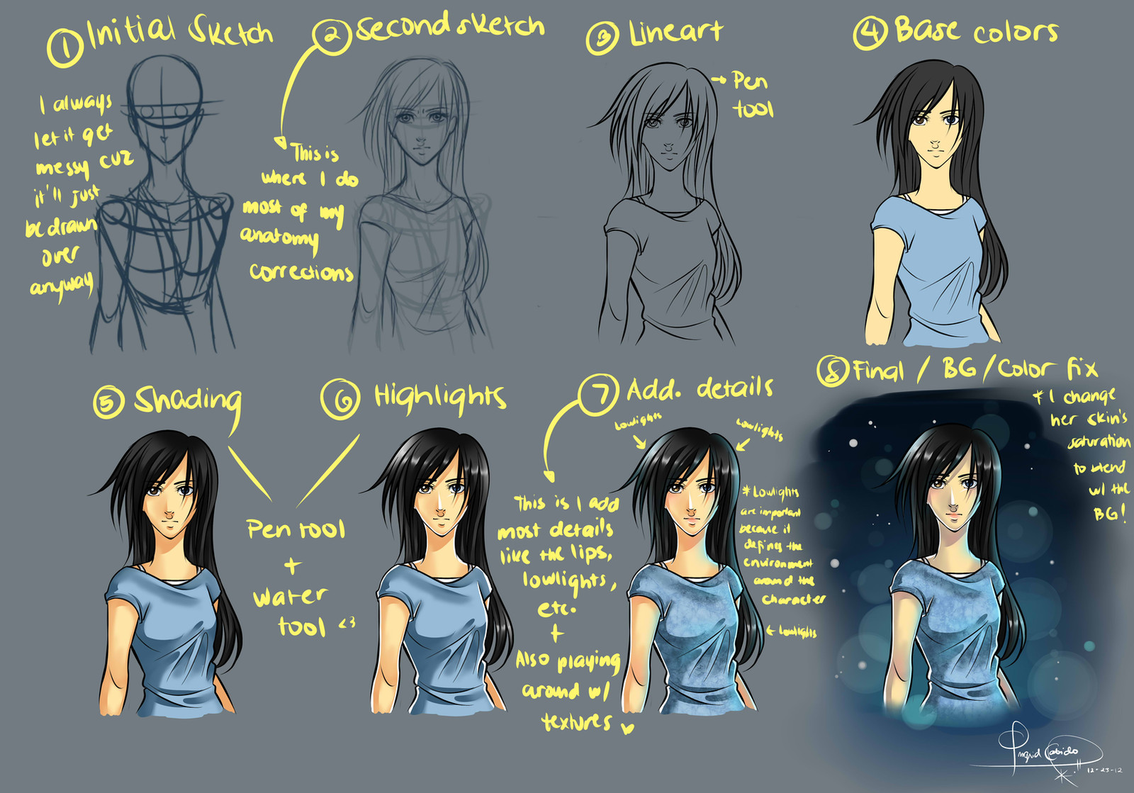
3) Over-careful Shading
The first part of this section is very good! It's always a good thing to point beginners in the direction of learning basic colour theory at least. However, using a picture with a very strongly tinted colour scheme probably wasn't the best way to give a before-and-after example, because all the colours in the 'after' image all come out as blue, which doesn't do a very clear job of showing usage of colour theory in a picture. It would have been better to use one with more colour variation, to show that you can use lots of different colours but still create a unified colour scheme.
Similarly, the comparison of a modelling photograph and a film still was also not a very effective way to explain colour usage, especially not saying that the photograph was a bad example of colour usage! The colours you picked for the 'darkest' and 'lightest' swatches were inaccurate, and it feels like you deliberately picked a lighter portion of the skin tone just to try and get the point across. The problem with the colours in the photograph are that there isn't much variation in colour, not that the values aren't varied enough.
4) Shading to the Side
This section is the one I really have the most issues with. Unfortunately, your before and after drawings work almost backwards - your colour choices and shading placement lead the 'after' picture to look almost worse than the 'before'. Yes, the original picture had overly tentative shading that lacked contrast and form, but the fix's shading is uncomfortably desaturated (a deeper, more yellow-orange colour probably would have been better for the jumper than the beige you used) and the placement is contradictory. (Although the lighting appears to be coming from the right, there is a large block of shading on the right-hand side of the girl's hair and her scarf, for example.)
I think this section demonstrates why it probably wasn't such a good idea to use your own art as an example for how to 'fix' the pictures. I know you aim this at beginners, and people of a lower skill level than you, but it's best not to use yourself as an example of what is 'correct' when your art still has quite obvious flaws.
By all means, show people how you improved yourself, but the way this tutorial is laid out makes it seem like you're saying that you are showing them how you did it 'right' rather than just demonstrating an improvement.
5) Creases
You can breathe a sigh of relief now, because this last section is one I don't have much nitpicking to do with. Although I think it would have been good to mention that different thicknesses of fabric crease differently (thick fabric creating few creases and thin fabric creasing all over the place), this part made its point well.
However (I know, I'm sorry, I do have one gripe here!) a tight-fitting bodysuit would actually be likely to crease quite a lot at the joint areas, unless it was made of tight lycra. If you look at images of faux-leather catsuits or any other non-stretchy tight garment, you'll see it bunches a tonne at the knees and elbows when they're bent, and sometimes also at the underarms as well.
Other than that, though, the creases section is fine in my opinion!
---
In summary: While I think your reason for making this tutorial is a very good one, and the idea behind it is lovely and very useful, it's marred by the usage of your own artwork of an example of 'correct' ways to draw things. I would suggest that if you do ever revise this tutorial (or make any future tutorials like this) that you either don't use your art as examples, or make it clear you are not saying that your way is how things 'should' be done. A quick explanation that you are only using your art to show your own personal techniques can go a long way!
Still, all-in-all this tutorial is promising and my many gripes with it would be easily ironed out. I only critiqued it this nitpickily because it really does have the potential to be very useful, but the inaccuracies and personal-art examples let an otherwise good guide down. With a little extra detail added, inaccuracies corrected and the removal or explanation of personal art examples, I'd be happy to add an extra couple of stars to a few segments of my score.
So despite my harshness, know that I don't hate your tutorial! e.deviantart.net/emoticons/s/s… " width="15" height="15" alt="
 (Smile)")
👍: 0 ⏩: 0

Originality
I find your Tutorial a Really good tutorial! If anyone should want to give a tutorial
to a beginner then this is a start! You put down the very important facts that we artists forget to remember or even learn!. As a very experienced artist, I know once in a while I forget some of these things and I always need something to remind me.And this is it! The best thing about this is how you talk about how important colors are. That is excellent! because colors are
really the most important part of a good drawing!
And Yes it's true that a lot of animes use incorrect noses in the front.
But I did see a small flaw with the nose thing though. A dot or line nose is not a "lazy nose"
It's an art-style. Big difference there. You are saying to beginners that, Well... "moe styles" are incorrect cus the use a line or dot for a nose.i know where you getting at with lazy animation thing.But even trying to do a dot nose isn't easy too.trying to put a dot nose in the right place and right length with the right balance of shade also takes some effort.Most beginners can't even get that right.
An yes! most tutorials are bad for beginners. They.They teach a lot of incorrect information leaving these artists in a bad situation.
👍: 0 ⏩: 0

This is a tutorial I've always wanted to see happen. A lot of points you touched on are things that happen much too often that people ignore because of the current trend in drawing style leaning towards anime. While I enjoy the style, it has caused some issues with up and coming artists. This is most likely something I would show my sister when she gets old enough to understand this on a better level.
While I love this, there is something I feel like maybe you should have touched on one other subject that seems to be an issue with early artists (myself included in my earlier years). Over saturation of color. Perhaps going into how you should have a set of colors in mind or if you use several colors, try to have something to tone it down and balance it out a bit.
Also, and this is a minor complaint, but it feels a bit blockish. It's just a personal preference really, but maybe a different layout would have improved it some. The color scheme works in your favor as well. It helps draw attention to whats important on the screen.
This is well executed and light hearted in it's teaching so it doesn't hurt anyone's feelings. It also is very humble to show that you have made those same mistakes and it shows personal experience in how one can improve upon themselves.
👍: 0 ⏩: 0

Vision
This is a good piece to help people consider their drawings and the common mistakes made. It is insightful and very well done. It doesn't demean those who read it and it uses your own drawings and experiences. One thing that may have made it better would be perhaps having a part that shows a basic in how to shade and/or add more folds etc. The points you went over and a quick "how-to" based off your drawing. Not necessarily how it should be done but something to give a little extra help. Overall it was a great informative piece.
👍: 0 ⏩: 1

Overall; fair
The lack of detail is intentional, though. If I included every bit of information about those 5 topics the tutorial would've been 23947823947 times longer and nobody would've read it ^^
👍: 0 ⏩: 0

I have always liked reading manga and it makes me want to draw some myself but I could never get anything right in it. But after looking through this tutorial, I can fix the mistakes and spot of I've done wrong. I can use this every time I try to draw. This tutorial would be better if it had something about certain eyes for males and females for some emotions in certain angles because I've never been able to get it right but as for shading, creases, face cheeks will soon be no problem. This surely is good for beginners!
👍: 0 ⏩: 0

Originality
Technique
I personally think this great overall.Although I feel like this is missing a few things like the clothing crease part it should have shown different types of appearance like armor and not just regular clothes also it would have been better with more than two examples so people can see more examples as references but I guess it would confuse them in some ways,either way the person put everything into context,very good statements were made and info was typed in this tutorial perfectly.That's pretty much all I have left to say other than some stuff could have been added.
-Don
👍: 0 ⏩: 0

Overall
Vision
Originality
Technique
Impact
All in all, I think this tutorial is a good one. It's easy to understand and you provide good examples of what not to do, and how you can help yourself know how to do it right. The bits on shading and awesome-ironing-mom were very good, however, the part on noses and cheeks I shall put more attention into.
Anime is a genre, not a style. There are a million different styles within that genre, and /every single person/ has their own unique style. anime is also a very stylized and cartoony type of art, although some is closer to realism than others.
There is absolutely nothing wrong with being one of those that is close to realism, my problem is in that here you are teaching things that are commonly found in anime styles, and used by professional manga artists to be /incorrect/. It's perfectly fine with me if you believe them to be wrong - you are entitled to your own opinion - but I just think you should've acknowledged that one of the distinguishing characteristics of anime are that it is not in sync with reality.
As I said, I think this was a good tut and in the grand scheme of things, I think it will prove quite useful.
~ice-chan
👍: 0 ⏩: 1
Oh my, an angry manga artists that does not agree. I somehow expected this.
Let me tell you a few things about the background of this tutorial. I've been doing art workshops, mainly on anime conventions and such. So yeah, the style I've come in contact with mostly, is manga. That doesn't matter... really. But it does increase the likelihood for me to encounter errors in that style.
The mistake many of those artists make, is saying that manga isn't similar to realism. It is, actually. Manga artists follow quite a number of rules on realism, and then break them. And most professional manga artists can, as a matter of fact, draw realistic body proportions. You have to know the rules in order to break them, right?
The point is that most people during workshops (the beginners) don't know these rules. They just started drawing manga from one of those how-to-draw-manga books and tend to look over the fact that most of it is based on realism. And that's fine. But during all those workshops, I saw many of those people not understand why their faces looked 'weird', or how they should draw a nose in different perspective.
I think style in itself should never be a limiting factor in your work, no matter what style you use. And the more you know, the better you'll get
👍: 0 ⏩: 1
Yeah I guess you're right about that, but I stand by my opinion that your way is not the only way, and that you're downing simple characteristics of manga/anime. -^-
👍: 0 ⏩: 1

she doesnt take disgreements too well
yet she asks for critique
she just really doesn't know how to not take stuff way too personally
really, i mean just say thank you and and accept the critique omfg
even though she straight up kept insulting manga/anime in her damn tutorial and acting like she knows whats shes talking about
i honestly didn't think it was that helpful
there really wasn't anything helpful about it
its just her pointing out to everyone what she hates about some anime/mangas
👍: 0 ⏩: 1
No offense (although I guess saying that is useless -_-) but it seems to me that you're the one that doesn't know how to not take things personally. Really, there's no call to be so straight-up rude. If you don't like the tutorial, don't comment on it unless you're telling her how to make it better. I happen to think that she actually did a pretty good job, despite those points I objected to. I wouldn't even trust myself to make something as well-organized as this.
so, not to be rude, but piss off!
👍: 1 ⏩: 0

(I'm sorry that my English is a bit off, please bear with me a little)
The tutorial is very helpful, BUT, it's a bit... well, help me, I can't find the exact word in English to describe it... maybe "discouraging"
I think every people using anime/manga style already know deep inside their consciousness that they are using deformity (it's like making unbelievable proportion believable), it is not right but they love it.
I think it's unfair to generalize everything and said deformity is entirely wrong. Some people make pretty deformity and it is their style (some of them are professional manga artist) - even though in realism point of view what they draw isn't human.
What you write is good, exceptionally good (I know there's already a lot of tutorial about this but you make it a lot better and understandable - with helpful example).
My point is.. I think you should tone down a little, don't make it sounds like that people who draw anime style are noobs... and that they are a bad teacher. Some of them choose to draw that way, and I (for one) respect that.
Good Day for you e.deviantart.net/emoticons/w/w… " width="25" height="20" alt="

👍: 0 ⏩: 1
You know... I'm totally fine with style... as long as people REALIZE the stylization makes it look wrong... and that's mostly the problem I saw doing those workshops. Those people had no freaking clue why their manga faces looked so weird.
👍: 0 ⏩: 1
my lecturer in uni also said that it is wrong but he admit there's deformation and stilation (simplify lines).
Yup, aren't we hate that weird faces
")
👍: 0 ⏩: 0

I like it, short, sweet, easy to remember. I actually agree with the mistakes you listed, the nose especially, being common mistakes. I wouldn’t exclude the tips to beginners only, because everyone runs into those from time to time, most often I think during drafting. Often times I find that I have those problems and have to draft something multiple times to fix it. The side by side comparisons I believe are extremely helpful, since there’s always that one thing wrong and you don’t know what it is until you see something with the fix right next to something with the issue.
👍: 0 ⏩: 0

I honestly thought that your tutorial on common art mistakes for beginners was amazing in and of itself since you take the time to point out mistakes in many common beginner level art so we can understand better. Personally, I think it was rather helpful even though I actually knew some of this stuff from the beginning. Generally, these tips make sense in its entirety, but I guess I can understand how the mistakes are still being made out there if the artist still thinks that their art still is even a little bit aesthetically pleasing as a final product. Thank you for your service to the community.
👍: 0 ⏩: 0

This tutorial is very easy to understand and provides a variety of examples quick fixes so that the readers will understand their mistakes and correct them. To me, your tutorial is an essential piece of information that is unfortunately overlooked quite a bit. It is amazing to see someone like yourself take the time to assist artists in overcoming these flaws. If you are capable of posting more information like this, I am sure that you'd be helping many artists out there. In short, this tutorial is fantastic! Thank you for providing this information to all the artists out there!
👍: 0 ⏩: 0

This is very helpful first off, because a lot of people learn the way you started off. Honestly, I still make some of these mistakes time to time. Anyway, this here gave visuals that were helpful as well as went about explaining how you knew what you did. The fact that you added in some humorous things to help lighten everything us, was also a nice touch. Doing that helps you connect to the people as well as letting them connect to you. That and showing some of your older work compared to your newer work helped show the comparison difference between what it was like to what it is now because you changed those things. This again was an incredibly helpful thing that you put together, so please continue the good work!
👍: 0 ⏩: 0

That looks fantastic!! You had a great mind for doing something like this. Now people are able to look at this and see what mistakes did they make in their drawings or digital artwork. You are a very helpful person for doing this for other artists. More people should what mistakes happen in drawings and/or digital artworks. You did a fantastic and outstanding jod with this. You made it easier for artists to see what are the common mistakes in their artworks. Keep up the great and awesome work to help others. I hope to see more of this soon.
👍: 0 ⏩: 0

Wish I’d found this sooner- The wrinkles seem to be giving me the worse trouble :/ especially around the crotch/seat of pants and similar clothing, have you any tips?
👍: 0 ⏩: 0


OMG I am guilty for making all those mistakes
👍: 0 ⏩: 0


Thanks for this l, really helped back when i was starting to draw digital art, especially to shade not only on the safe parts of the drawing...glad to see this again cauze i think i was slipping back into old safe ways lol
👍: 0 ⏩: 0

Thank you senpai. You just taught me a new way of looking and analyzing manga art.
👍: 0 ⏩: 0


omg lol im so stupid thank you so much this will help me a ton!! (I do all of these... lol)
👍: 0 ⏩: 0

I wish someone Said this stuff to me when I was started drawing!I had to figured out all of them by my own!:/
👍: 0 ⏩: 1

>m<
still...thanks for sharing!

👍: 0 ⏩: 0

I'm sorry a bunch of people hated you for making this.
I think it is wonderful that you made this.
I also appreciate the Journals you've made.
I should Watch you just for those! 
You'd be the first person I did that for.


👍: 0 ⏩: 0


I have just now found this and I must say this is very helpful!
While I do not draw humans as this tutorial mainly shows I believe I can use this for future references to improve my own artwork.
Again very helpful tutorial.
👍: 0 ⏩: 0
Thanks, this is really helpful! Especially the cheek thing…I didn't realise just how prominent it was!
👍: 0 ⏩: 0


Thanks for the tips from an absolute beginner. When I get past perfecting a drawing of a stick figure, I will definitely come back to your article as it introduces a lot of concepts to me.
👍: 0 ⏩: 0

This helps me muuucchhhhh!!! Thank you for sharing this with us!
👍: 0 ⏩: 0

this helped me so much while I was shading the skin for the picture i'm working on ;w;
👍: 0 ⏩: 0

This is a great help, it's nice seeing your earlier work and how you've gotten better whilst applying the tips in the tutorial.
👍: 0 ⏩: 0

could you make a tutorial on colour? I can never seem to figure it out
")
👍: 0 ⏩: 1
| Next =>