HOME | DD
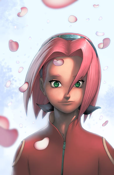
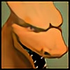
 danimation2001 — Sakura Portrait colors
Published: 2007-10-07 21:49:16 +0000 UTC; Views: 8892; Favourites: 311; Downloads: 361
Redirect to original
Description
So here's the first one out of the three, Sakura.EDIT: I did some changes to this piece thanks to Seed for the very helpful critique.
Related content


Comments: 78

all of it in just photoshop?
👍: 0 ⏩: 1


I hate naruto, but that doesn't stop me from enjoying your use of color. Her facial expression is nice and I really like how you painted her nose
👍: 0 ⏩: 0

AWSOME!!!! Totaly rocking. Read the siggy you rock dood.
👍: 0 ⏩: 0


if that's not clear- I mean its BIG like its suppose to be ^_^
👍: 0 ⏩: 0
wow- I think ur the first person I've noticed draw Sakura emphasizing her forehead X3 nicely done.
👍: 0 ⏩: 0

poooooooooooooooota es que vergon te quedan los colores
👍: 0 ⏩: 0

OMG!..that looks sooo good!!..You can think that it is a doll!..Nicee!!^^
👍: 0 ⏩: 0


Yus, colours from dan! Very smooth, as always! But, might I suggest a bit of minor tweakage?
The moment I saw this picture, I thought: "long neck" and "fish lips!" XD I fiddled around in Photoshop to see if I was right... and this is the result of a couple of minutes, with the tweaked version on the left:
[link]
See what I mean? Not much of a difference, really, but it feels more natural to me. Hope I helped a bit!
👍: 0 ⏩: 2

The edit you did there does seem more inviting and friendly. Thanks for taking the time to show me what you mean. I'll see about implementing it
👍: 0 ⏩: 1
Glad to hear I was of some use!  (Smile)")
👍: 0 ⏩: 0

That's a nice difference.
👍: 0 ⏩: 0

The changes you made added a shit ton! I was already just happy as hell to see colors from you again, but the edit really brought this up a couple notches.
Good looking out from Seed, and of course definitely great job from you. I'm most anxious to see the Sasuke portrait (good call on having the eyes closed on that one by the way, adds so much more interest to this series).
👍: 0 ⏩: 0

shee looks a bit weird. next time it will be perfect
 (Wink)")
👍: 0 ⏩: 0

Love it man! Excellent use of color and lighting!
👍: 0 ⏩: 0


reaaaally nice coloring man!
now I WANT rock leeeeee
XD T^T
lee! lee! lee!
👍: 0 ⏩: 0
Aww what a beautiful portrait of her! I love so much the coloring style you used!

👍: 0 ⏩: 0

wow this is awsome dude, i love the hair especially, you've done an excellent job on this.
The blured Sakura blossoms are a nice touch too
👍: 0 ⏩: 0
Awesome Sakura!
This is a bit more like the manga right? In the TV show she doesn't really have a huge forehead but in the manga she does.
👍: 0 ⏩: 0
First of all I'd like to say, holy s#@ those're some nice colors. But in the critique section, I think if you would just close her eyes a tad more, I think it would give her a less "deer caught in the headlights" look, and soften her up a great deal.
👍: 0 ⏩: 1


Yeah you still got the talent ")
Really nice, she looks beautiful
👍: 0 ⏩: 0


I didn't catch the previous version, but this is very nice. Not too fond of the show, but still a very well painted portrait.
👍: 0 ⏩: 0

hehe~ dont reallly look like her but i like the glowing background.. the light seeps through
👍: 0 ⏩: 0

shoot! damn alt+tab... i didnt finish that post Dx anyway, I'm looking forward to the other two!!
👍: 0 ⏩: 0
wow, her hair is great! ^^ that's some awesome work! I
👍: 0 ⏩: 0

take away the eyes and i think you did a damn good job.
👍: 0 ⏩: 0

This came out beautifully; her eyes really catch my attention ^.^
The metal headband is amazing, I really like how you did it.
Can't wait to see the rest, are you going to put all three together in one picture? You could make a bookmark version of it too if you combined all three. I know i'd buy one ;3
👍: 0 ⏩: 1
I'm not sure I could make all three fit.
👍: 0 ⏩: 1
Well, with some cropping and resizing of course.
👍: 0 ⏩: 0
| Next =>