HOME | DD
 danimation2001 — TMNT Seq page

Published: 2004-11-12 18:51:16 +0000 UTC; Views: 30796; Favourites: 690; Downloads: 4684
Redirect to original
Description
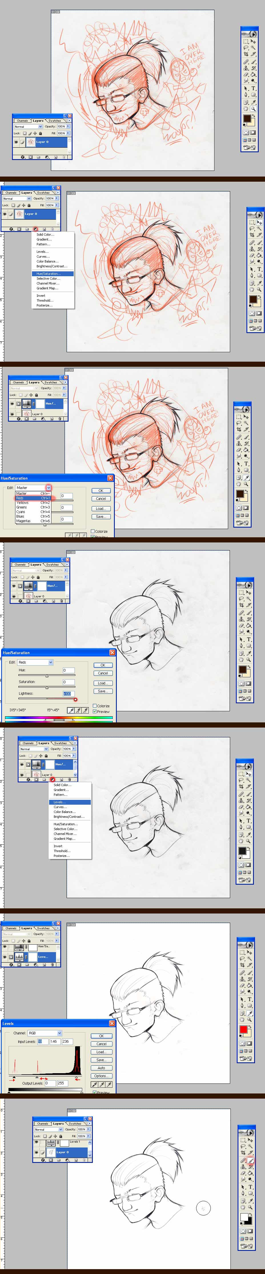
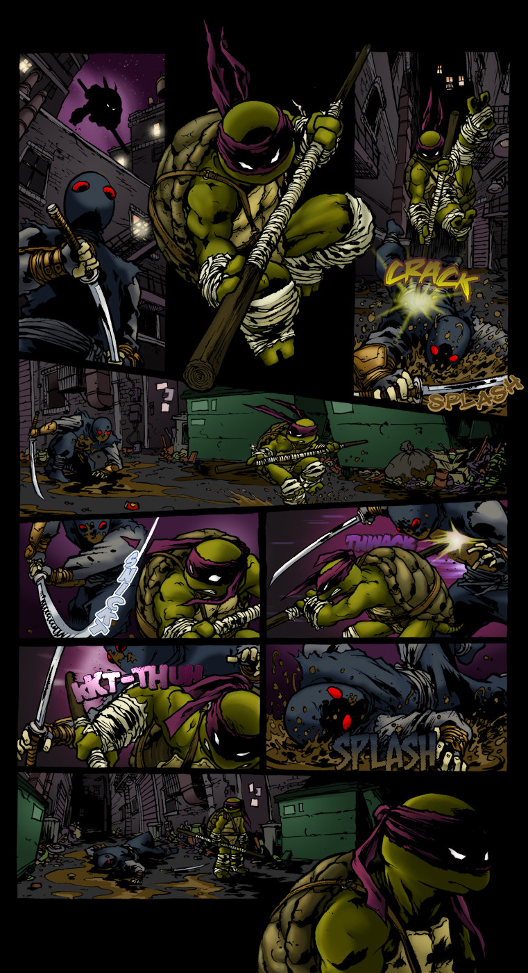
Here's something that I wasn't going to post, but I did.This is another piece that I did for my senior project class. I had a week to do the sketches, the pencils, the colors and the text. Not to mention all the other class final projects that I had to do along with work... It wasn't a fun momment of my life lets just say.
as you can tell my backgrounds need work as well as anatomy. But I'll improve on that.
Related content


Comments: 211

Damn this is such an incredible piece and Slash looks incredible, I hope this can come out in the comics one day....great job
👍: 0 ⏩: 1

to be serious if I'd get the chance for it I'd love to do a turtles comic book and make it great like the movie was... the first one that is.
and this is pretty old stuff, So I have improved a bit since then.
:]
👍: 0 ⏩: 0

The anatomy isn't really an issue. In the comics, the turtles calves and bicepts are much bigger than the forearms and ankles. It isn't anatomically correct, its Eastman & Laird's style. But this is for a class. So I could be wrong.
👍: 0 ⏩: 0

I dig the Ninja Turtles. I especially dig the frightening teeth.
👍: 0 ⏩: 0

awsome work man. ive seen many different tmnt comic styles and id have to say that this is one of the best color style ive seen so far.
👍: 0 ⏩: 1
thanks, hopefully one day it would be cool to work on the series both pencils and colors.
👍: 0 ⏩: 0


wow...superb stuff, absaloutly superb...colours and tones are so well done...but that poor big guy...im sure all he wanted was luv...
👍: 0 ⏩: 0

*points* big turtle! nice art dude, i like how it looks like oil painting, very nice!
👍: 0 ⏩: 0

whoa dude......that looks...awesome!!!! 
👍: 0 ⏩: 0


it still rox man, the colors are great, i really like how u set the mood through ur colors, it comes together really nice.
👍: 0 ⏩: 0

love everything about it, especially how the water looks. great job man.
👍: 0 ⏩: 0

Ooh! TMNT! Actually, I like this one quite well. It's more controlled than the Street Fighter image of yours that I responded to earlier. Plus I like the unsaturated color scheme (it punches really nicely when you do use a saturated color that way!)
👍: 0 ⏩: 0

Jesus, man, this is absolutely sensational and well worth the misery you must've endured during 'finals' week!
👍: 0 ⏩: 0

Aaaaaaaaaaah


")

👍: 0 ⏩: 0

hey im doing senior projects and stuff 2 and were doing about the same feild can you tell me how 2 edit my pages 2gether like this....when it comes 2 backgrounds and cropting i suck with ps ;(
👍: 0 ⏩: 0

Holy...I never commented on this before now?? Shame on 'me'! This is...in the turtle's words...AWESOME. Definitely one of the best I've seen...yeah.
👍: 0 ⏩: 0


i think i'll this guy's name attached to the word "famous" soon.
👍: 0 ⏩: 0

Where are the "shwish" effects on his blade? Infact now that I look at it, the whole thing seems pretty static in the image... like everything was put into slow motion so theres no blurring/action/impact (aside for the water), add some
 (Smile)")
👍: 0 ⏩: 0


yeah, the backgrounds arent that ellaborate, but they fit the situation nicely. and dude, the drawings and colours are just amazing! one of your best jobs so far, in my opinion.
👍: 0 ⏩: 0

wow, you dont really need backgrounds with characters like that.
👍: 0 ⏩: 0

holy shit!!! "needs work"?!!! holy shit...thats amazingly good!!!
👍: 0 ⏩: 0

As I se it, you're somewhat new to drawing the lineart yourself. But even if if that's the case, i'm immensively impressed how you can bring forth "good lineart" with your amazing coloring skills. Yeah, you have some work to do with anatomy, but atleast you got the coloring problem covered  (Wink)")
Keep up the wonderful work!
//Skedeks
👍: 0 ⏩: 1
way back, I gave up on pencils, that it was impossible to get to the level of those pros in the business. I really didn't know how they did it back then, I was only a kid and thought it was something that just couldn't get to. So I gave up and just started coloring. It was easier and I got to meet people on the net because of it. I find out later that all it takes is practice and doing it every day regardless of all the crap that you create on your first, second, and etc attempts. So I have to play catch up.
👍: 0 ⏩: 1
Yep, there are only the (what I call it) two P's in drawing. And that is "Practise and Patience". That's all there is to it (well, skillfulness in detecting correct anatomy and overall "flow of art" control might be good to have, but that might come with practise, so..)
If you don't mind, could you possible share some of your sources of inspiration and learning? Personally I'm not really fond of the cell-style coloring. I'm looking for that "shady & dirty look", a good example would be: [link] If you know of any good online tutorials/resources using this style of coloring? Kind of hard analyzing the images given 
Keep up the awesome work mate.
//Skedeks
👍: 0 ⏩: 1
buy issues 3 and 4 of megacity909 and you'll find two tutorials from Hyung Tae Kim.
also here's a photoshop tutorial website.[link]
[link]
very awesome artist, totally inspires me to no ends.
👍: 0 ⏩: 1
Whoa, awesome. I will be sure to check out his work and save those that could be used for reference and inspiration (i'm up to about 5 700 images right now). I wished I was home right now so I could check those tutorials out (i'm at school currently).
Also, I have a bit of a problem getting ahold of good art boks where I live, very scarse and if I would like to have any good I more than likely have to order it from outside the country (that's quite expensive :S)
Thank you for the links none the less!
👍: 0 ⏩: 0


The colouring is just... 

👍: 0 ⏩: 0

I kinda feel bad about being picky about some of this stuff since I know there's no way in hell I could render like this just yet, but there are a few things that do stand out to me.
I do agree with a few of the others about the 1st panel, I'm not exactly sure of the emotion Slash is going for here. It's kinda like the look on Eva 01 in the last couple of episodes Neon Genesis. The teeth are great, but I think it's the lips, that's there's no real expression there, or muscles in the mouth area to make one, more like loose flaps of skin. A touch of expression around the eyes as well might help that as well, but I know how difficult that is without pupils.
I like the fact you have Slash alot bigger by comparasion, but he seems way too big in the 2nd panel, I think it's dead on in the center shot. Very nice there.
3 and 4 my main problems are the arms, they just don't seem too "natural." Slash is kinda holding the blade behind his head alittle, maybe if it lower and abit more infront of him, like he's putting his weight into the parry with Raph or swatting his sai to the left and coming around for the punch. The main thing I think it the arms. In 4, I think the upper arm looks awesome, but the elbow I think starts abit early and should be abit farther down, also being an overhand punch, the elbow should probably be pointed a hair more up, maybe rotating it 15degrees toward Slash's face, since the fist would be twisting counterclockwise as it's coming down.
I hope that didn't come off too harsh, because alot of the detail you have here looks really awesome. The zooming on the sai is downright beautiful. The center panel definitely shines here, and the water splash is astounding
👍: 0 ⏩: 0


Whoa
this is
C R A Z Y
crazy phat that is
very nice work
dark coloring and all
adds to the mood
way to go !
👍: 0 ⏩: 0

nice work. great page...but the last two panels are a little confusing. the throwing of the sai is great, but I don't like the "recieving" of it...the angle seems off.
regardless, overall I like it a lot.
👍: 0 ⏩: 1
you'd probably get it more if it was animated. When you throw a stick like sharp object into something, it'll hit into that object and tilt on an angle when it does.
👍: 0 ⏩: 1
well, it was mostly the composition I was talking about. the way the panels flowed into one another...not the physics.
👍: 0 ⏩: 1
oh, well in that case, I can understand that being glitchy.
👍: 0 ⏩: 1
its still a great page though. don't take it the wrong way.
👍: 0 ⏩: 0


great image, great coloring, good lighting too, it look like those comic book from motion pictures, the movements are great so is the effect of the water, i like the way you choose the diferent types of colors for the turtles
👍: 0 ⏩: 0

NINJA TURTLES!!!!!!!!!!!!!!!!!!!!!!!!
'T M N T what you get is what you see.'
Sorry...
This is absolutely gorgeous, you depicted this show so perfectly.
👍: 0 ⏩: 0

amazing, I love the turtles
This is really good done, I have never seen the turtles drawn this good.
👍: 0 ⏩: 0

man you draw the turtles so good. looks like raph is getting his ass kicked though. great stuff. i have no idea how you pull quality work like this off, but i sure enjoy looking at it. fav for sure buddy
👍: 0 ⏩: 0

yeah, the blatant obviousness of the maximal background suckage was just BLINDING me.
..
that was sarcasm.
Go me.
👍: 0 ⏩: 0

Looks great to me, I really can't say do not be too hard on yourself but that comes with the disre to be talented and have the word art tattooed on your heart so great job and pracrtice! As for anatomy, everyone has those lil nitches that agervated the eyes.
👍: 0 ⏩: 0
| Next =>