HOME | DD
 DanRabbit — Notification Settings

Published: 2012-07-31 01:49:30 +0000 UTC; Views: 8660; Favourites: 51; Downloads: 77
Redirect to original
Description
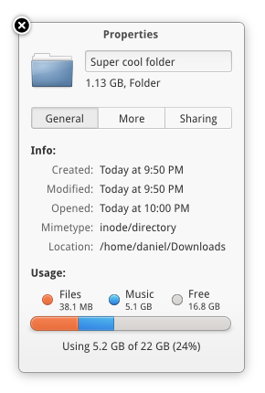
Trying out the Notifications plug (and thus Switchboard) with a more compact toolbar/titlebarRelated content


Comments: 44


I really like this mockup, especially the button 'setting' and the toolbar/titlebar. I hope that Luna look like this!!!
👍: 0 ⏩: 0

*sees on/off switch* MAAAAAAAAAAAAAAAAAAC FUUUUUU NOOOOOOOOOO I WANNA GTE A MAAAAAAAAAC!!!!! i cant live with windows *clicks on picture thumnail an d looks at picture* AHH mac looks so beutifu-- wait... IT"S LINUX O_O
👍: 0 ⏩: 0

elementary OS Luna is easily going to be the best looking Linux disto available. I'm really looking forward to the launch.
👍: 0 ⏩: 0

It's even possible without hacking gnome??
Would be nice to have 2 options compact and normal, compact for lower resolutions.
👍: 0 ⏩: 0


I feel like I should preface my comment with the knowledge that I love all your stuff but don't comment enough for fear of being lost in the wealth of them you already have :/
So as with most your mockups/design, i really like the level of quality and how thought out everything is on this piece.
I like that from the mockup I can assume that it's possible to turn on all three at once which is most likely what I'd like, depending on the notification sound. Speaking of which, any ideas for the sound theme yet? It should obviously be a custom one.
One thing I disagree with only very slightly is the window controls, I wrote an explanation here but deleted it because is doesn't make a whole lot of sense XD, instead I'll be mocking it up soon and you can see my opinion that way.
👍: 0 ⏩: 1

I do try really hard to respond to comments and mail and the like. I think it's important to maintain a direct connection with the people who use/enjoy/hate/etc my work
Thanks, I'm glad you enjoyed it. We haven't started anything with a sound theme yet. Still waiting for someone awesome to come along and come up with one for us
Okay, can't wait to see it! I'm really interested in experimenting with a more compact toolbar/titlebar like in this mockup, but I don't know if it will really become something true or not. Only time will tell if it's actually a good idea ha.
 (Smile)")
 (Wink)")
👍: 0 ⏩: 1
I've noticed and I really appreciate that as will the other commenters. So thanks again for responding. Trawling DA you see some people whose work has some serious page stats and literally hundreds of comments, but scroll down and you won't once see their avatar. It makes me angry, I'd love such feedback.
Well maybe these comments will spark someones interest in making a sound theme
I definitely think a merged titlebar and toolbar is the (future?) way to go. But I have some tweaks in mind, obviously it'll still be mainly to my taste but it might help brainstorming them anyway.
I'm going to start trying tonight but I still can't manage to create shapes or icons that don't pixelate or degrade beyond recognition when they're altered to their actual minuscule size :/ I do use Photoshop, but any tips at all?
👍: 0 ⏩: 0

Am curious as to the rational of having the close and expand buttons on either side as oppose to the same side for both?
👍: 0 ⏩: 1
I wrote a post about it when we introduced it a while ago: [link]
👍: 0 ⏩: 1

")

yes please. altho actually having buttons to click at all is a little redundant. can't you just make it respond to nervous input already?
👍: 0 ⏩: 0


The “Settings” button points to the close button. How are they related?
👍: 0 ⏩: 2
hrm, well they aren't really. The "Settings" button is actually pointing back to the previous screen.
👍: 0 ⏩: 1
Yes, but that's what it looks like. I'm just pointing out that it may be confusing for some people.
👍: 0 ⏩: 0

This.
Obvious problem with the design. If the window controls leave their own little world, they bring confusion. d:
👍: 0 ⏩: 0

In my opinion, there needs to be more space inbetween the close and settings and search bar and maximize buttons. Right now it seems too clumped together, but overall it looks like a nice concept.
👍: 0 ⏩: 1

what is the status of the elementary notifications system ??
👍: 0 ⏩: 0


It feels like if you press the settings button you close the window.
👍: 0 ⏩: 1


It needs *something*. Maybe padding and a separator.
👍: 0 ⏩: 0

Compact toolbar, hmm don't like it, the classic toolbar is more targetable.
👍: 0 ⏩: 0


If you're going to have the "close" and "maximize" buttons be part of the toolbar, could you make them full-fledged toolbar buttons so that they're easy to target?
(They're very hard to target on Mac OS, btw.)
👍: 0 ⏩: 0

Regarding the compact titlebar/toolbar it might be a good idea since according the elementary HIG the menu should be located in the menu-cog and if that is all the application has in it's toolbar it will look ridiculous with both the titlebar and toolbar taking up so much space. BUT won't it possibly break the layout/design of third-party applications? How would the window be decorated if it isn't an elementary- or GTK-app?
👍: 0 ⏩: 1
We're going to break third-party apps that weren't designed to run on elementary one way or another. That's a guarantee.
👍: 0 ⏩: 1
That will bring up a lot of problems. With Wayland I think (if I remember correctly) the planned way of handling window decorations is letting the applications do it themselves. In the end I'd say it's better to have some irregularity in the desktop experience as long as the core is solid and the irregularities are created by the users themselves when installing unsupported software. If e.g. LibreOffice will look broken due to your decisions then that is a show stopper for many. Think about it, you won't be able to control every framework and some things will always look a bit out of place.
👍: 0 ⏩: 1
Our goal isn't to be just some random linux distro that takes what it can get. We're building a healthy dev community that can stand on it's own with it's own apps. LibreOffice might be the first choice for a lot of Linux users, but it should be the second or third choice on elementary, just like it is on Mac OS or Windows.
👍: 0 ⏩: 1
LibreOffice is just an example of many. In other OS:es, if a non-native app exists it's usually just looking displaced, not broken. I understand that your vision is great but you should rather encourage users to use native elementary apps instead by providing a great experience instead of discouraging them to use third-party apps by breaking them.
👍: 0 ⏩: 0
Shouldn't there be a switch for disabling all notifications located somewhere at the top (or bottom) of the left pane?
👍: 0 ⏩: 0

Out of interest, what would noise use bubbles and sounds for?
👍: 0 ⏩: 1
could be a number of things...
You use the "next" media key when the window is not focused
Noise finishes downloading a new song/album
Noise finishes importing songs
A new album is available from a band you like.
👍: 0 ⏩: 0

I'm not really fan of the "compact toolbar" in osx either, call me conservative, but the controls should be in the corners.
👍: 0 ⏩: 0

Looks nice, but the compact tool bar makes it look like an OS X clone.
👍: 0 ⏩: 1
I'm just picking on you because you made the clearest point so, sorry XD
But how is it OS X like?
I have OS X Mountain Lion and there's isn't a merged titlebar/toolbar. I'll give you it that it's very well blended but the window controls and page/app title are all in a row at the top and then, often directly below these (in contrast to the merged bar) are the application buttons.
It seems to just be a stock comment on Dan's things. He probably, like me, likes Apple a lot, takes inspiration but then makes his own ideas and tries to create something more functional. Bu he's very likely inspired by a great many more things/people/places than just Apple.
👍: 0 ⏩: 0
