HOME | DD
 DanRabbit — Session Indicator
Published: 2011-07-26 03:38:01 +0000 UTC; Views: 13880; Favourites: 58; Downloads: 113
Redirect to original
Description
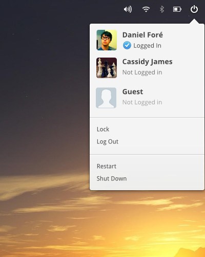
Just a session indicator.Related content


Comments: 80

I think... this is a great idea. ... when we see on elementary os ??
👍: 0 ⏩: 0

I really don't understand why there is a separate User Account menu to the power menu. Ubuntu 12.10 dealt with it and so should elementary!
👍: 0 ⏩: 0

Will you include "system settings"/switchboard in the session menu? It's really convenient to have it there in both Unity and GNOME-Shell
👍: 0 ⏩: 1

Or put switchboard on your dock.
👍: 0 ⏩: 0

GNOME3 seems to have a very similar style, only darker: [link]
👍: 0 ⏩: 0

I think it might be better to make the whole "Logged In/Not Logged In" thing transparent and just allow users to switch the active user, letting the system log users in if they're not already. The difference between "Logging out" and "Switching the user" is often somewhat confusing. In the unlikely event that the system runs out of resources, a system dialog could request that someone switches to their user and closes some apps. In the future, the system could even clear another users' apps from the memory if they've told the system they're where-you-left-off/auto-saving/etc.
👍: 0 ⏩: 1

That's a good point. I really like the idea of "who cares if you're already logged in or not"
👍: 0 ⏩: 0

Nice indicator menu. The most important think to me is. When I move my mouse cursor to items in that popover. Indicator menu should not switch accidencially to sound, battery, wlan menu. It is so annoing in ubuntu. The best solution would be: each time to click on that icon what menu you need.
👍: 0 ⏩: 1
But that was a problem with the old notification area.
")
👍: 0 ⏩: 2
also depends on display resolution. The sollution with the name make this edge wide enough. That should not happen in elementary.
👍: 0 ⏩: 0
also depends on display resolution.
👍: 0 ⏩: 0

i really like it, but why the totaly monochrome icons?
i love it, but only on white is really burring, why not like the faenza panel icons? or a little gradient (sorry for my bad english)
👍: 0 ⏩: 1
They do have a slight gradient, or should have one anyways.
👍: 0 ⏩: 0
So an app like empathy is gonna handle current status/status message?
👍: 0 ⏩: 0

Great design, I'd like to see it in Luna.
And you should do it like Paaskonijn said.
👍: 0 ⏩: 0
I don't see the need for listing other users in the Session Indicator. A button to "Switch user..." is much better since the user will have to go through LightDM anyway and select the user and perform the login. Add the "show notifications on/off" functionality of GNOME-Shell instead.
👍: 0 ⏩: 1

I think it would only show the guest account and other users who are already logged in.
👍: 0 ⏩: 1
Why? The currently logged in user would have no interest in switching accounts so why should those links clutter his interface? If another user comes to the computer he still needs to validate his credentials through LightDM so it's unnecessary to show that he's already logged in in ANOTHER user's interface.
👍: 0 ⏩: 0

You should make more clear who's the active user.
AFAIK, in Ubuntu you can log in from another account without logging out from the first. In that case, both Daniel and Guest could be Logged In, but you can't tell who's currently using the computer.
👍: 0 ⏩: 1
It says in the panel who's currently using the computer lol
👍: 0 ⏩: 1
What if you have to people named Daniel? (It can actually happen. My father and I share the same first name so if we had users on the same computer it would be a problem.)
👍: 0 ⏩: 1
In that case, I would imagine we could show the actual username (which is unique) in quotes.
👍: 0 ⏩: 0


Yeah, lets use different dialogues for everything.
👍: 0 ⏩: 0

no, he's not. IMO this is consistency.
by the way, this mockup is Amazing!
👍: 0 ⏩: 0
How do you log into the (insensitive) Guest Session?
👍: 0 ⏩: 1
It's not insensitive, it's just inactive. But yea it does look insensitive doesn't it... hmm..
👍: 0 ⏩: 0

there is something odd about the balance of the top right corner and the arrow.
about the options, I often use hibernate. rarely log on to another user directly.
otherwise, looks good. I finally gave to white menus.
👍: 0 ⏩: 1
Lock Screen should probably sleep the device, just as you would expect when you press the lock screen button on your mobile.
👍: 0 ⏩: 1
ok then, thought it was the already existing lock screen, which leaves the computer on.
but even so, having a bad battery laptop, when I carry it around I really use hibernate, not suspend mode, to save any work layout.
👍: 0 ⏩: 0

Looks really nice even if the menu is short a few things.
👍: 0 ⏩: 0

it would be easier if we would just use the gnome 3 indicators. I really don't get why we're using gnome 2 indicators now.
👍: 0 ⏩: 1
We're not using the GNOME 2 applets. We're using the KDE/Ayatana indicator spec.
👍: 0 ⏩: 1
Then you must have some kind of hacked third party version o.O Wingpanel has never (and will never) supported gnome2 applets.
👍: 0 ⏩: 0


Looks good. Although, I'm not sure I understand the point of '...' is for after Log Out, Restart, and Shut Down. Seems like it would make more sense to just leave the '...' out for a cleaner look.
👍: 0 ⏩: 1
Ellipsis indicates that further action or information must be provided before an action can be completed. In this case, ellipsis indicates that there is a confirmation dialog in between clicking "Log Out" and actually logging out.
[link]
👍: 0 ⏩: 0
Much more concise than the new Ubuntu session indicator. They should really rename it to "system indicator."  (Smile)")
I feel like there should be some indication of the currently logged in user. I know you'd know which one is logged in, but they should be distinguished. A check or something would work.
👍: 0 ⏩: 1
Ooops, meant a check for the current user only.
👍: 0 ⏩: 0

I really like it- I was one of the first to gripe when I saw how they butchered the menu and filled it up with seemingly redundant options. :\
👍: 0 ⏩: 0

i really don't like white borders around black popups. but the functionality looks swell
👍: 0 ⏩: 0
love the simplicity, bur i think the fonts are oversized
👍: 0 ⏩: 1
That's why font size is adjustable  (Wink)")
👍: 0 ⏩: 0

It looks a lot better than the gnome-shell session indicator.
👍: 0 ⏩: 1
We need a new granite widget for this kind of menu.
👍: 0 ⏩: 1
Naw, it should be a part of the regular GTK menus. Inconsistency is bad.
👍: 0 ⏩: 0

I love the blue color! If the entire theme could have this blue color, it would be perfect.
👍: 0 ⏩: 1

Very clean. Finally someone who took the system settings out of the session indicator. They just not belong there.
👍: 0 ⏩: 1
| Next =>