HOME | DD
 DanRabbit — Switches

Published: 2012-03-31 15:56:13 +0000 UTC; Views: 7145; Favourites: 36; Downloads: 125
Redirect to original
Description
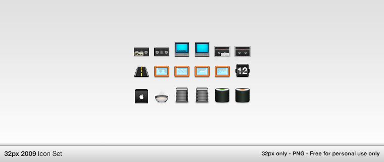
messing around with a switch design.Related content


Comments: 48

I don't care if it is look like iOS. I just wanted eOS to be look like this ")
")
👍: 0 ⏩: 0

I'd much more prefer checkboxes than toggle switches. How about a checkbox that looks like the Enyo Project's:
[link]
Except the blue used would be "elementary blue".
👍: 0 ⏩: 0


I really hate how every time he does anything good everyone throws tantrums because he apparently ripped off Apple. Look at BeatBox: People say it looks like iTunes. OF COURSE IT LOOKS LIKE ITUNES. It's like you're criticizing the LibreOffice team of ripping off Microsoft. And, for the record, have you seen the scrollbars in Lion? Anyone know who had that one first?
👍: 0 ⏩: 0

omg, who cares if it looks like ios, osx or whatever. this looks awesome maybe change to blue to black or gray something.
👍: 0 ⏩: 0

I second ~c-krell 's opinion" The chrome and the blue makes it look way too much like the ones in iOS. I suggest that you'd change the chrome part to just a plain-colored handle, fitting in with the background.
👍: 0 ⏩: 1

Ironically, changing the handle to matte would make it look more like iOS, not less
 (Wink)")
👍: 0 ⏩: 1
You do have a good point there, Dan. But, I'm convinced about my statement. Why? The chrome button tells, no yells me one thing: "Look, I wanna be shiny and polished!". And, okey, of course the graphical interface is eOS' main unique selling point, but I think we should keep is as simple and plain as possible. No sweet grainy background-textures, no shiny buttons, no glass touch on anything... Just matte, for simplicity's sake.
👍: 0 ⏩: 1

We actually kinda want grainy background textures though.
👍: 0 ⏩: 0


I prefer the matte style which has been used previously :/
👍: 0 ⏩: 0


I feel that the silver knobs are too detailed to fit in the "elementary" theme. Perhaps matte gray would do the trick.
👍: 0 ⏩: 0


Will be an option to change the ON/OFF to different language shortcut? In polish it would be WŁ./WYŁ.
👍: 0 ⏩: 3

But, why u need to translate ON/OFF ? All people in world know, what ON/OFF mean
 (Smile)")
👍: 0 ⏩: 1

That's the same as saying “Everyone speaks English”. It's simply not true.
👍: 0 ⏩: 0
In other languages the Switch shows as "I" and "O"
👍: 0 ⏩: 1
I see now. Maybe "I" and "O" symbols should be in the same height?
👍: 0 ⏩: 1
I'm not sure I really have control over that :/
👍: 0 ⏩: 0

Interesting remark a "0" or "1" should be better.
👍: 0 ⏩: 0


At first I thought, "Oh, this is super slick," but when I thought more about Elementary's design I think that this would be a good opportunity to add more color to what is already a very cold, metallic theme. The elementary icon set trends towards smooth, unobtrusive, yet recognizable symbols, and I think this very physical looking button is great in that respect.
👍: 0 ⏩: 0

It would be awesome it had the animation when you turn it on or off! Otherwise, awesome!
👍: 0 ⏩: 0


OH U COPIED APPLEE!!!!
But actually, I wonder if styling switch "handles" and slider handles would make people try to drag the switch handles. Maybe it would be better to style the handle more like a button so people will click it instead? (Sorta forget how GTK switches work, does it trigger on mousedown or click?) Some user testing would help...
👍: 0 ⏩: 1
GTK Switches work either on click or on slide.
Mainly I want to make sure these don't look like a button to avoid confusion about off/on states and whether it's inactive or active and stuff like that.
👍: 0 ⏩: 0

I actually dislike this, mainly because I feel it does not match the rest of the controls in elementary, because it has a glossy feel, compared to elementary's sleek matte style.
👍: 0 ⏩: 1
Scale has been using this style for a while now.
👍: 0 ⏩: 0

I just....no. Just no. It doesn't really seem "elementary." I prefer the old design.
👍: 0 ⏩: 0

Sorry, but I think that is first thing in your gallery whitch I don't like...
👍: 0 ⏩: 0

Nice. I would like to see this switch button in Luna
👍: 0 ⏩: 0


I like it. Visually its similar to the scale which makes sense since in both widgets you slide the knob to do something. Makes more sense than making it look like a button which doesn't function the same way.
👍: 0 ⏩: 0


The silver strains my eyes (too shiny). But I love the blue theme going on.
👍: 0 ⏩: 1

I agree. The silver doesn't really fit in with the theme (to me).
👍: 0 ⏩: 0