HOME | DD
 DarlingMionette —
Quick and Dirty Color Theory
DarlingMionette —
Quick and Dirty Color Theory

Published: 2010-04-19 00:21:39 +0000 UTC; Views: 120500; Favourites: 5578; Downloads: 3397
Redirect to original
Description
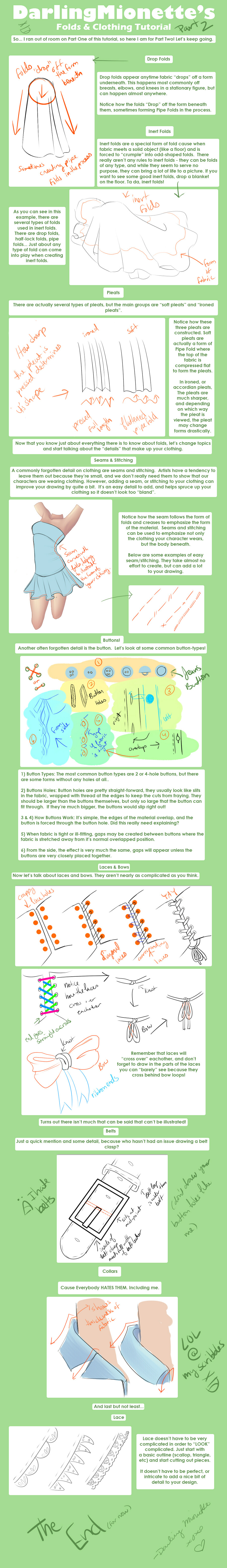
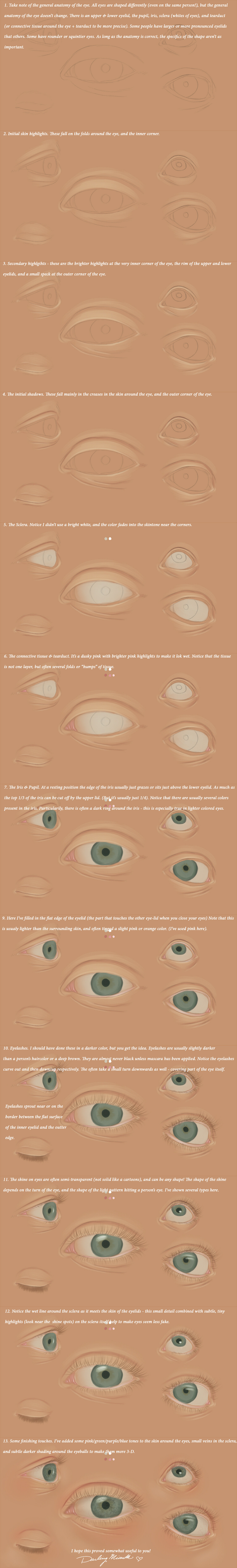
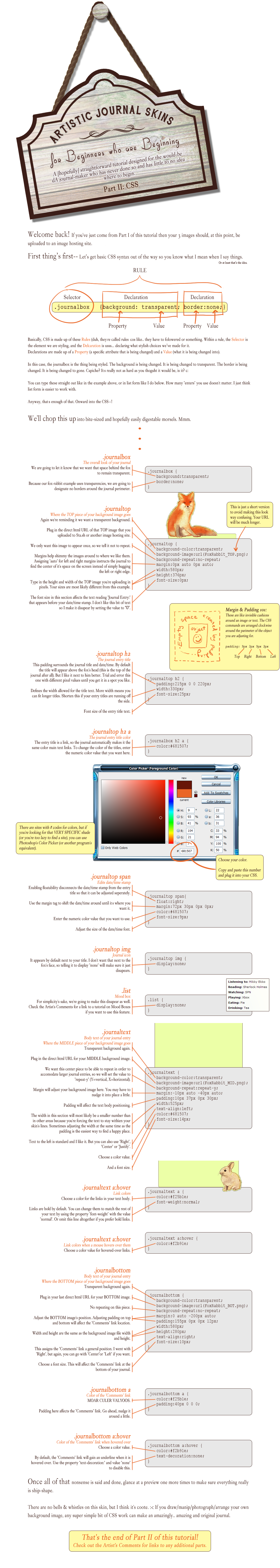
My Quick & Dirty Color Theory Tutorial. That turned out to not be so quick >.> I got absorbed and explained a lot more than I originally intended. LMAO I hope you guys find it useful (Smile)")
More tutorials to come!
Related content


Comments: 485

That's certainly interesting 0_0 Thank you ^-^
👍: 0 ⏩: 0

The second one and third one are the most correct - the shading you did on the red character in the second one is ideal - it looks really really nice, but it didn't work out so well for the blue character. You had the right idea with the third one - tinting the shadows/highlights towards warm / cool colors individually, but you still need to find a way to tie the two characters together. It would help if you have a back-ground tint.. what I usually do is (even if I erase it later) floodfill the background with color before I start coloring any other part of the picture - and then paint the characters over that. This helps to not only pull some of the background color into the characters (if you're using one layer and brushing over it) but it can also help you pick the colors you want for your picture (it tricks your eyes into tinting your characters so that they fit well into the background). For example, you can see me do that here: [link]
👍: 0 ⏩: 1
Well, in terms of the background color part, that can be hard for me since those colors came from official pictures, so I don't really know if I could alter them. (Though I'm sure there are people who know color A LOT better than me who could.) If I wanted to go back and try to tie these two characters together, how would I do that? Like, maybe adding a little bit more shading, but using the same color for both? (I probably would go back, but I do have characters that are even more differently colored that show up in my work.)
Thank you for the tips though :3 I don't really know if I understand everything yet (I GET color theory, and I understand all the basics, but I guess I'm just having trouble putting it into practice) but hopefully I'll get it x3
👍: 0 ⏩: 1
XD I was once in the same position as you - figured colors of popular characters had to be exact - but here's a secret: lighting and environment both change every single color in a picture... you wouldn't use the same bright colors for a picture at night right? so there's no reason why even recognizable characters have to have an exact RBG value. As long as a green characters looks green-tinted in it's environment, no one even notices the colors are drastically different :3 So if you need a background color to tint a picture to make it cohesive, just pick a color - ANY COLOR - and start working it into the picture. Example: [link] this started out with a light green/yellow background. Notice how there's little bits of green/yellow in her hair, and also her skintone has been tinted somewhat yellow. Compare it to: [link] which started out with a pink background (notice the pink in her hair and skintone) I later changed it to that icky green - which was also worked into her skin (check the shadows under her chin). At first glance, if you aren't looking for them, you don't notice right away how the background has been pulled into the picture. Compare it to a picture where the background was NOT taken into account: [link] notice how all the colors are far more saturated and not cohesive at all - it's a very vibrant cartoon XD it makes a HUGE difference. Don't be afraid to experiment with color
👍: 0 ⏩: 1
but here's a secret: lighting and environment both change every single color in a picture... you wouldn't use the same bright colors for a picture at night right?
That's a very good point xD Lightning and color changes are differently something I should play around with since, unless it's nighttime, I don't think I ever really do change my color, just my shading.
Thanks again for all the tips! :3
👍: 0 ⏩: 1
you're very welcome :3
👍: 0 ⏩: 0


Wow. I feel like your palette will help me a lot with color! Thanks!
👍: 0 ⏩: 1

THIS IS SO FRICKEN HELPFUL THANK YOU!

👍: 0 ⏩: 1

Really helpful, thank you for taking the time to do this
👍: 0 ⏩: 1


Great resource! Thanks for taking the time to make and share this with everyone
👍: 0 ⏩: 1
")
👍: 0 ⏩: 0


This is really helpful and I'm going to experiment with it, well deserved DD!
👍: 0 ⏩: 1


Wow, this is so helpful! Thank you!
This is one of the best saturation scales/tutorials I've ever seen. Very helpful, as I have always had trouble with colour hues and making my art look dynamic and "pop".
Thanks!
👍: 0 ⏩: 1
you are very welcome
👍: 0 ⏩: 1

This has been a great help for me, your saturation scale is certainly one of the most useful ideas I've found so far.
👍: 0 ⏩: 1
👍: 0 ⏩: 0

Definitely awesome, thank you so much !
👍: 0 ⏩: 1

This is fantastic! I can't wait to make use of it.
👍: 0 ⏩: 1
👍: 0 ⏩: 0

Thank you,this was very good advice
👍: 0 ⏩: 1
you are very welcome :3
👍: 0 ⏩: 0

Greetings, Darling Mionette. I want to thank you again for the awesome tutorial.
I have questions, if you don't mind. x) In the saturation section, when you tinted the highlights a bit toward green and the shadows a bit to purple, you said that the highlights (green tint) became slightly warmer while the shadows (purple tent) became cooler. Now what I don't understand is that green and purple are both cool colors, and the difference between them is the heaviness, not warmth. So, how did tinting the highlights toward green make them warmer? Shouldn't they be tinted toward yellow or red instead?
And a second question; when tinting colors to give this slight feeling, on which basis do you decide weather to tint the highlights/shadows toward the light warm/cool or toward the heavy warm/cool colors? I am having this decision difficulty at the moment, while setting a palatte for my drawing.
👍: 0 ⏩: 2

The reason is that colours only have a relative warmth. So, in the context of that particular blue, going greener looks warmer and going more purple looks cooler. Warmth is something more like a direction than an inherent quality of a colour. (Unless we're talking about a colour in isolation, or a general colour scheme of a painting. So it makes sense to say that a palette hast mostly 'warm' or 'cool' colours, but when talking about 'warmer' or 'cooler', it's a relative thing and it means something slightly different.)
Here's an image showing where the direction is for different colour wheels: [link]
(the traditional artist's colour wheel is a mixture of these three)
'Heavy' just means darker. I'm not sure this has any relevance to colour temperature. (Maybe it's like how some art teachers incorrectly call desaturated stuff 'cooler'. More information here about that.)
If you want to go for realism, what tint the shadows get just depends on what the colour of light illuminating them is. (Shadows are always lit up by something, or else they'd be pitch back. So in space they are actually pitch back, because there's nothing for light to reflect off.) So, in a room with orange furniture, they might get an orange tint. Outside during a sunny day, shadows facing the sky get a blue tint, and shadows facing the grass get a green tint. If you're in a neutral grey room, the shadows wouldn't get a hue shift.
However, artists sometimes like to base hue shifts on different things, such as "make shadows the opposite colour of the light source" or "make shadows the opposite colour of the object's colour". The first one is an exaggeration of a visual effect called 'simultaneous contrast', where the brain exaggerates the difference between two colours (or in this case shades). Like the grey squares in this tutorial . The second is just an artistic style thing. Neither of these are accurate to life, but might look nice.
👍: 0 ⏩: 0
XD it's because green is what you consider a "light cool" and purple a "heavy cool" so even though they're both in the cooler range, the green turns out to be a "warmer" color in a way. it's kind of hard to explain XD but it works. warmer isn't a good word for it, but I think you understand what I mean XD
I generally pick whether something's going to go heavy warm / light warm based on atmosphere. I treat day-time (outside) colors as light blue, greens, and yellows, and evening (underground) colors as reds/oranges. Also keep in mind the color of the lightsource itself. if your character is standing next to a blue/red police light, then the highlights/shadows are going to be different than a character standing outside mid-morning on a sunny day. :3
👍: 0 ⏩: 0

XD you're very welcome!
👍: 0 ⏩: 0

Have you ever seen [link] ? It's not easy-going, but it explains in depth some very popular misconceptions (e.g. the primary colours are red yellow blue, the traditional painter's colour wheel, and so on).
He says in his first Principle of Colour that shading will move along a line of uniform saturation (except specular highlights, which take on the colour of the lightsource), whereas here you have the mid tones as the most saturated and the rest as desaturated. (For a better idea of what this is all about, this thread goes into more depth, with pictures: [link] )
The basic reason is, well, why would it lose saturation? In shadow, assuming the ambient light is the same colour as the main light, all you're doing is removing some photons -- it's still the same balance of photons.
The only time you'd expect shadows to desaturate is situations like the ambient fill light being a different colour, so there you'd be removing mostly the photons of the main light source and leaving the photons of the ambient, which would then mix with the local colour of the object.
👍: 0 ⏩: 1
Nope, I hadn't seen it, thank you for the info!
👍: 0 ⏩: 0

you're very welcome :3
👍: 0 ⏩: 0

#3 does look like crap, lol.
Nice tutorial.
👍: 0 ⏩: 1

awesome job and very well explained.
👍: 0 ⏩: 1
<= Prev | | Next =>