HOME | DD
 dawnbest — Ruby Comic Page 01

Published: 2006-02-06 02:57:34 +0000 UTC; Views: 11301; Favourites: 124; Downloads: 1817
Redirect to original
Description
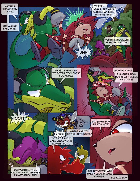
Hope you guys are enjoying the Superbowl as much as I currently am. Haha. So here's my project, in between the game and cooking in prep for the game. Let's get started!Strange but true Sonic factoid #1. Mighty has a tail. Don't believe me? Check this out... [link]
I guess he lost it in translation, as he hasn't had a tail for a very long time in the Archie comic. But, as I've said before, this isn't Archie and I'm allowed to draw Mighty with a tail in my own comic. I'm also allowed to ink him without filling his body in solid black. Often, even when I'd leave him open, the inker would come along and fill him in with black ink. Pain in the ass.
The other thing I'm allowed to do is, of course, define my characters. It always bugged me how Archie treated the Chaotix as basically four of the same guy. Here, you can already get a sense of my continuity's versions of Espio and Mighty.
NEXT PAGE: [link]
Related content


Comments: 59

I have to say that I prefer the Archie Sonic comics back in the ol' days.
And I think I remember one issue I read where Sonic returned from missing in space to Knothole only to see most of his friends have changed. Like Antoine! Dang, I missed the ol' sweetheart Antoine. Okay, maybe some find him cooler than ever with the scar and the angst!attitude... But bleh. That's just not the same...
I like the thin outline and the colouring is clean and not too much. Just perfect for comics like this. :3
👍: 0 ⏩: 0

I don't think Mighty has ever had a tail in the comics. That's funny, I've seen those sprites before, but never noticed the tail. I also find it annoying when anything that's black is inked in entirely, it looks better if there are some highlights.
Personally I've always seen Mighty as being the calm, quiet, pacifistic sort. In fact apparantly it says something like that in the Japanese Knuckles Chaotix manual. Oh well. I've seen other interpretations as well. It's kinda hard just going by the comics, though earlier on the Chaotix were a bit more defined in personality...except Espio, who always seems to lack any personality. Anyway this works just fine for me. Probably more amusing this way.
Do you use gradients or is that just my moniter? I only see it in a few places.
👍: 0 ⏩: 0

Actually, (and sorry for double posting here) there is one little niggle I have, and that's how the bottom of Mighty's sock rims tend to sort of fall on one side of the show than the other. It'd work if it were lopsided, but the sides of the sock seem to just fall apruptly, whereas the rest are sort of horizontal. Not sure if that makes a lick of sense XD
👍: 0 ⏩: 0
Theres definately more depth there then seen in Archies renditions. I love how you pack a lot of detail in, yet still keep it stylistically simple. The trees for example. There's definition in there, like the leaves, yet it's not overcrowded. And again, great inking.
Love the perspectives too.
 (Smile)")
👍: 0 ⏩: 0

I think you colour better than the comic, too :/
👍: 0 ⏩: 0

Lol, good stuff... So makes me want to go back to collecting the series, I stopped at about the 100th issue, and from what I last saw, they were at 156 or something...
")
👍: 0 ⏩: 0

I'm already excited. 
👍: 0 ⏩: 0

<= Prev |